
Maps and layouts
Before we begin
Section titled “Before we begin”Before diving into this module’s exercises, it would be good if you can review and familiarize yourself with the Print Layout.
Map themes
Section titled “Map themes”A map theme is a snapshot of the current map legend that records:
- the layers set as visible in the Layers panel and
- for each visible layer:
- the reference to the style applied to the layer
- the visible classes of the style (i.e. the layer checked node items in the Layers panel. This applies to symbologies other than the single symbol rendering)
- the collapsed/expanded state of the layer node(s) and the group(s) it’s placed inside
Map theme options can be found in the Layer panel via the ![]() button.
button.
Creating map themes
Section titled “Creating map themes”To create a map theme:
- Check the layer/s you want to show.
- Configure the layer properties (symbology, diagram, labels, etc).
- Expand the Style ‣ menu at the bottom of the Styling Panel.
- Click on Add… to store the settings as a new style embedded in the project.
- Repeat the previous steps as necessary for the other layers.
- If applicable, expand or collapse groups or visible layer nodes in the Layers panel.
- Click on the Manage Map Themes button (
 ) on top of the panel and click Add Theme
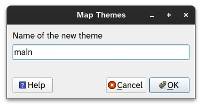
 - Enter the map theme’s name and click OK.
- Your themes are listed under the button.
1.1. Adding multiple maps to the same layout
Section titled “1.1. Adding multiple maps to the same layout”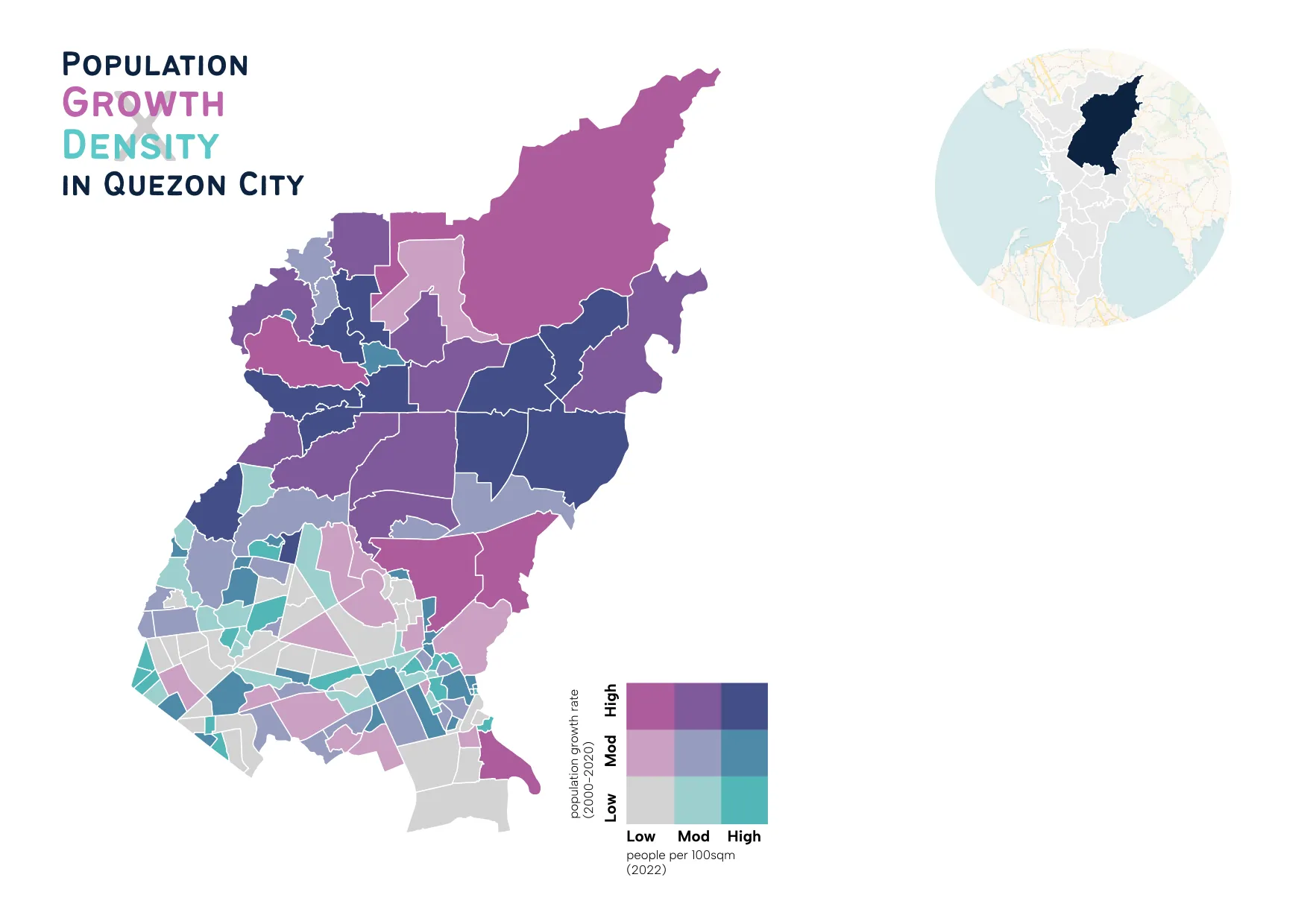
What we want to achieve
Section titled “What we want to achieve”- You will utilize map themes in order to add the two maps to a single layout. You will create a map showing population information for Quezon City barangays with an inset map showing the location of Quezon City in NCR.
What we have
Section titled “What we have”-
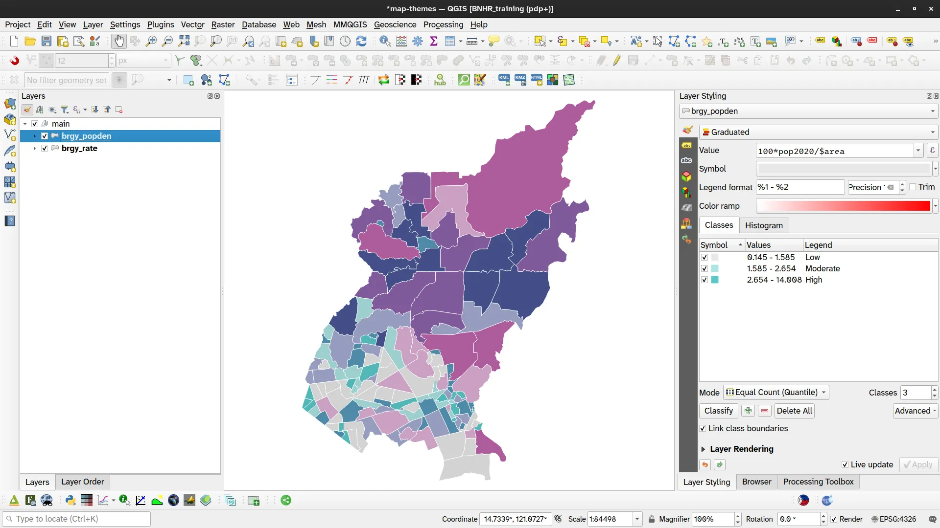
adm_brgy_quezon_city_pop2000_2020 - the barangay-level admin boundary data styled as a bivariate choropleth as per Bivariate choropleth map of barangays showing population density and annual population rate
-
Load the bivariate choropleth map we created in Bivariate choropleth map of barangays showing population density and annual population rate and add the layers to a group named main.
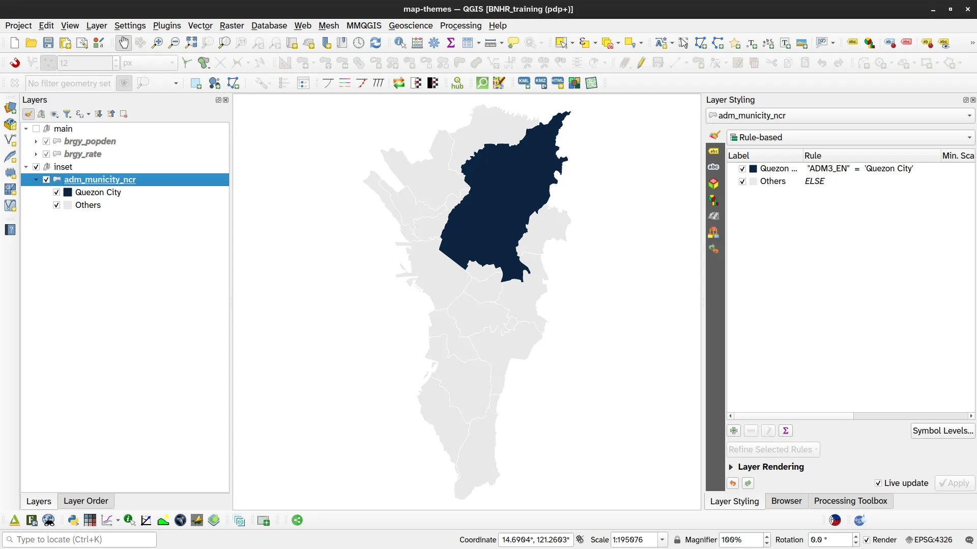
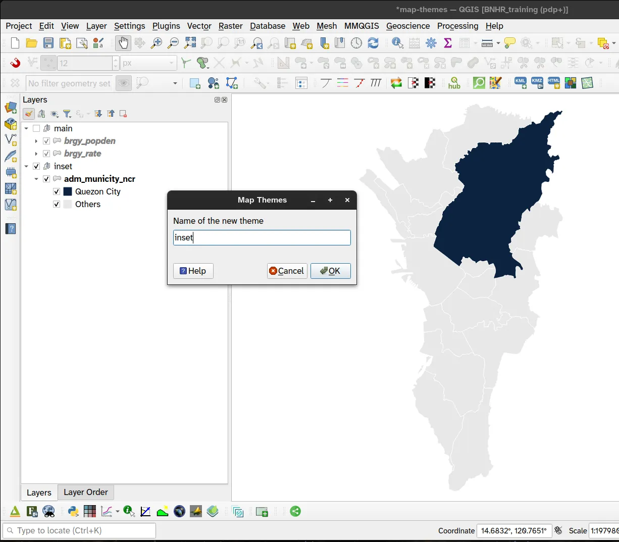
- Add the adm_municty_ncr layer in QGIS and use any symbology to highlight Quezon City. In the example below, we used rule-based symbology. This layer will serve as our inset map so add this to a group named inset.
- Set the main group as the only visible group (checked in the Layers Panel). Add a theme by clicking > Add New Theme. Name the theme main.
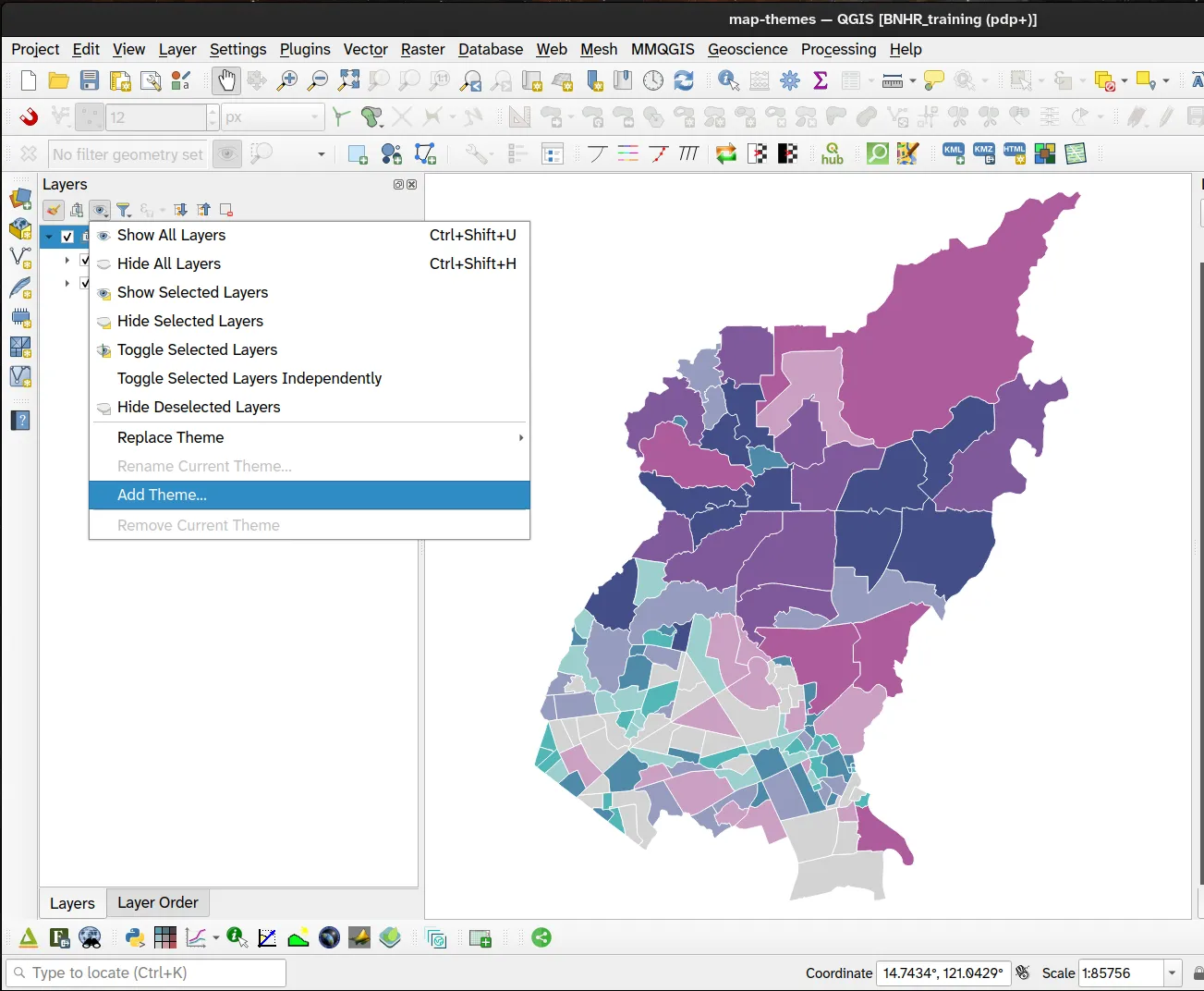
- Do the same for the inset group. Make it the only visible group and add a theme by clicking > Add New Theme. Name it inset.
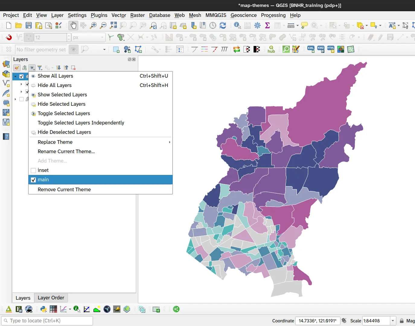
- The map themes are listed under and can be activated/deactivated any time. Try it.
- Open a Print Layout.
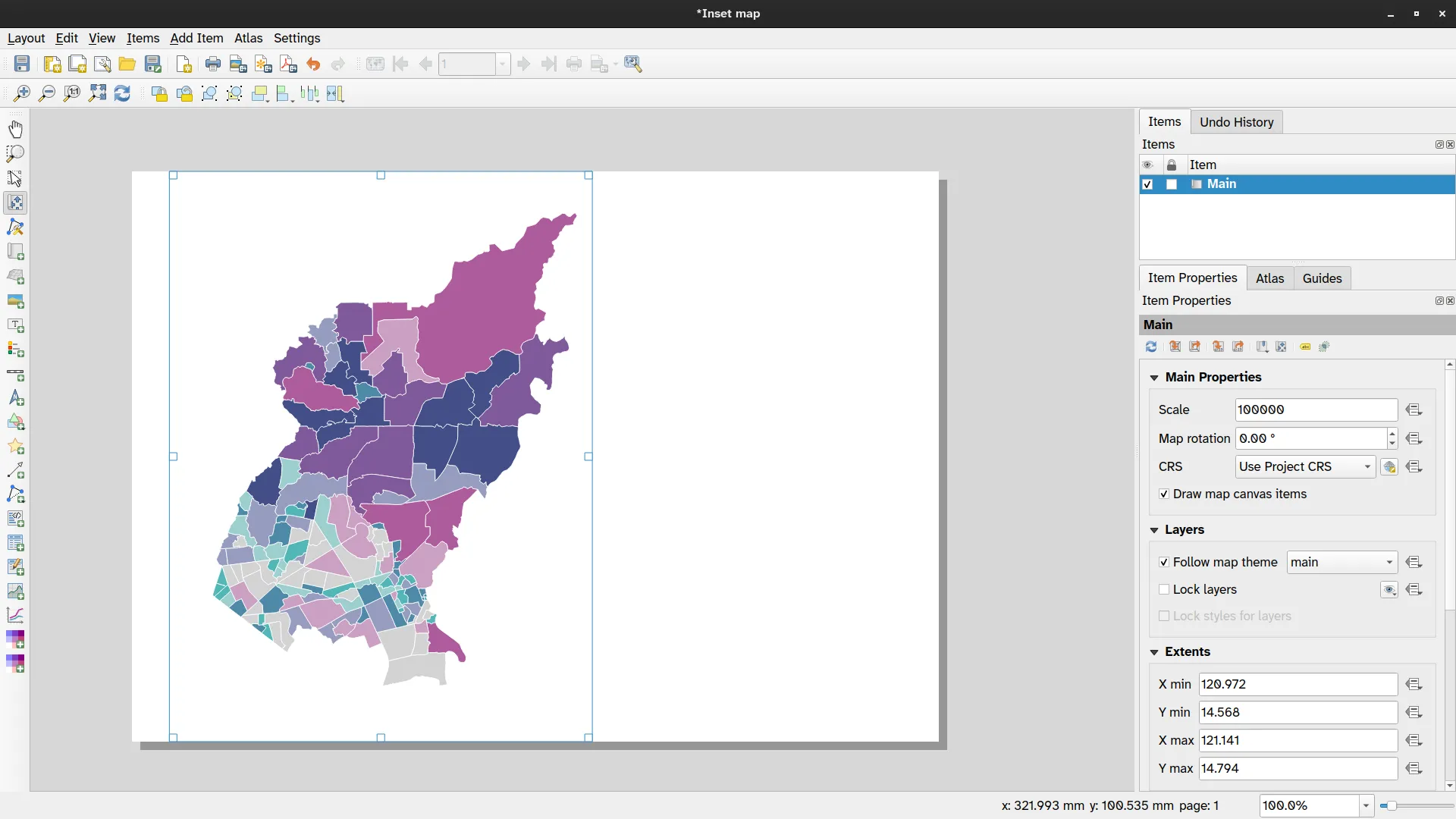
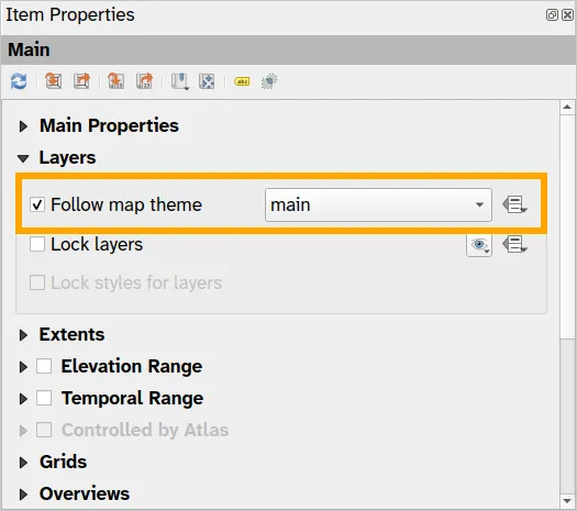
- Add a map. In the Item Properties of the Map, set:
- Layers
- Check Follow map theme
- Select main
- Layers
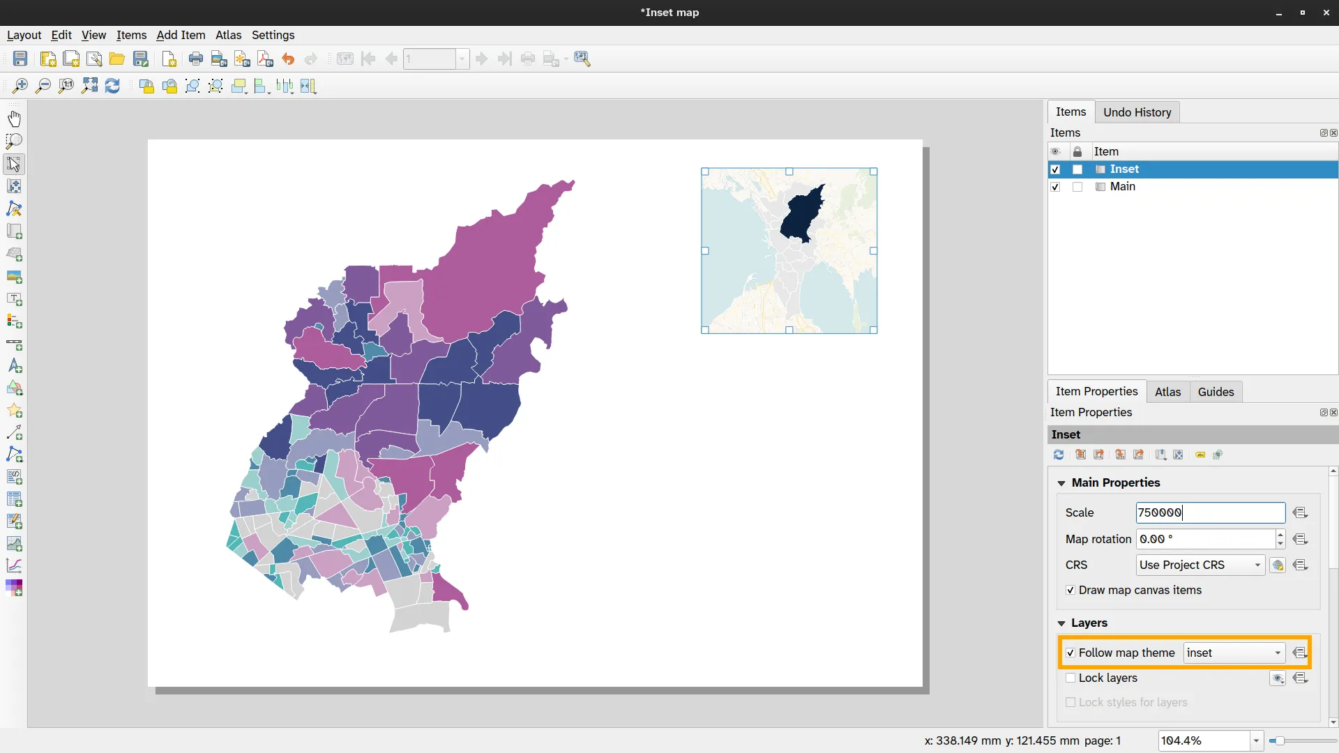
- Add another map element. This time make it smaller and place it in the upper right corner of the page. In the Item Properties of the Map, set:
- Layers
- Check Follow map theme
- Select inset
- Layers
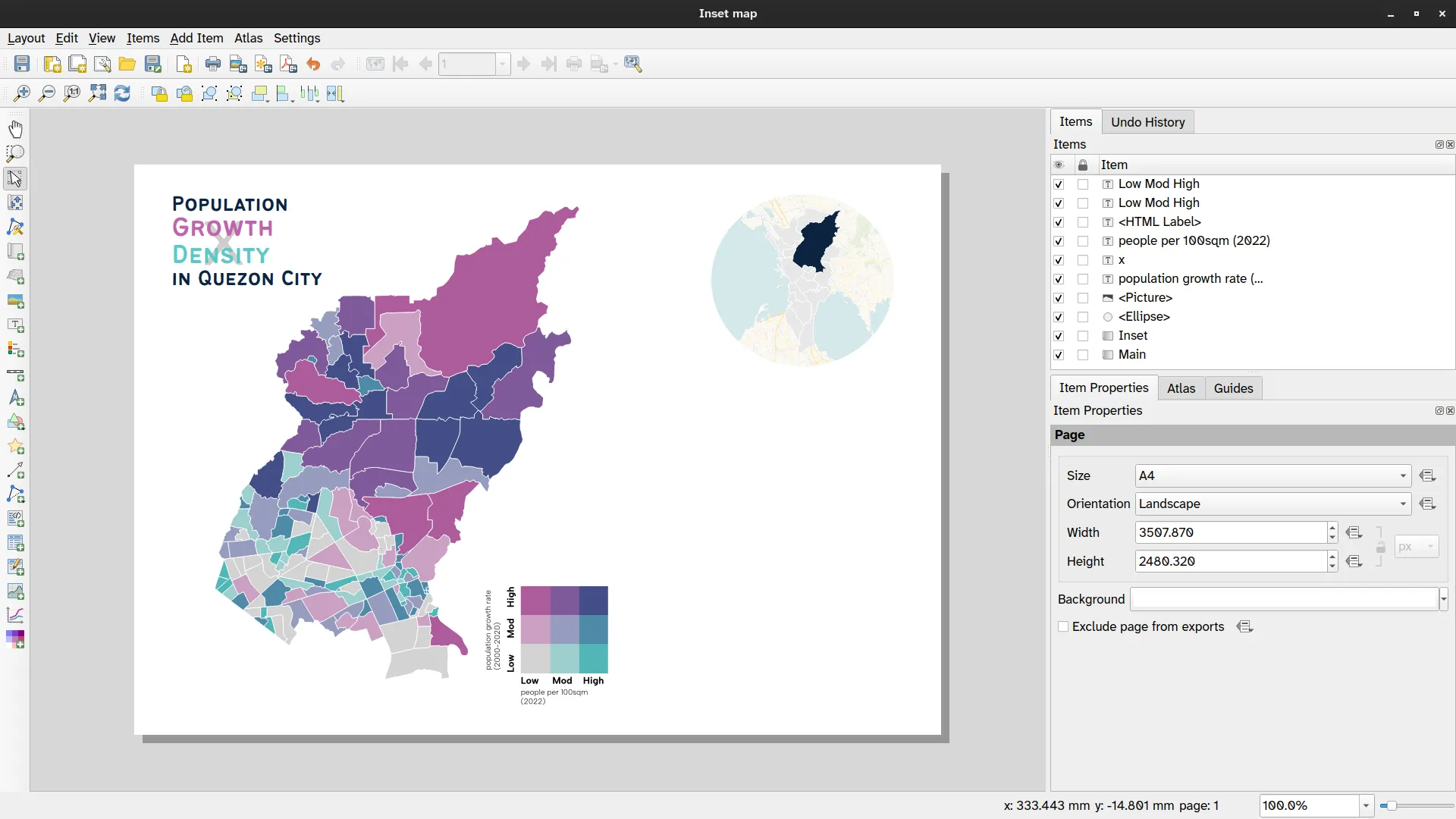
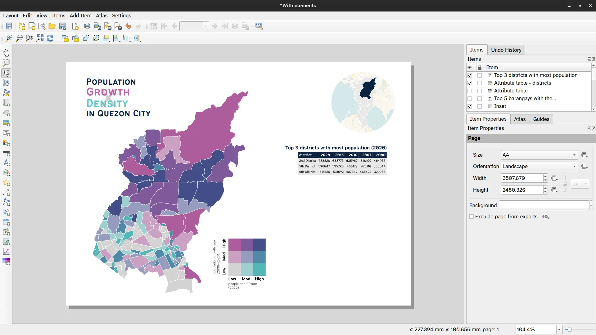
- Add other map components (e.g. title, north arrow, scale bar) so that your map looks something similar to the one below.
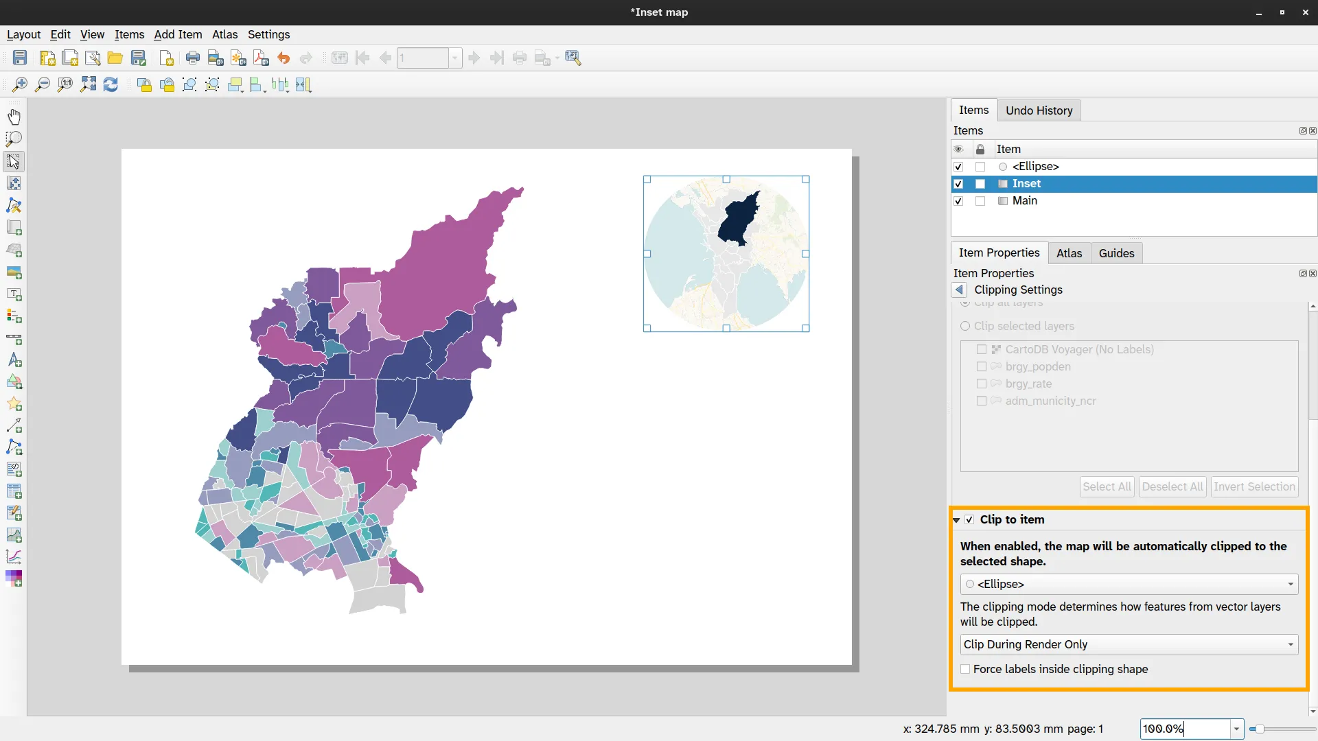
BONUS: What if you want to clip the inset map so that it looks like a circle (or any other shape)?
Section titled “BONUS: What if you want to clip the inset map so that it looks like a circle (or any other shape)?”QGIS makes it easy to clip map elements. In the Map properties toolbar, the rightmost button will open the Clipping settings that will allow you to define how you want the map to be clipped.
![]()
- Add a circular shape to the map using the Add Shape > Add Ellipse command. You will use this to clip the inset map to its shape. Place this circle over the inset map where you want it to be clipped.
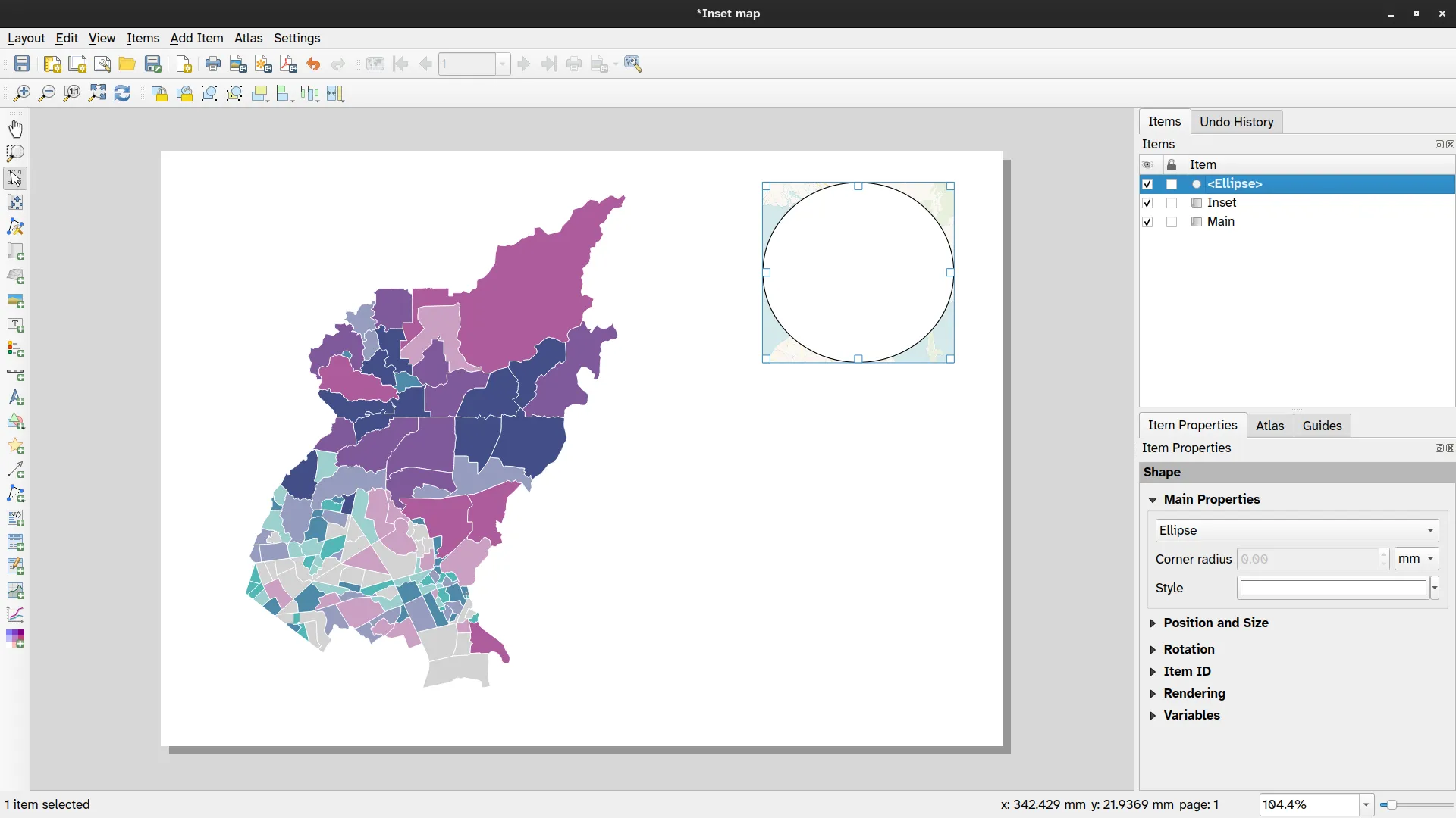
- Go to the Clipping Settings of the inset map, check Clip to Item, and select Ellipse.
Plots, tables, and other map elements
Section titled “Plots, tables, and other map elements”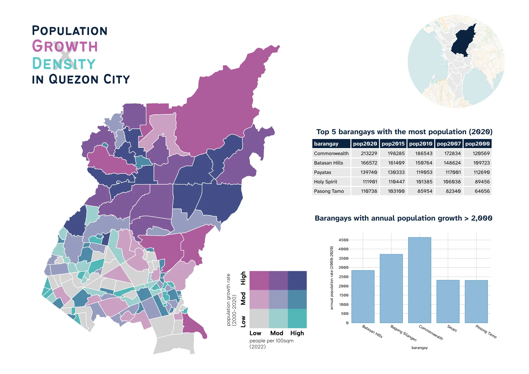
Aside from common map elements such as labels, scale bar, and legends, the QGIS Print Layout also allows for other map elements such as tables and plots to be added to the map. For tables, these can be fixed tables or based on the attribute table of layers.
For plots, they can be added using plugins such as the DataPlotly plugin (https://plugins.qgis.org/plugins/DataPlotly/) for graphs (bar, chart, pie, line) or natively such as with Elevation profiles.
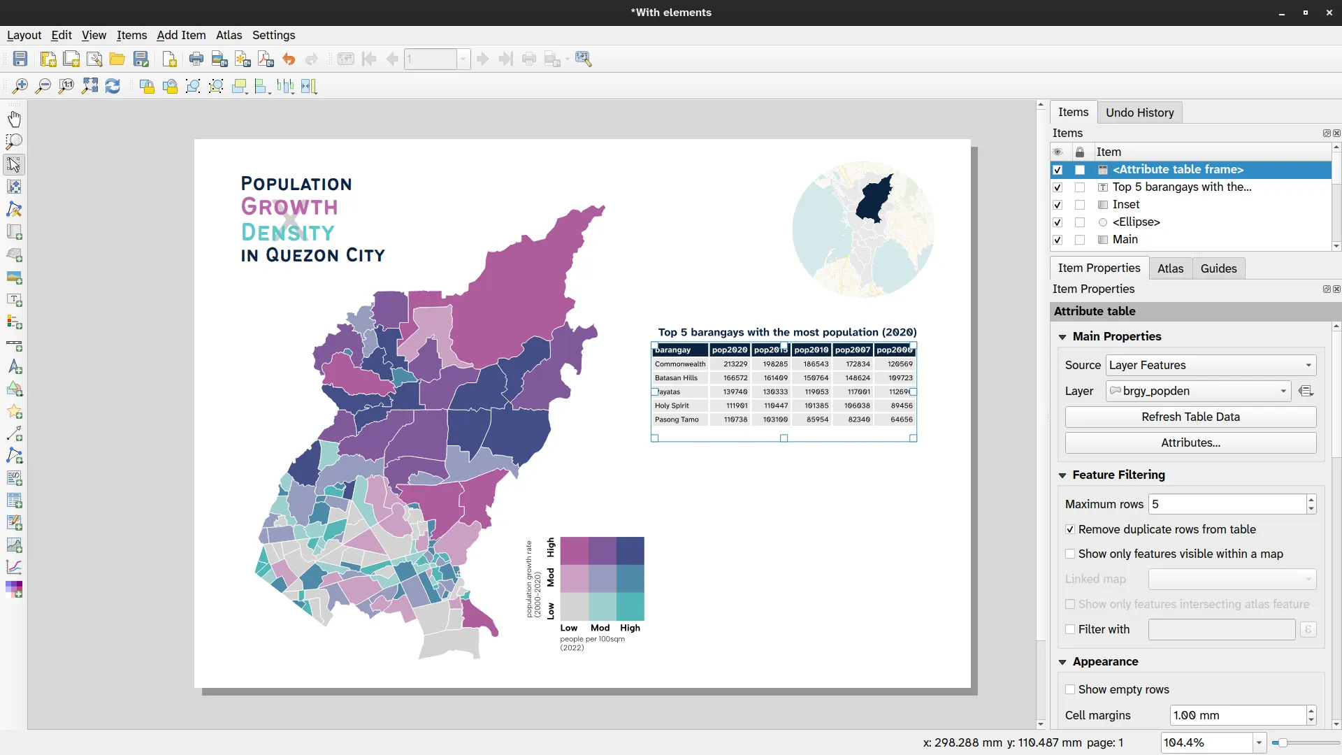
2.1. Add a table of the top 5 barangays with the most population in 2020
Section titled “2.1. Add a table of the top 5 barangays with the most population in 2020”-
Add an attribute table to the layout by clicking
 or Add Item ‣ Add Attribute Table on the menu bar.
 -
Under Main Properties in Item Properties of the Attribute table:
- Layer: brgy_popden (or any layer that has population fields)
- Click Attributes…
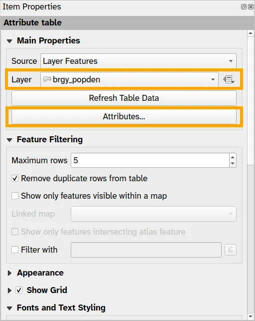
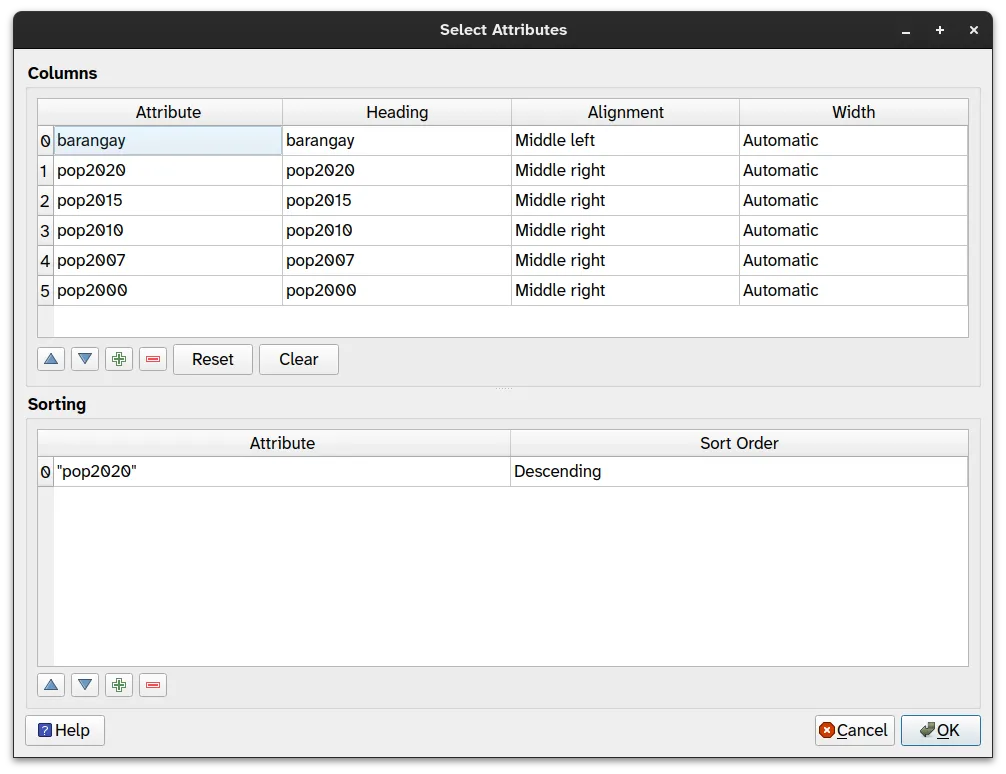
- On the Select Attributes window:
- Remove all attributes so that only barangay, pop2020, pop2015, pop2010, pop2007, and pop2000 remain.
- Add a new Sorting by clicking on the green plus button.
- Attribute is:
"pop2020"
- Sort Order: Descending
- Attribute is:
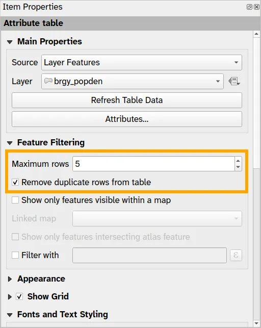
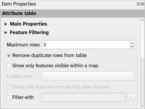
- Let’s limit the number of barangays shown to just 5 by adjusting the parameters under Features Filtering in Item Properties.
- Set Maximum rows to 5
- Check Remove duplicate rows from table
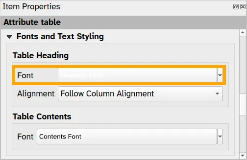
Editing the look and style of the table
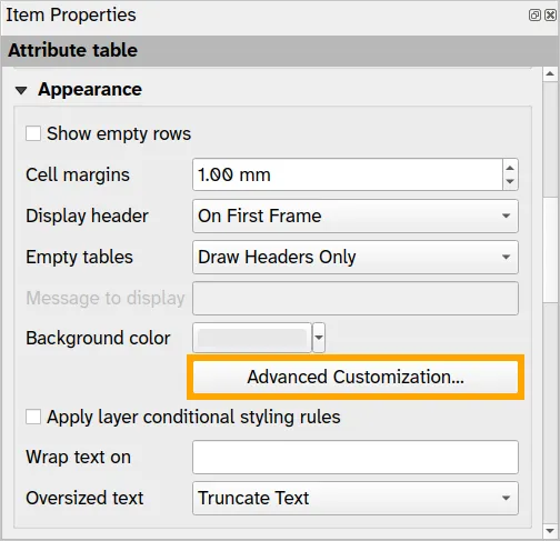
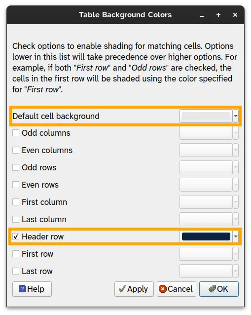
Section titled “Editing the look and style of the table”- You can edit the general apprearance of the table under the Appearance tab. For example, you can click Advanced Customization… to chacneg the Table Background Colors.
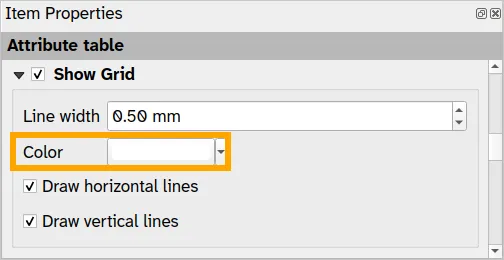
- You can also edit the table grid.
- As well as the fonts used.
- After editing the table, your layout should look something like below:
BONUS: What if you want to show the top 3 districts in terms of population?
Section titled “BONUS: What if you want to show the top 3 districts in terms of population?”Even without loading a layer that has district-level population data, we can add a table that summarizes our barangay-level population data for individual districts by using Expressions.
-
Click Attributes… to open the Select Attributes window again. This time use the following Expressions for the Attributes:
sum(pop2020, district)sum(pop2015, district)sum(pop2010, district)sum(pop2007, district)sum(pop2000, district) -
For the sorting, use the following Attribute:
sum(pop2020, district)
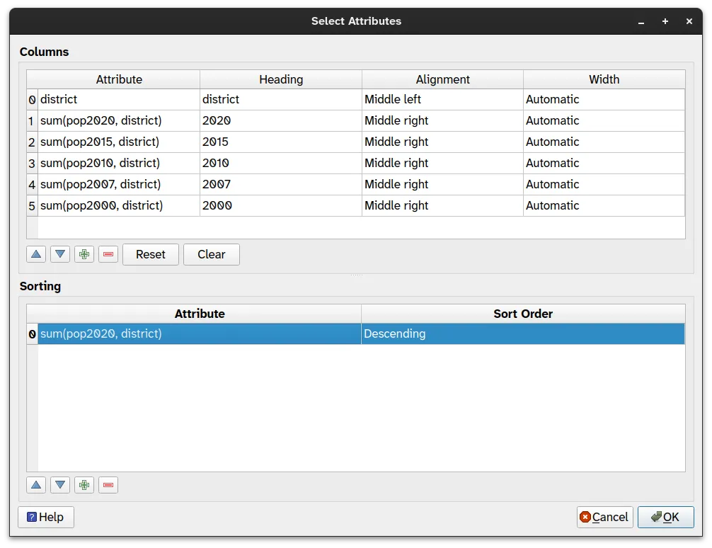
- In order to get only the top 3 districts, we set Maximum rows to 3 under Feature Filtering.
- Then we’ll have a table that shows the top 3 districts in terms of population in 2020—all without needing to load district-level data.
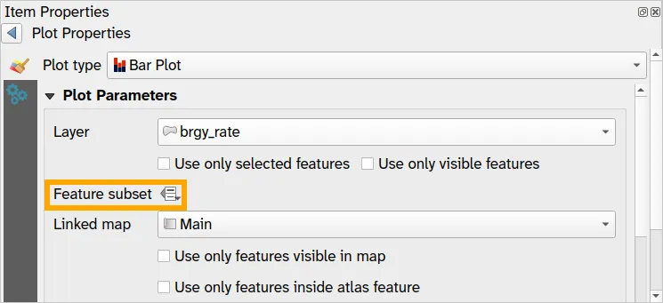
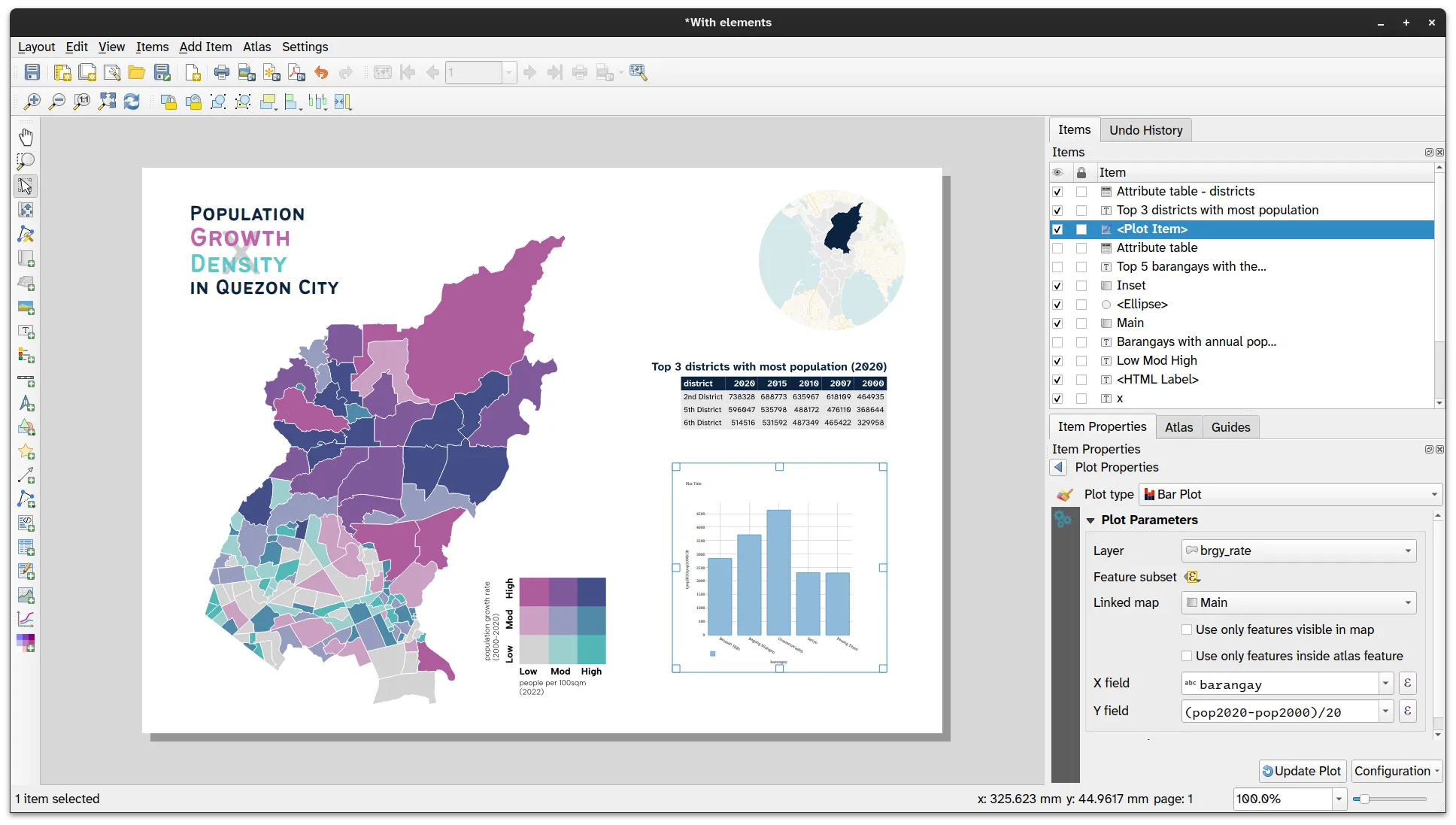
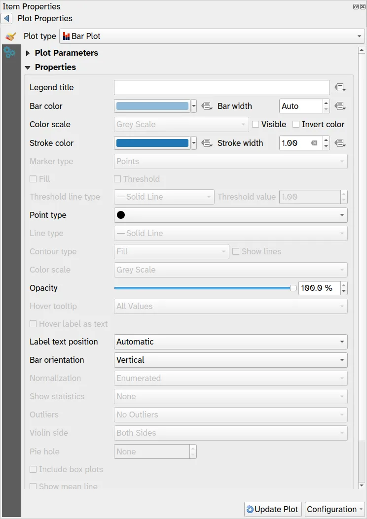
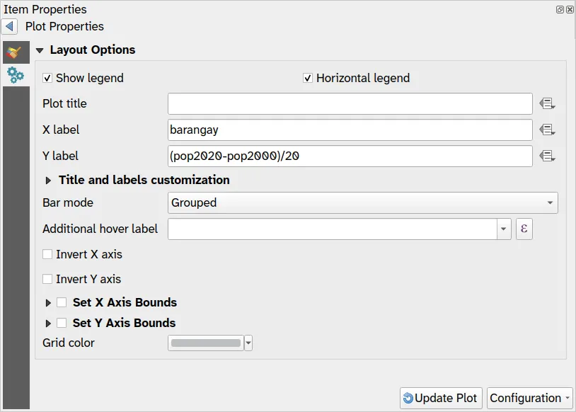
2.2. Add a bar graph of the barangays with annual average population rate from 2000 to 2020 > 2,000
Section titled “2.2. Add a bar graph of the barangays with annual average population rate from 2000 to 2020 > 2,000”-
Add plots by clicking the Add Plot icon
 or Add Item ‣ Add Plot Item on the menu bar.
 -
In the Item Properties click Setup Selected Plot with the following parameters.
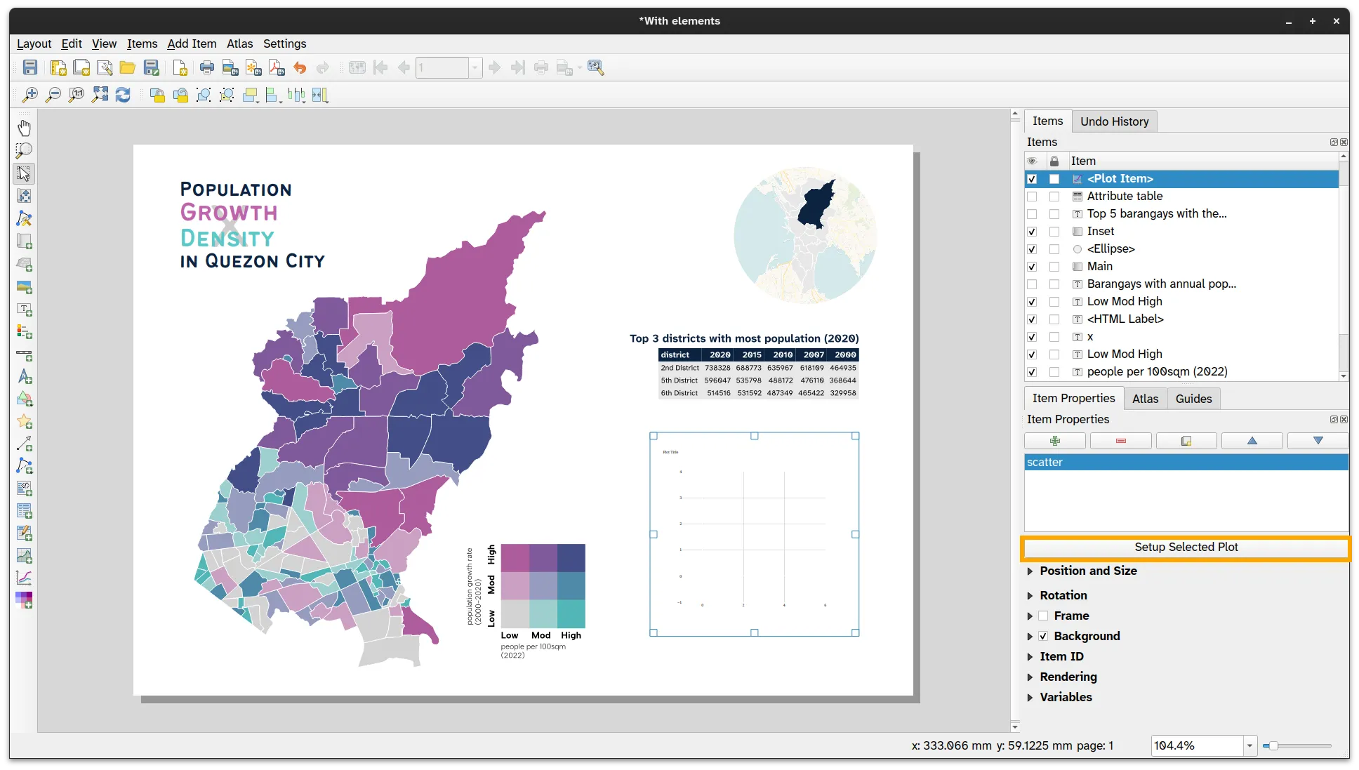
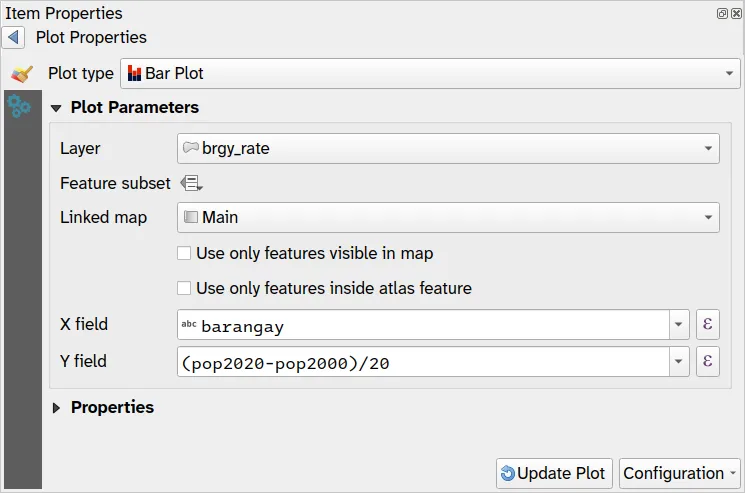
- Click Update Plot. Your plot should look something like below.
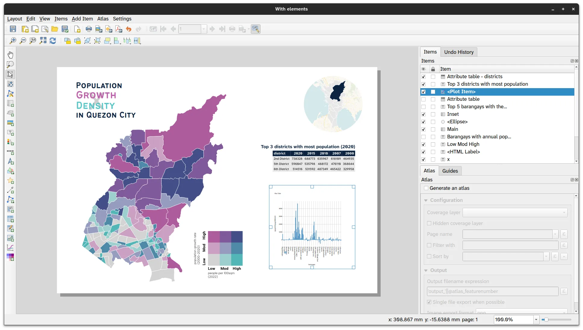
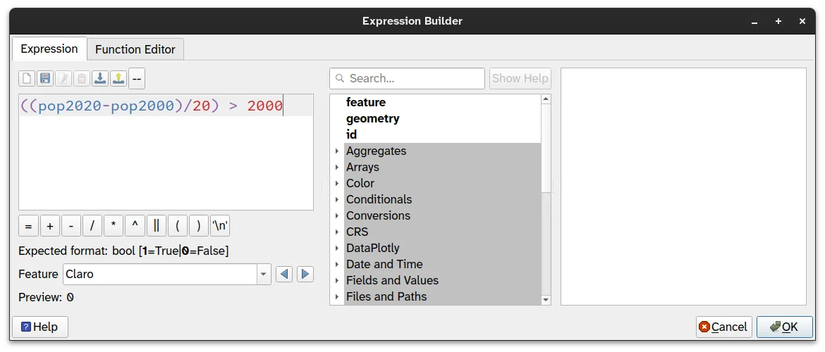
- Use a Feature subset to limit the features to be plotted to those where the annual average increase > 2000. Use the expression:
((pop2020 - pop2000)/20) > 2000
- Your new plot should look like below:
Editing the look and style of the plot
Section titled “Editing the look and style of the plot”You can edit the look and style of the plot by going to the Properties and Layout Options.
Certification and support
Section titled “Certification and support”Contact us or sign-up to our courses if you are interested in having this as an instructor-led or self-paced course.