
Styling layers and making maps
Introduction
Section titled “Introduction”This module is designed to teach you the basics of symbology and map-making in QGIS.
By the end of this module, you should know: QGIS style elements, basic styling and symbology of rasters and vectors, and how to create printable maps in QGIS.
What you should already know
Section titled “What you should already know”Since this is a beginner module, no previous knowledge of GIS or QGIS is required. However, familiarity with the QGIS interface (as discussed in Introduction to QGIS) and how to load different kinds of layers (as discussed in Introduction to Layers in QGIS) are preferred.
How do you style layers?
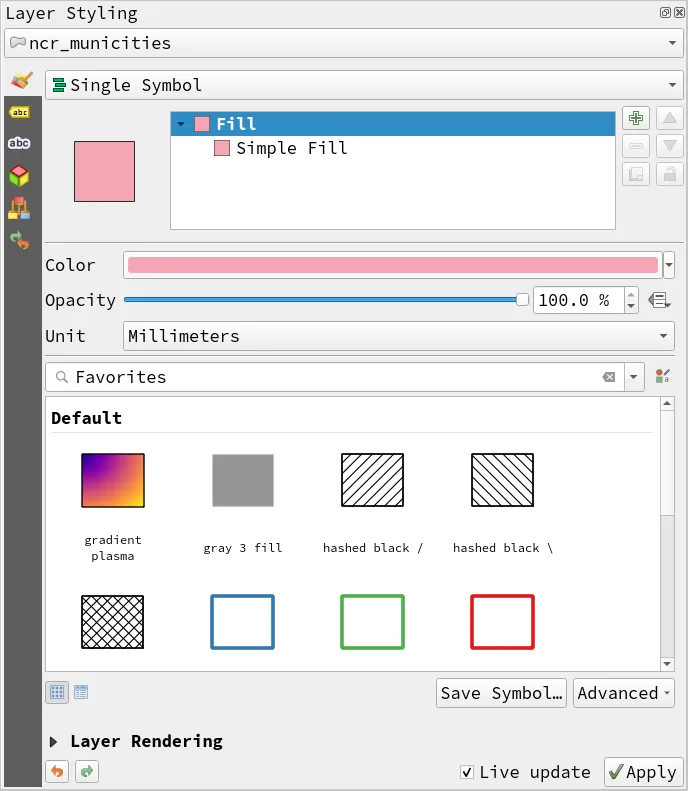
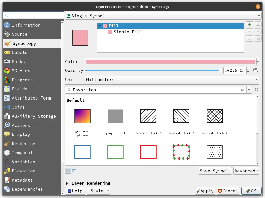
Section titled “How do you style layers?”When it comes to styling layers in QGIS, there are two main approaches you can take: using the Layer Styling Panel or applying the style via the Layer Properties. Both approaches have their pros and cons, and the choice ultimately depends on your preference and the specific task at hand.
Using the Layer Styling Panel allows you to see changes in layer symbology in real-time, making it easier to experiment with different styles and quickly visualize the effects of your changes. This approach is especially useful when you need to quickly make changes to a layer’s appearance or create a simple style for a new layer.
On the other hand, using the Layer Properties have some functionalities that provide precise control over the layer’s symbology. This approach is useful when you need to create a more complex or custom style that requires more fine-tuning.
Style and symbology components
Section titled “Style and symbology components”Style Manager
Section titled “Style Manager”The Style Manager allows you to easily manage and organize styles for your layers and provides a central location for storing and applying custom styles—making it easier to maintain consistency across your projects. It can be accessed via Settings ‣ Style Manager in the Menu bar.
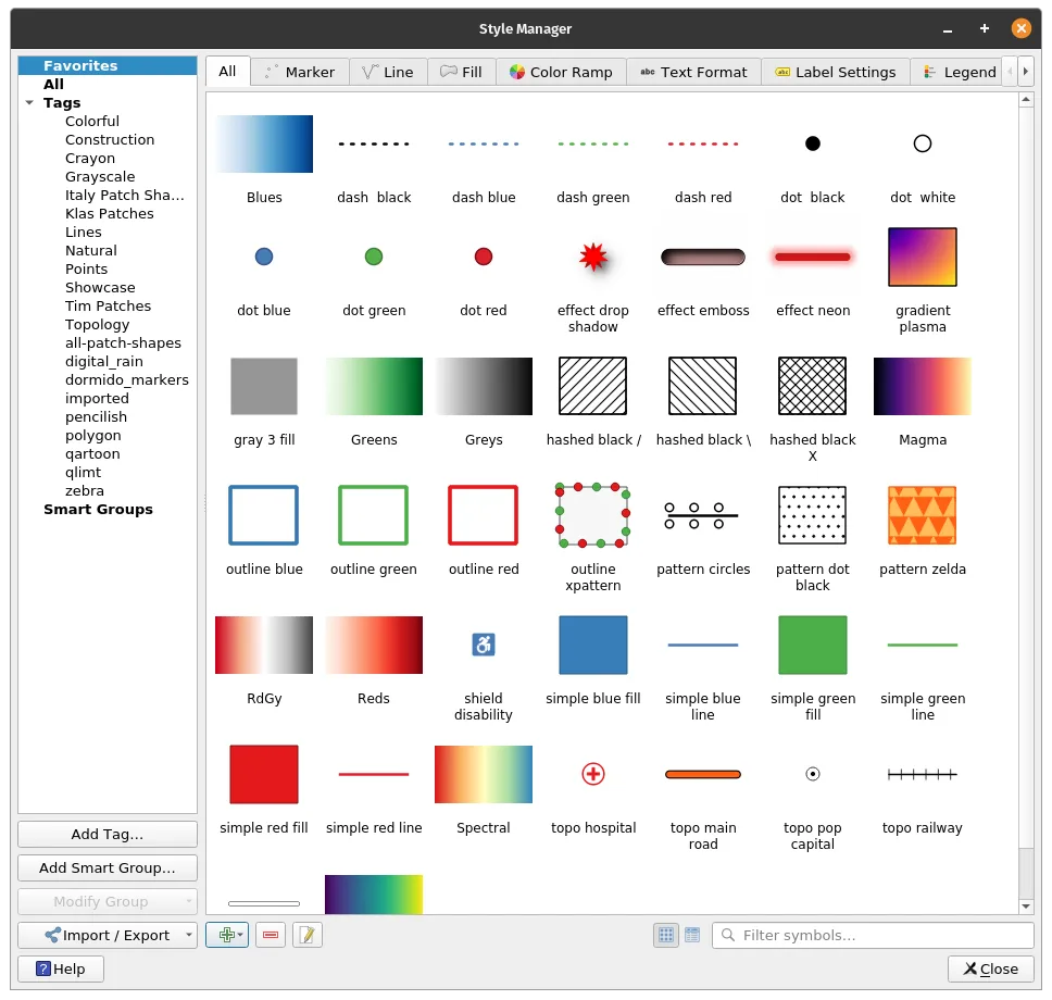
With the Style Manager, you can create, edit, and delete styles, as well as import and export them for use in other projects. This can be especially useful if you have a large number of layers with different styles, or if you want to share styles with other users.
In the Style Manager, you can find the different styles for points (markers), lines, polygons (fills), color ramps, text formats, label settings, and legend patches. By using the Style Manager, you can have reusable and consistent style components—style can be created once, stored in the style manager, and used multiple times. The Style Manager also allows for sharing of styles between different users so one user can create a style and share it with others to use.
Importing styles
Section titled “Importing styles”In addition to creating your own styles from scratch, QGIS also provides a convenient way to import pre-made style components into your project through the Style Manager. This feature allows you to import styles as files or URL. By importing these components into the Style Manager, you can easily reuse them in different projects and share them with other users. The Style Manager also allows you to organize your styles into categories for easier management and access.
Exercise 4.1. Importing Styles into QGIS
Section titled “Exercise 4.1. Importing Styles into QGIS”For this exercise, we’ll be importing the wonderful QGIS styles made by Topi Tjukanov (@tjukanov) available from https://github.com/tjukanovt/qgis_styles.
- Download any style XML from the link above or download the entire repository.
- Open the Style Manager via Settings ‣ Style Manager in the Menu bar.
- Click Import/Export and select Import Item/s.
- If you downloaded the qgis_styles repo by tjukanov, you can use File and select the necessary file.
- Was your style added to the Style Manager?
- Try to import a style from a URL.
- Once imported, these styles become available in QGIS and can be updated and modified just like any other style.
The QGIS Style Repository
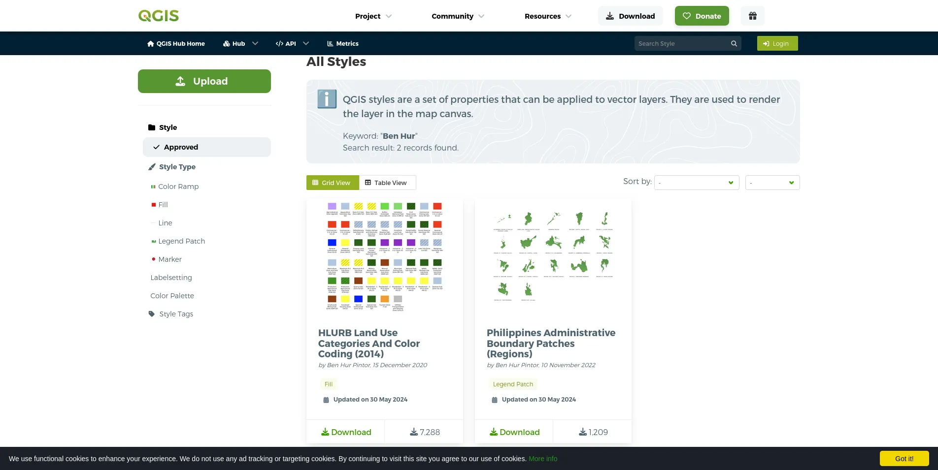
Section titled “The QGIS Style Repository”You can also get more styles at the QGIS Style Repository: https://hub.qgis.org/styles/.
The QGIS Style Repository is an online resource where users can access a vast collection of styles created and shared by the QGIS community from all over the world. These styles are available for download and can be easily imported into your QGIS project.
The repository features a variety of styles, from simple and minimalistic to highly detailed and complex, covering various mapping themes such as land cover, transportation, and water features. By exploring and utilizing the QGIS Style Repository, you can save time and effort in creating your own styles from scratch and have access to a diverse range of creative options to enhance your mapping projects.
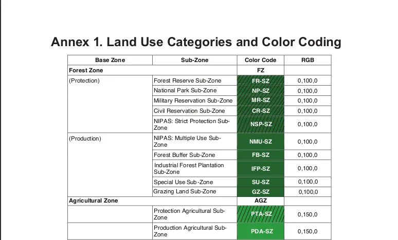
You can try downloading the HLURB Land Use Categories And Color Coding (2014) fill style [https://hub.qgis.org/styles/62/] and Philippines Administrative Boundary Patches (Regions) legend patch [https://hub.qgis.org/styles/145/] that I shared there.
Color Schemes or Palettes
Section titled “Color Schemes or Palettes”QGIS allows you to create your own color scheme or color palette that easily gets integrated into QGIS’ built-in color selection dialogs. This is useful when you have a set of colors that you usually work with (i.e. branding) or if there are standard colors for the maps that you are creating (i.e. HLURB Land Use and Zoning Standards).
Exercise 4.2. Creating your own color scheme or palette
Section titled “Exercise 4.2. Creating your own color scheme or palette”In this exercise we will create a new color scheme in QGIS that reflects the HLURB CLUP Guidebook Annex on Land Use Categories and Color Coding (HLURB_CLUP_Vol_3_Annex_1.pdf).
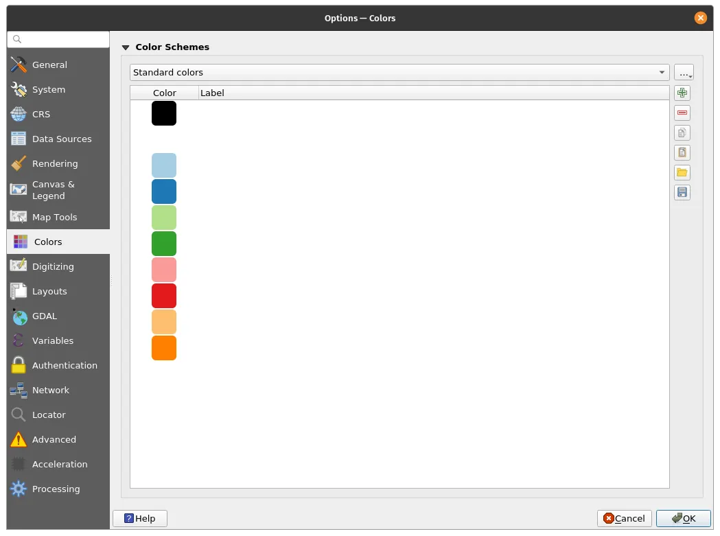
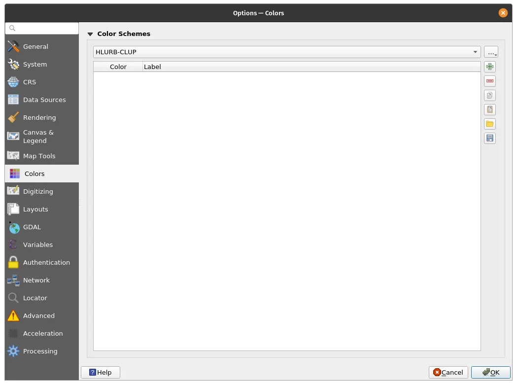
- Open the Color Options via Settings ‣ Options ‣ Colors in the Menu bar.
-
QGIS has some built-in color schemes. You may check them out by selecting them from the dropdown button. Initially, the Standard color color scheme is shown.
-
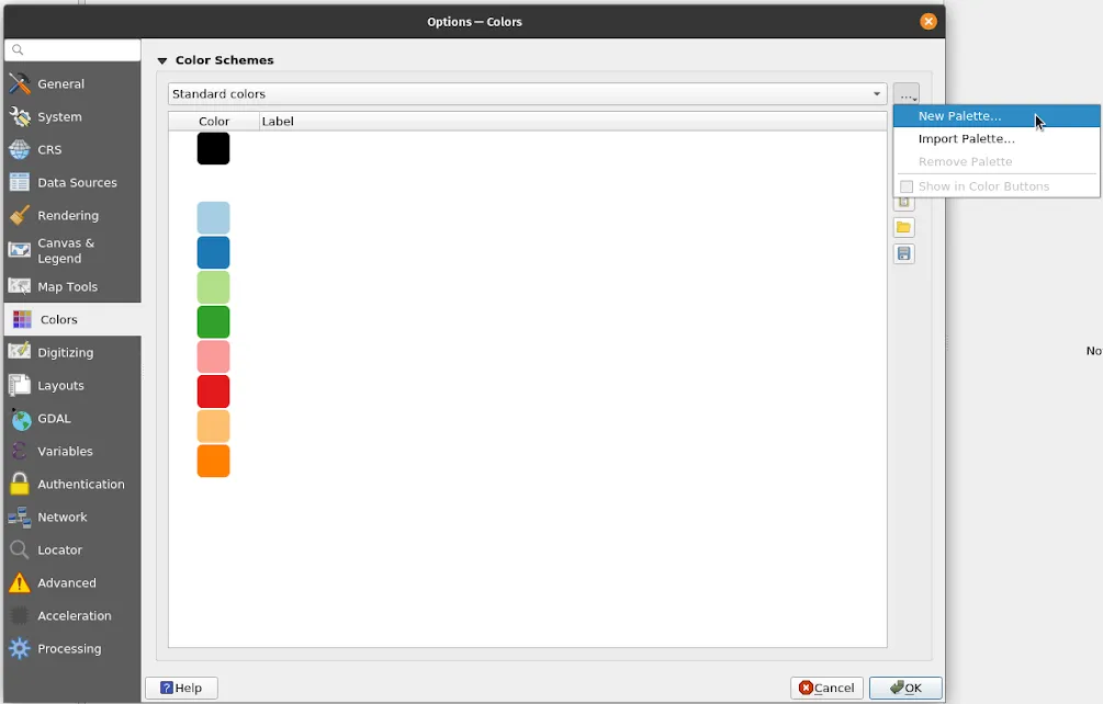
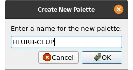
To create a new Color scheme, click the dropdown button next to the Color scheme selector and select New Palette. Name your new palette as HLURB-CLUP.
- A blank color palette should appear with the name HLURB-CLUP in the dropdown button.
-
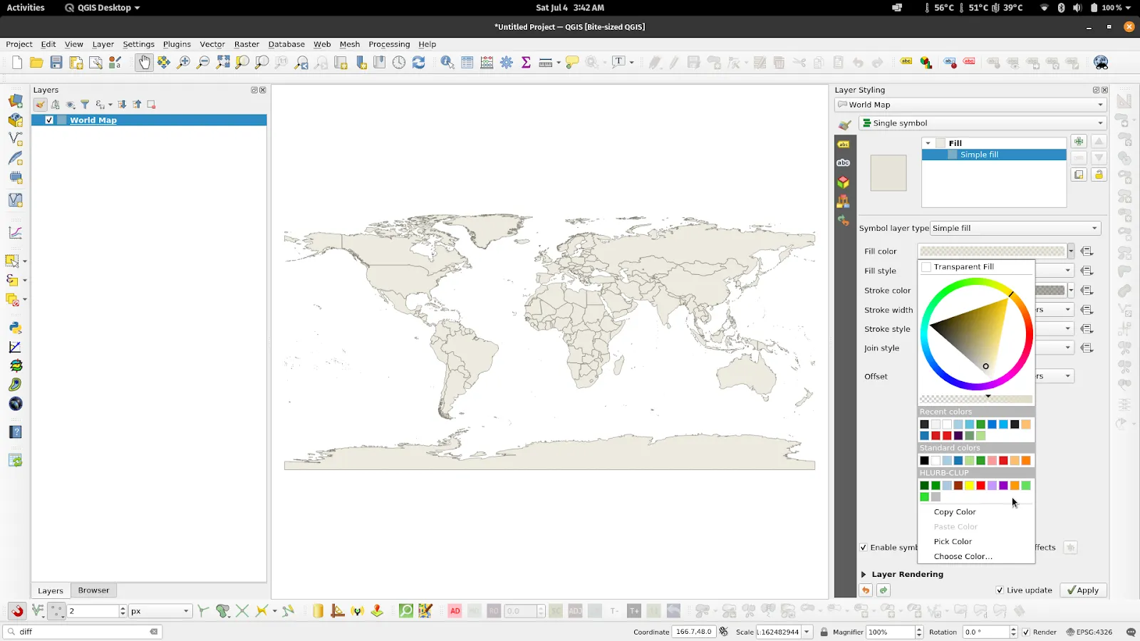
Now we need to fill up our color palette. We can use the buttons on the right side of the dialog to do this.
-
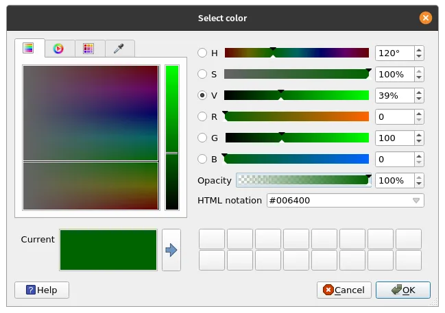
Let’s add the colors from the HLURB Guidebook. Click Add new color (green plus button) to open the add color dialog. To add the Forest Zone category, add a color with RGB = 0, 100, 0.
-
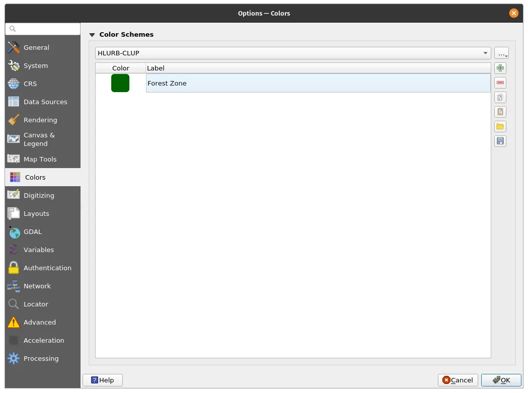
Rename the Label to Forest Zone.
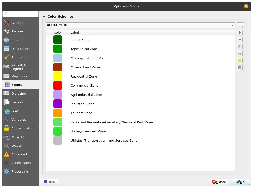
- Do the same for all categories. In our case, let’s add a color for each Base zone (Bold Categories in the Guide) since the sub-zones have the same color as the base zone. In the end you, you should have the color palette below:
- Now, we can add this color palette to the QGIS color selection dialogs by clicking the dropdown button and checking Show in Color buttons.
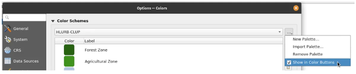
- Afterwards, this palette should always appear in the color selection dialogs in QGIS.
Built-in color palettes and color ramps
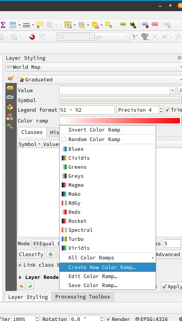
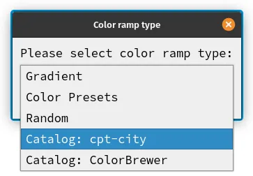
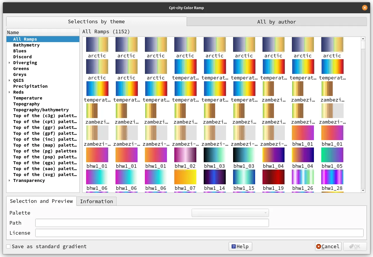
Section titled “Built-in color palettes and color ramps”QGIS also has a lot of built-in color palettes to choose from aside from the ones shown when selecting color palettes in the color selection dialog (e.g. raster symbology).
For example, QGIS has built-in cpt-city color palettes and even a palette creator using Color Brewer.
This option can be found by clicking Create New Color Ramp… when a color ramp dialog is present.
Basic vector symbology
Section titled “Basic vector symbology”Symbology is how the layer appears visually on the map, and it plays an important role in making the map informative and easy to read. In QGIS, there are different types of symbology that you can apply to vector layers, depending on the data type.
For points, lines, and polygons, there are several basic symbology types available in QGIS.
The first type is a Single Symbol, which means all features in the layer will appear the same. This is useful when you want to display simple datasets or when you want to show a basic layer with a uniform appearance.
The next symbology type is Categorized, which is ideal for categorical data. With Categorized symbology, a feature’s appearance is based on the value of one of its fields. For example, you can assign different colors or shapes to different categories, such as land use types or administrative boundaries.
Another symbology type is Graduated, which is useful for numeric data. Graduated symbology adjusts the appearance of features based on the value of one of their fields. You can use this to show population density, elevation or any other continuous data. Graduated symbology helps to visualize differences in data by using different colors or sizes for the features.
Lastly, Rule-based symbology is another type available for vector layers. With Rule-based symbology, you can define a set of rules that control the appearance of features based on multiple attributes. For instance, you can use rule-based symbology to apply different colors, shapes or sizes to features that match specific conditions.
There are also other symbology types that are specific to points, lines, and polygons. Using the correct symbology type will help you create a more visually appealing and informative map.
To change a vector’s symbology you can:
- Right-click the layer ‣ Properties or
- Use the Layer Styling Panel (F7)
For Exercises 4.3.X, you will use the bnhr_qgis_essentials_04.gpkg inside the data subfolder in the BNHR_QGIS-Essentials_Module_4 folder.
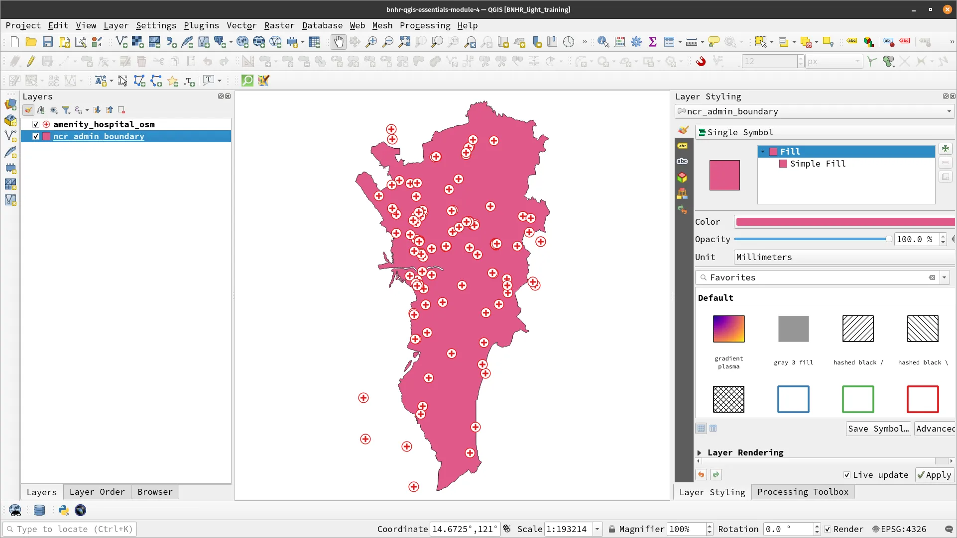
Exercise 4.3.1. Applying a Single Symbol symbology
Section titled “Exercise 4.3.1. Applying a Single Symbol symbology”- Load the amenity_hospital_osm and the ncr_admin_boundary layers.
- Select the amenity_hospital_osm layer in the Layers Panel.
- On the Layer Styling Panel, select Single Symbol and select the topo hospital marker.
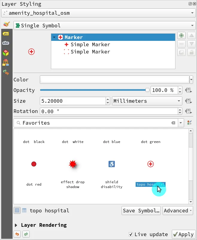
- Apply a Single Symbol symbology to the ncr_admin_boundary layer as well.
- Your map canvas should look similar to the one below.
Exercise 4.3.2. Applying a Categorized symbology
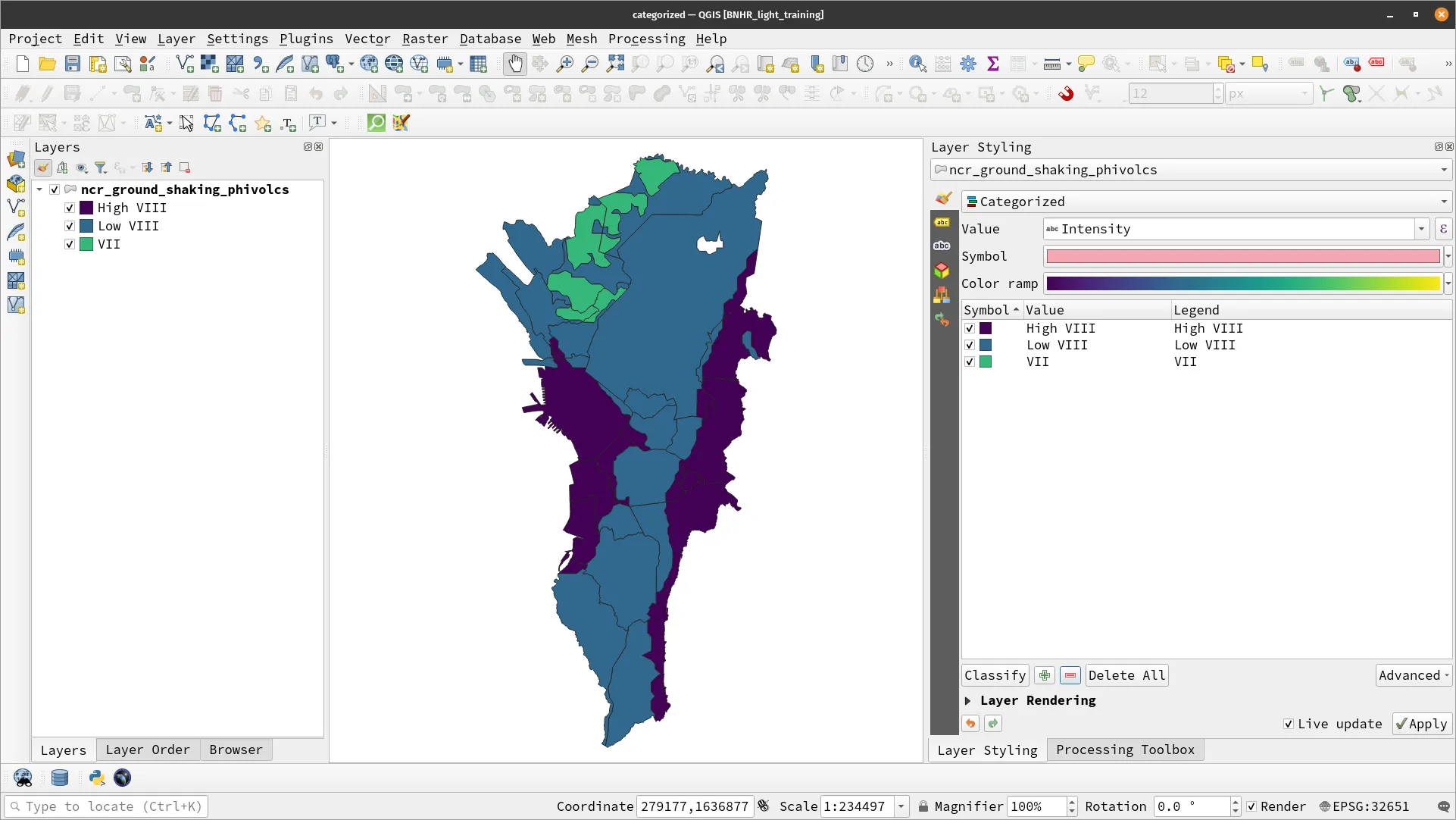
Section titled “Exercise 4.3.2. Applying a Categorized symbology”- Load the ncr_ground_shaking_phivolcs layer.
- Open its attribute table and notice the values. We have features with their corresponding intensities.
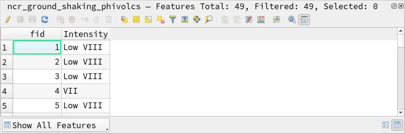
- Apply the following symbology.
- Type: Categorized
- Value: Intensity
- Color ramp: Viridis
- Click Classify
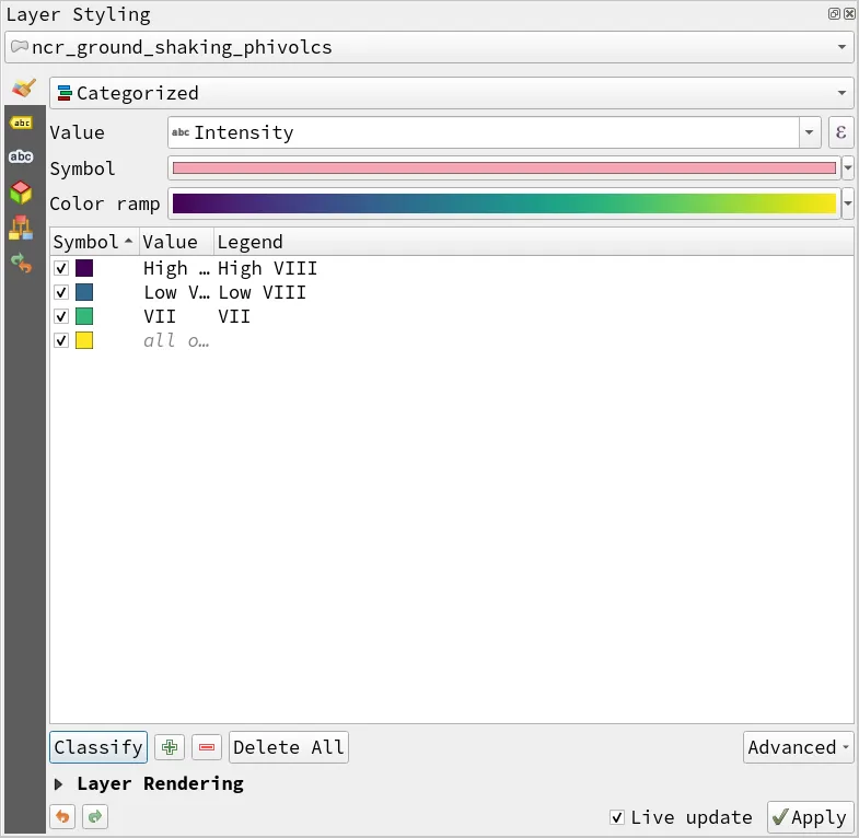
- Your layer should look like below.
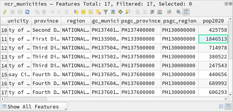
Exercise 4.3.3. Applying a Graduated symbology
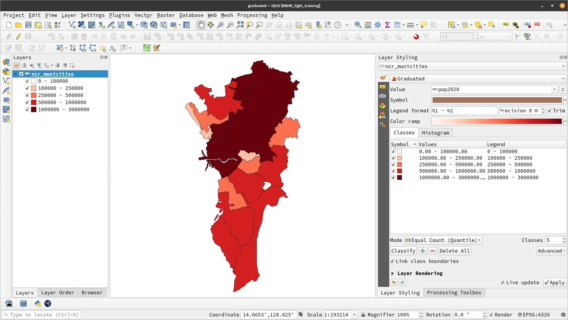
Section titled “Exercise 4.3.3. Applying a Graduated symbology”- Load the ncr_municities layer.
- Open its attribute table and notice the values. We have the population for each municity based on the 2020 census (pop2020).
- Apply the following symbology.
- Type: Graduated
- Value: pop2020
- Color ramp: Reds
- Click Classify
- Edit the parameters to make it have more sense.
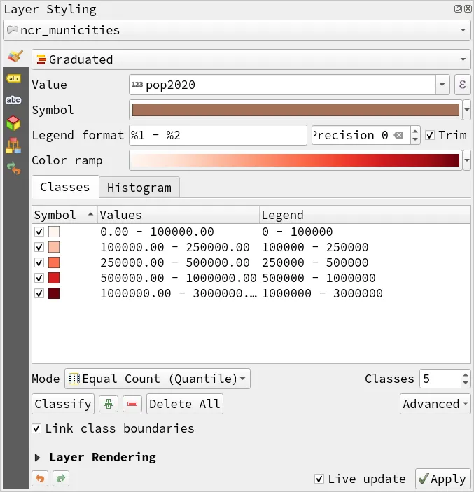
- Your layer should look like below.
Basic raster symbology
Section titled “Basic raster symbology”When working with rasters, there are different ways to represent them visually, depending on their type and the purpose of the analysis. Here are some of the symbology types commonly used for rasters:
Multiband color: this symbology utilizes multiple bands of the raster to create a composite image that can show different combinations of colors or brightness values. It’s useful for visualizing multispectral or hyperspectral data, such as satellite imagery.
Paletted/Unique values: this symbology is useful for styling classified or categorized rasters, where each pixel value corresponds to a certain category. It assigns a color to each unique pixel value, based on a user-defined color ramp.
Singleband gray: this symbology applies a grayscale color ramp to a single band of the raster, which can be useful to display elevation data, for example.
Singleband pseudocolor: similar to the paletted symbology, this symbology applies a custom color ramp to a single band of the raster. It allows the user to create a smooth transition of colors between pixel values, rather than a discrete mapping.
Contours: you can generate contours directly from rasters. Contour lines are isolines that connect points of equal elevation, and they can be useful for creating elevation maps or visualizing terrain features.
Hillshade: this symbology applies hillshade shading to the raster, which simulates the effect of sunlight on a terrain surface. It’s very useful for elevation rasters, as it can enhance the visual perception of relief and slopes.
For Exercises 4.4.X, you can find the necessary files inside the data subfolder in the BNHR_QGIS-Essentials_Module_4 folder.
Exercise 4.4.1. Applying Singleband pseudocolor symbology
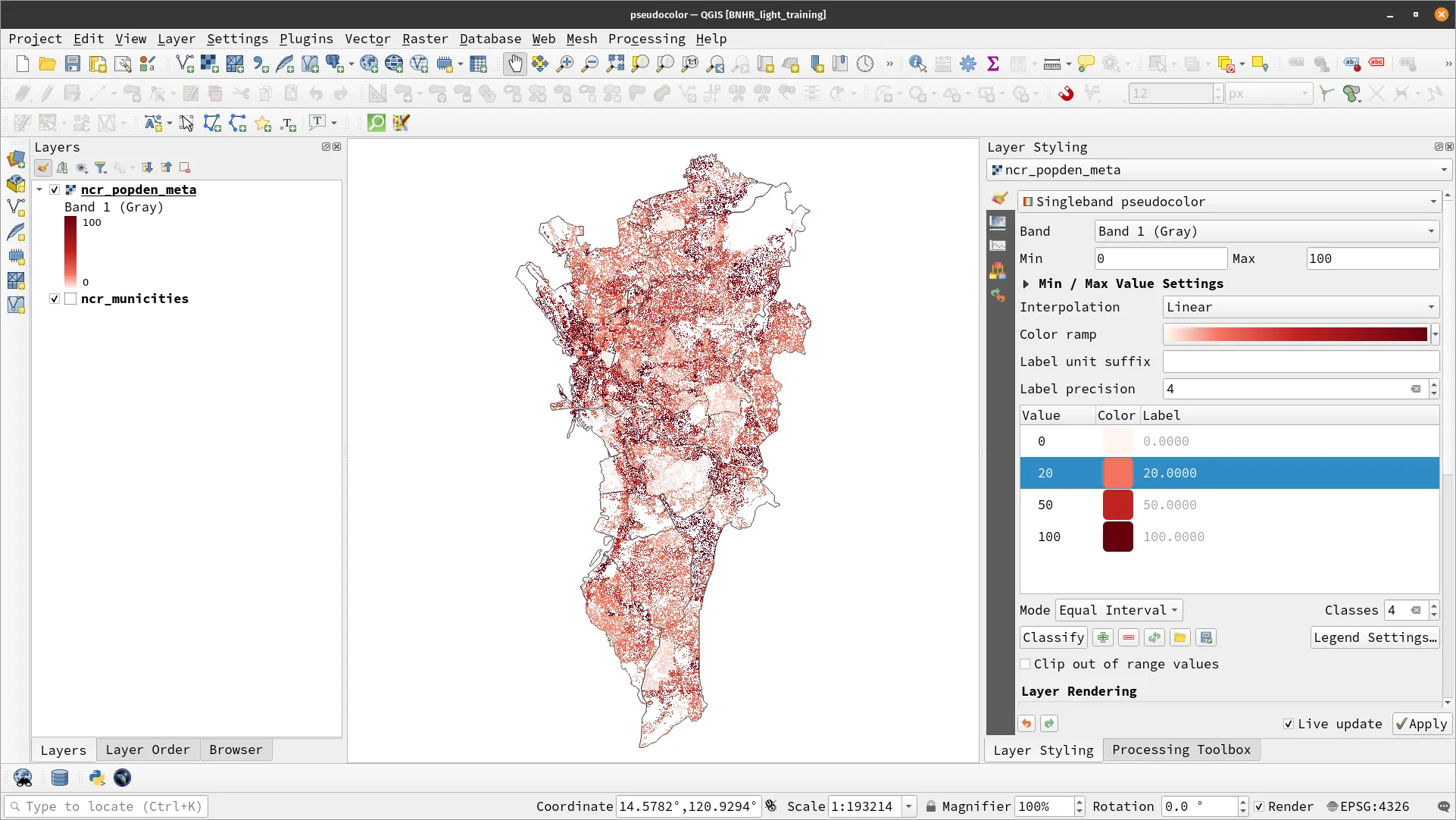
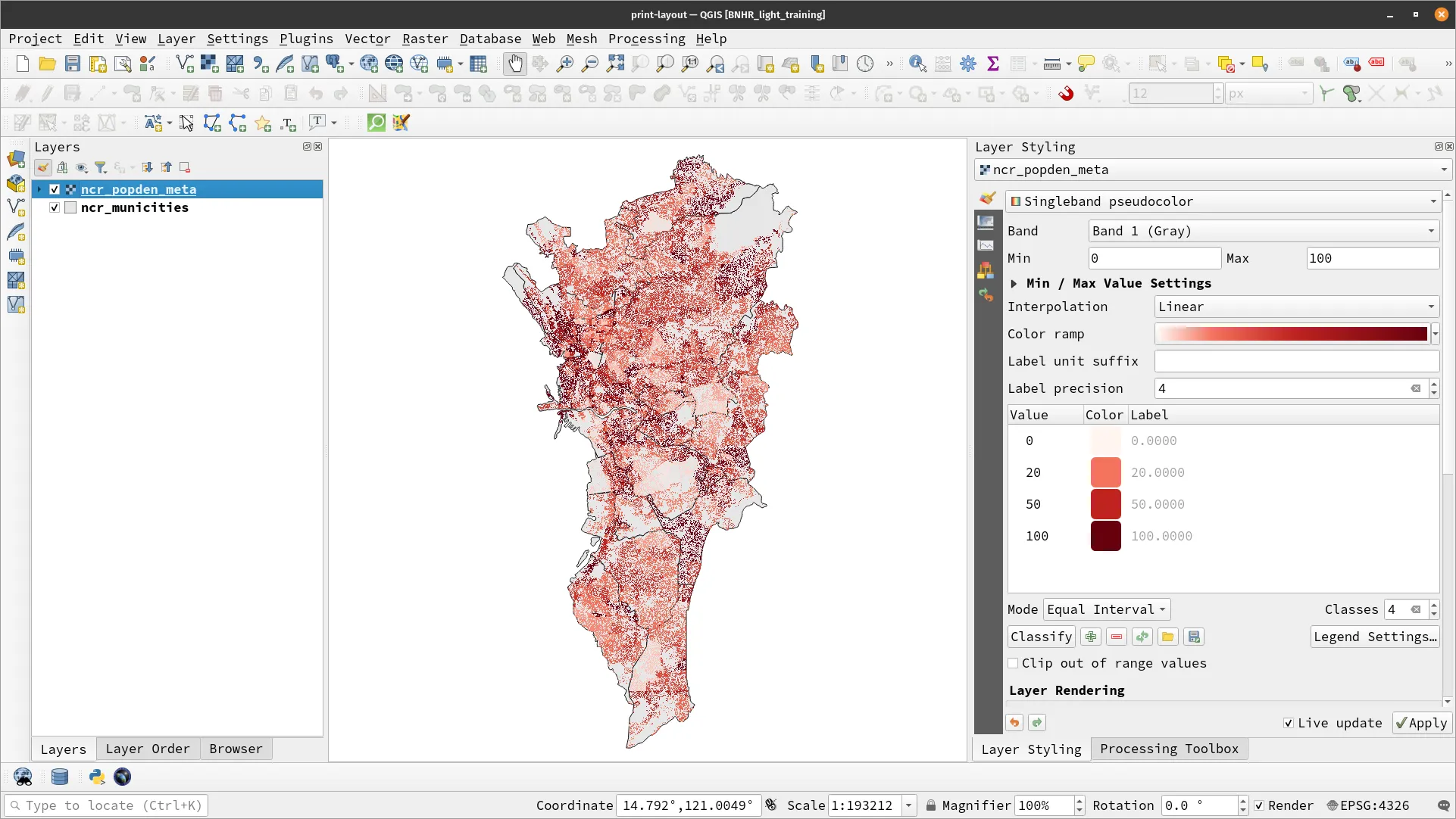
Section titled “Exercise 4.4.1. Applying Singleband pseudocolor symbology”- Load the ncr_municities and ncr_popden_meta layers. The ncr_popden_meta is population density data from Meta’s high resolution population density maps.
- Apply a single color symbology to the ncr_municities that uses a light color as fill (e.g. white).
- Apply the following symbology to the ncr_popden_meta layer:
- Type: Singleband pseudocolor
- Band: Band 1 (Gray)
- Min: 1, Max: 100
- Interpolation: Linear
- Mode: Equal Interval, Classes: 4
- Edit the values of the 4 classes to read: 0, 20, 50, 100
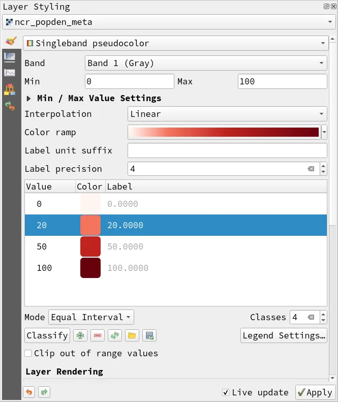
- Your map should look like below.
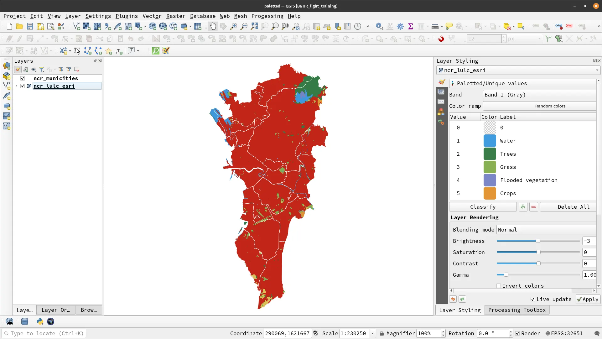
Exercise 4.4.2. Applying Paletted/Unique values symbology
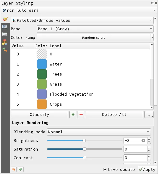
Section titled “Exercise 4.4.2. Applying Paletted/Unique values symbology”- Load the ncr_municities and ncr_lulc_esri layers. The ncr_lulc_esri is 10-meter resolution land cover data obtained using satellite imagery (ESA Sentinel-2) and composite land cover predictions released by Esri in 2020. It is composed of 10 discrete land cover classes.
- Apply a single color symbology to the ncr_municities that uses a transparent fill and a white stroke.
- Apply the following symbology to the ncr_lulc_esri layer:
- Type: Paletted/Unique values
- Band: Band 1 (Gray)
- Add values manually by clicking the green plus button. You need to add 11 values/classes from 0 to 10.
- Edit the color and Label for each Value. (You may choose not to edit the Colors to save time)
- Water
- Trees
- Grass
- Flooded vegetation
- Crops
- Scrub/shrub
- Built Area
- Bare ground
- Snow/Ice
- Clouds
- Your map canvas should look like below.
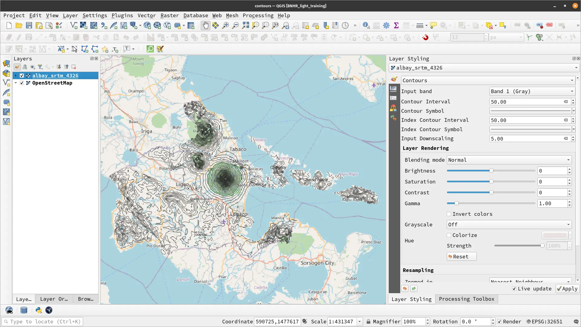
Exercise 4.4.3. Applying Contours symbology
Section titled “Exercise 4.4.3. Applying Contours symbology”- Load the albay_srtm_4326 layer. This is a digital elevation model (DEM) that is an output of the Shuttle Radar Topography Mission (SRTM) in 30m resoulution. This layer is in the WGS84 CRS (EPSG: 4326).
- Load a basemap such as OpenStreetMap.
- Apply the following symbology to the albay_srtm_4326 layer:
- Type: Contours
- Contour Interval: 50
- Input Downscaling: 5.0
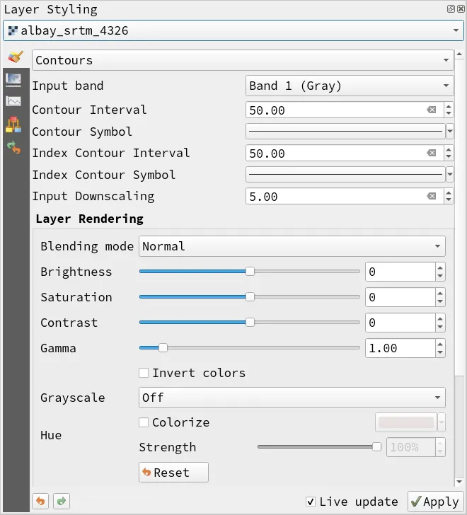
- Your map should look like below.
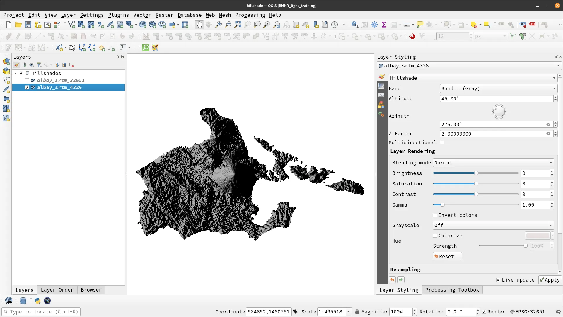
Exercise 4.4.4. Applying Hillshade symbology
Section titled “Exercise 4.4.4. Applying Hillshade symbology”- Load the albay_srtm_32651 layer. This is the same layer as albay_srtm_4326 only in a different CRS (EPSG: 32651 – UTM Zone 51N).
- Apply the following symbology to the albay_srtm_32651 layer:
- Type: Hillshade
- Band: Band 1 (Gray)
- Altitude: 45 ˚
- Azimuth: 275 ˚
- Z Factor: 2.0
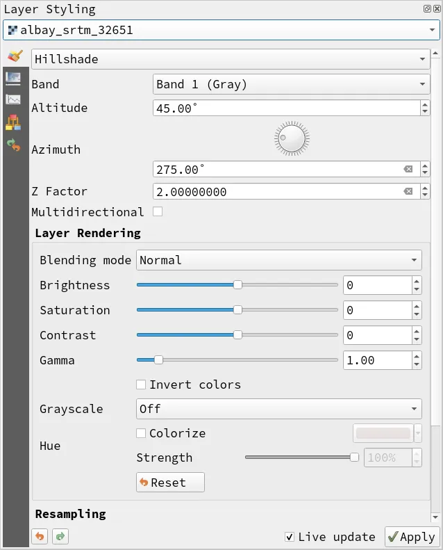
- Your map canvas should look like below.
Advanced symbology and styling
Section titled “Advanced symbology and styling”In addition to the basic symbology types, QGIS also offers advanced symbology and styling options that can enhance your maps and visualizations.
Learning advanced techniques in QGIS is essential for those who want to take their geospatial analysis and mapping skills to the next level. Advanced symbology and styling techniques allow users to create more visually appealing and informative maps while also providing greater flexibility and control over how data is represented.
One of these techniques is Geometry Generators which allows you to perform spatial operations directly within the symbology itself. This means you can create new geometries, modify existing ones, or perform calculations without having to create a new layer.
Another advanced feature is Data-defined Overrides which allows you to override symbology parameters using fields, expressions, or other variables. This means you can create dynamic styles that change based on the data in your attribute table. For example, you can use data-defined overrides to adjust the size or color of a point symbol based on a numerical field in your attribute table. To assist with data-defined overrides, there is an Assistant that helps you change how the data is applied to the parameter for each feature for some parameters using Data-defined override
Draw Effects is another advanced styling feature in QGIS that allows you to apply different visual effects to layers. These effects include drop shadows, inner and outer glows, blurs, and embossing, among others. Draw Effects can be accessed through the Layer Properties dialog, specifically under the Symbology tab.
QGIS also has Blending Modes, which are special rendering effects applied on layers, features, and print layout items. These modes can add interesting visual effects to your map, such as blending one layer into another or making a layer appear transparent. You can experiment with different blending modes to create unique and visually stunning maps.
Finally, you can utilize Expressions in creating your styles.
QGIS also allows you to fine-tune your styles using Rules and Scales or create 3D and Temporal visualizations.
You can combine all these techniques to create the map or visualization that is most appropriate for your need.
Making printable maps
Section titled “Making printable maps”Creating maps is probably the most popular and most known function of a GIS. In fact, a previous module, we mentioned that map making is usually used interchangeably with GIS. Of course, we know this isn’t technically true but that doesn’t diminish the importance of the ability of a GIS to create maps which allows us to visualize and communicate spatial information in a clear and understandable way.
In this module, we will look at the basics of map making in QGIS.
Exporting the Map Canvas
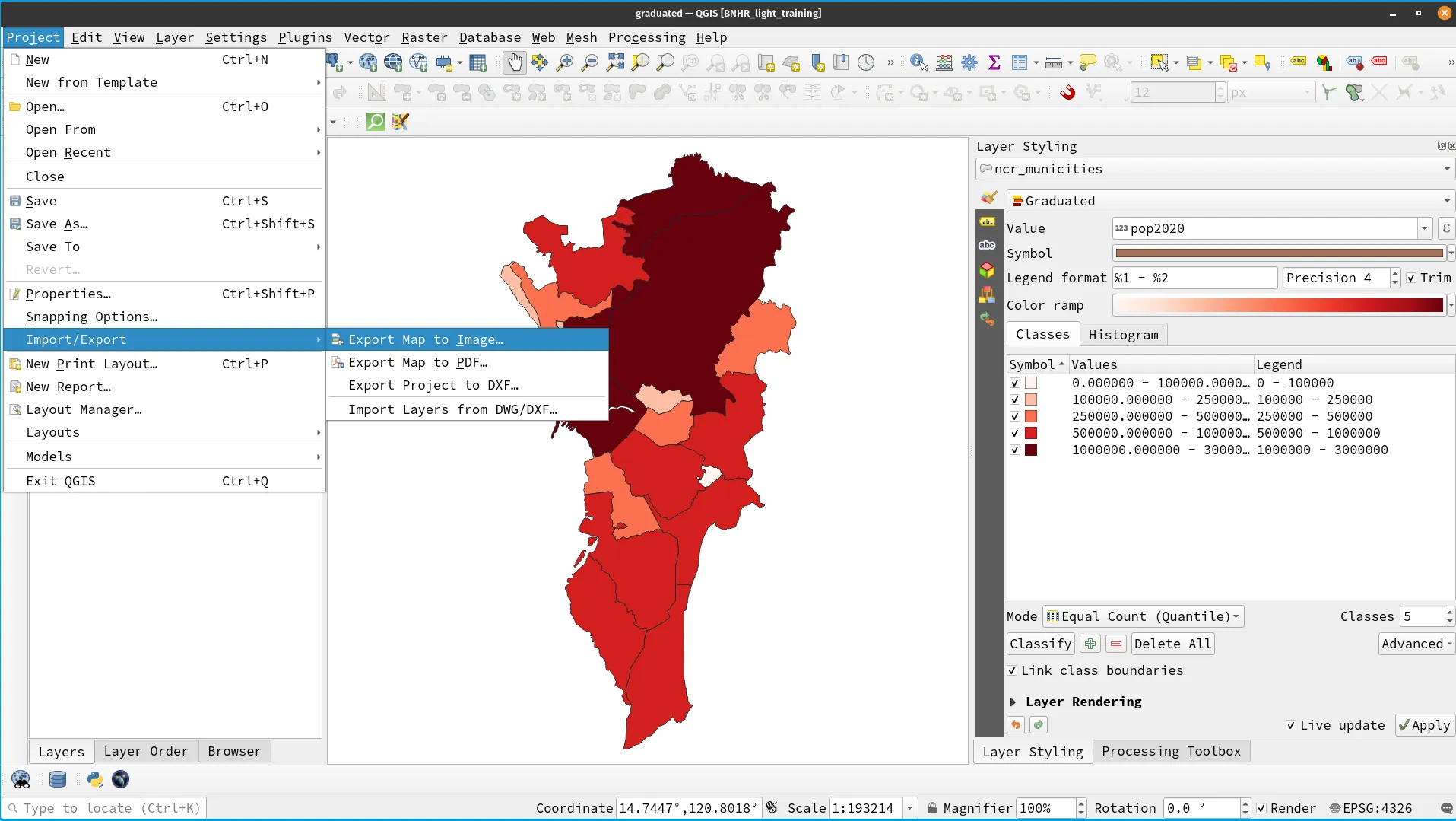
Section titled “Exporting the Map Canvas”If you simply want to print the content of the map canvas, this can be done through: Projects ‣ Import/Export ‣ Export Map to Image.
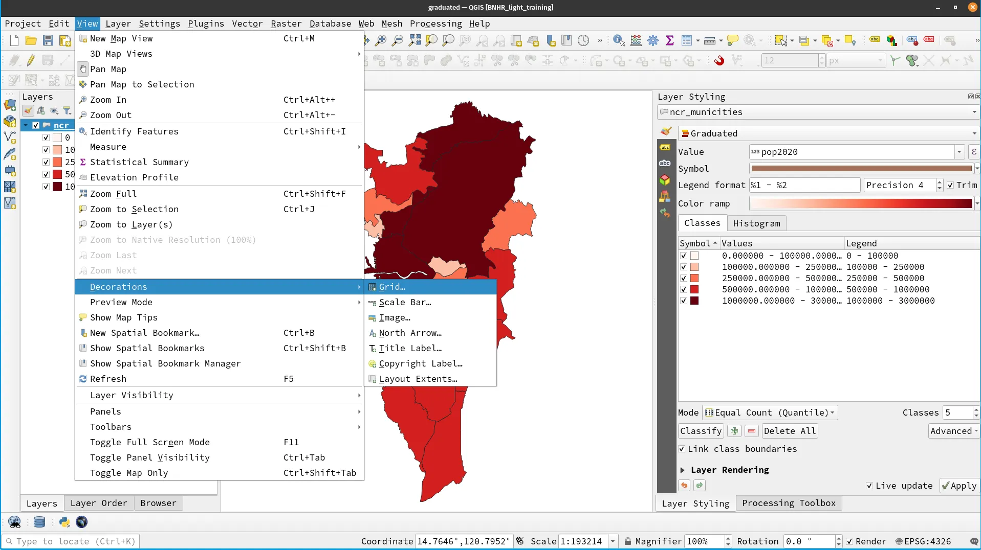
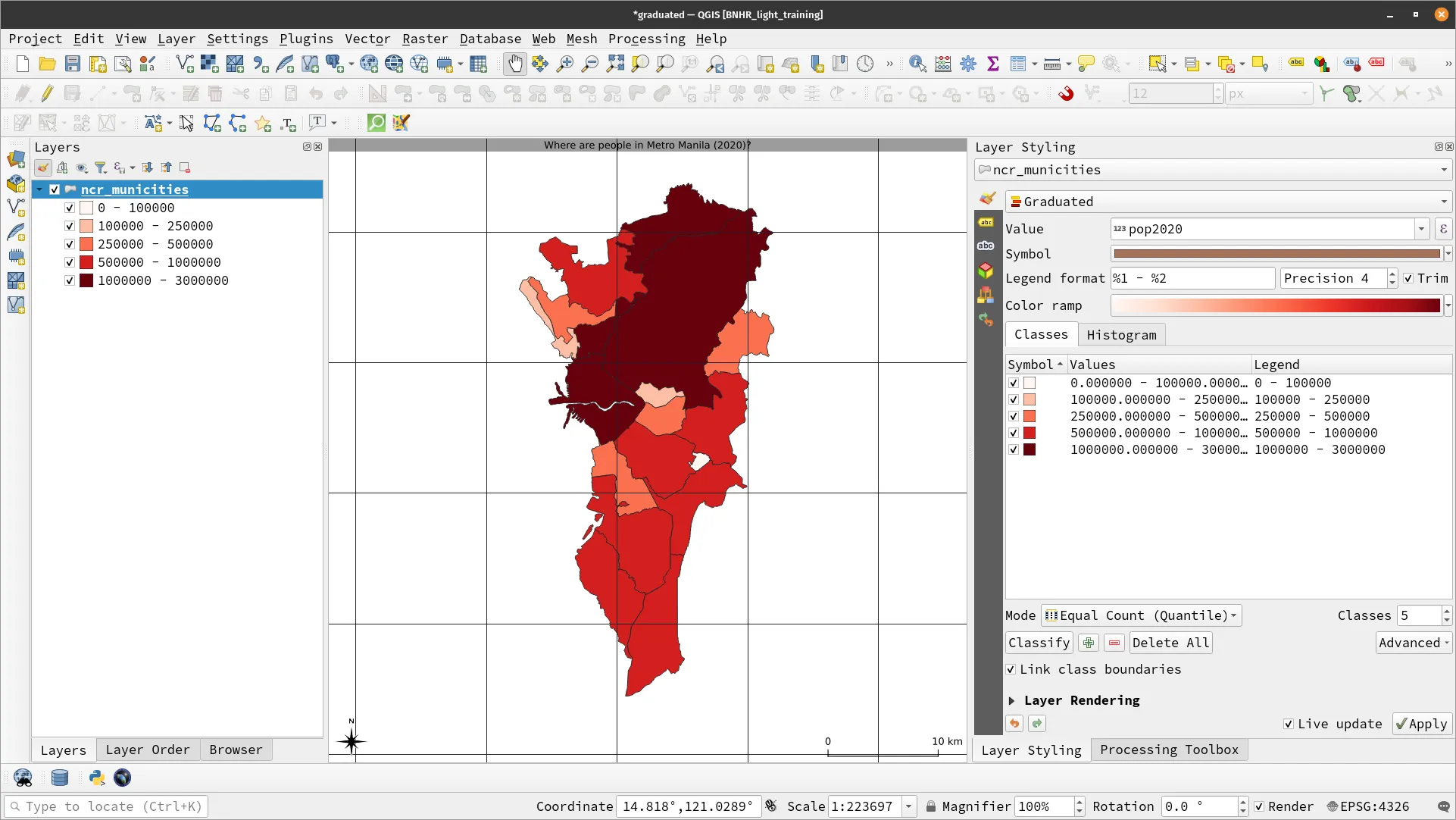
You can add some minimal decorations to the map canvas like grids, title, a north arrow, and scale through: View ‣ Decorations.
This technique is useful for quick and simple maps but if we want to create a fully-featured map and take advantage of the power of QGIS as a cartography and map design application then we need to use Print Layouts.
Using the Print Layout
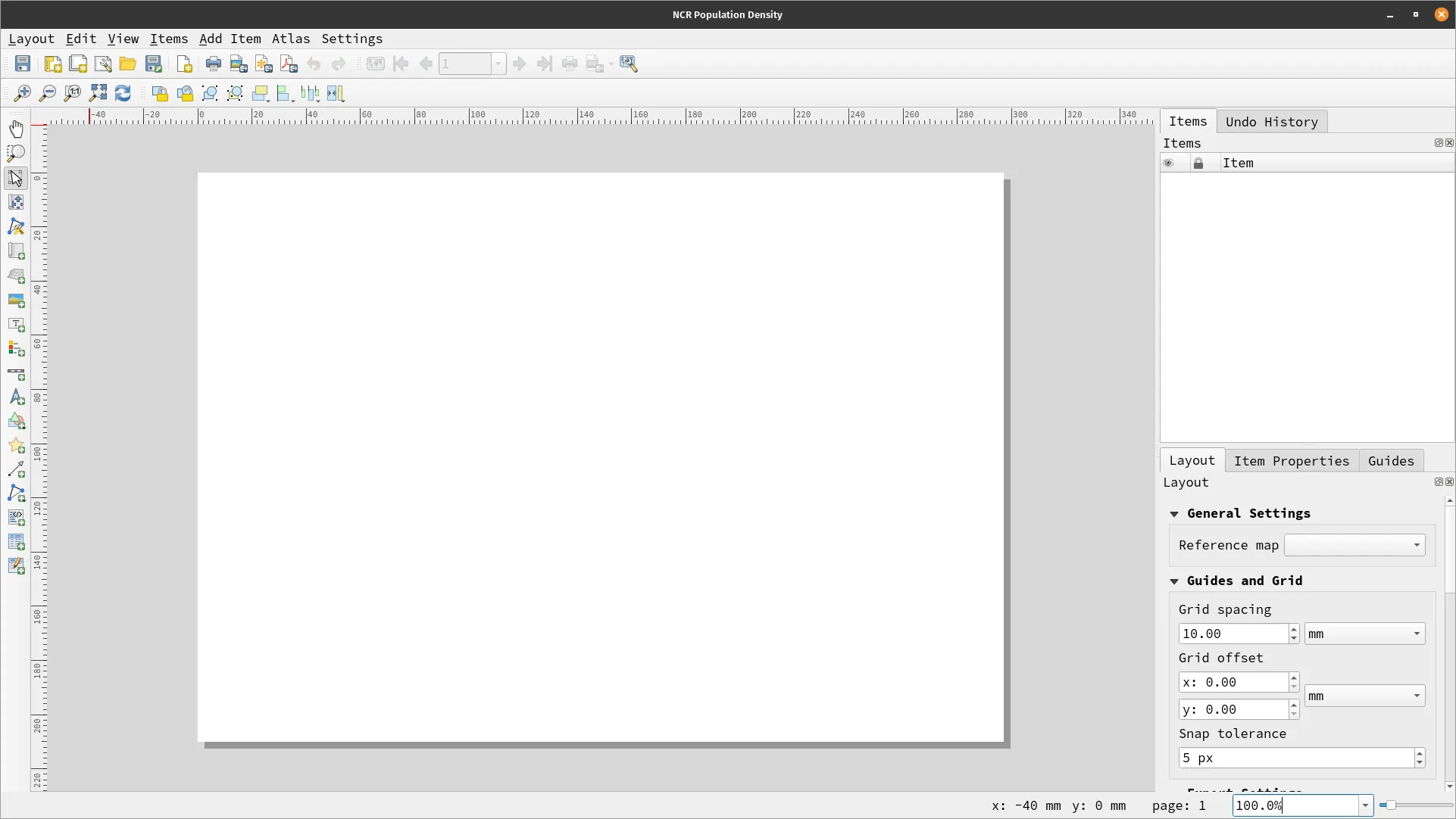
Section titled “Using the Print Layout”You can create and manage Print Layouts through Project ‣ Layout Manager. You can also create a new Layout using Project ‣ New Print Layout.
Print Layouts are stored together with the project and each project can have multiple layouts. This is useful if you need to create different map layouts with the same data or layers.
Exercise 4.5 Creating printable maps
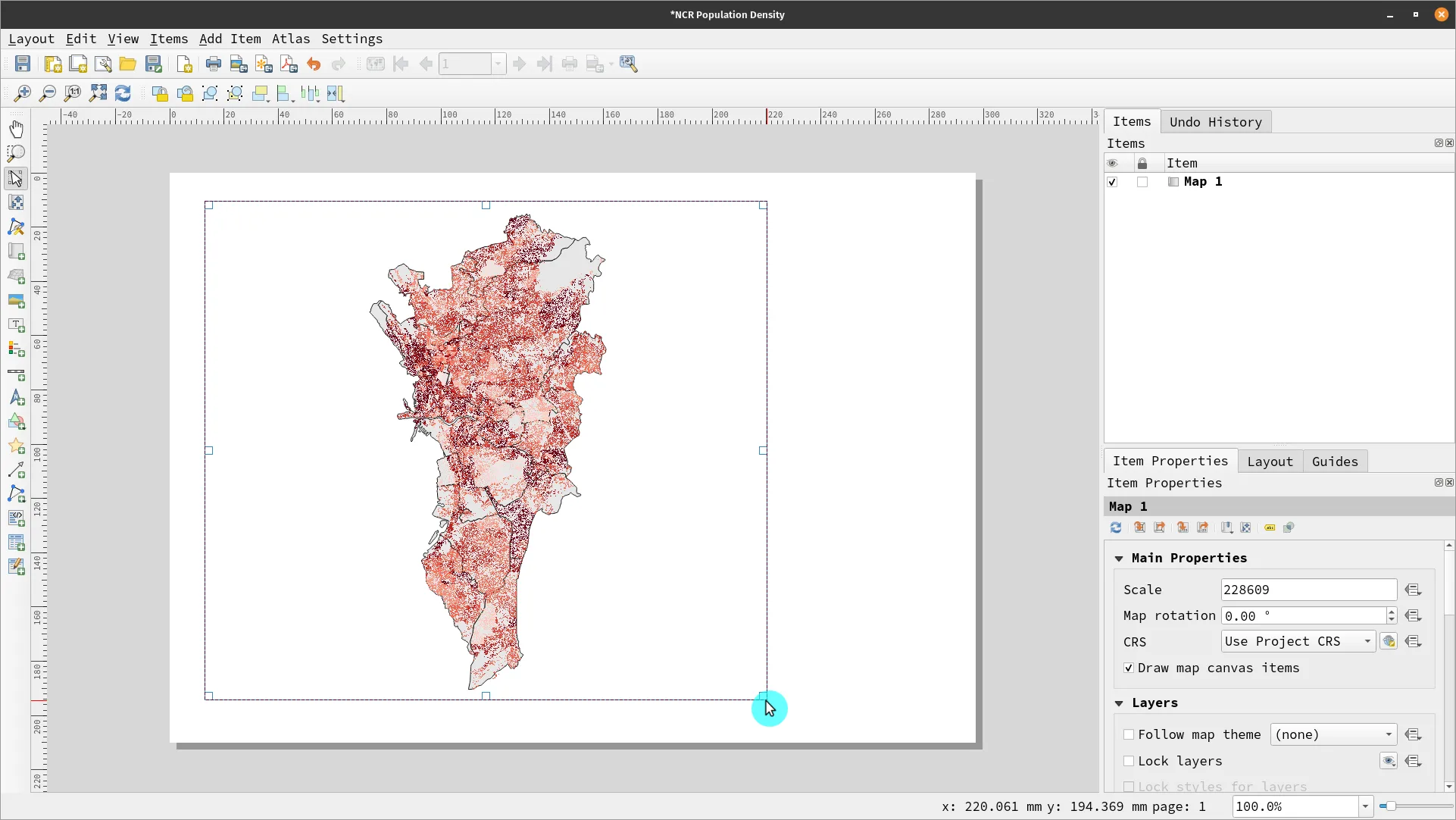
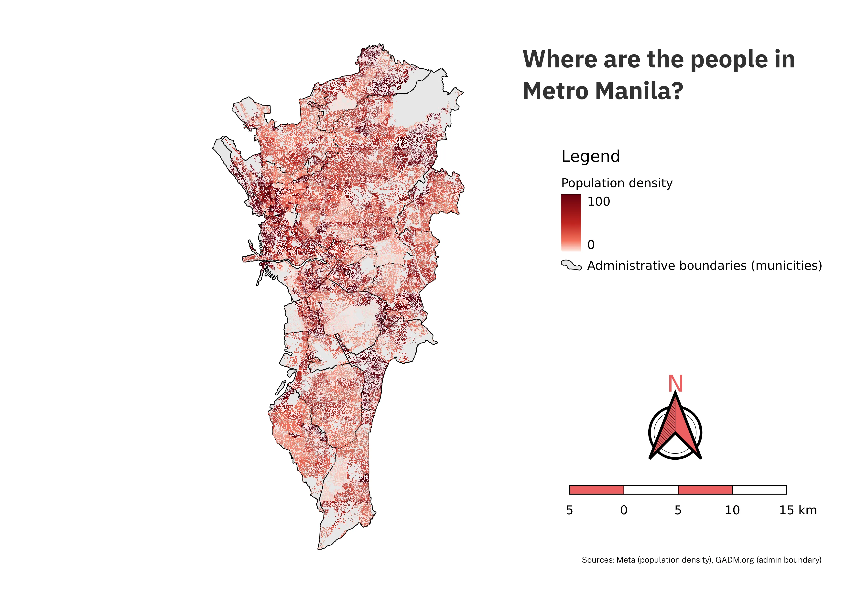
Section titled “Exercise 4.5 Creating printable maps”For this exercise, we want to create a map that shows the population density in Metro Manila.
- Load and style the ncr_popden_meta and ncr_municities layers. Your map canvas should look something like below.
- Create a new Print Layout via Project ‣ New Print Layout (CTRL + P) and name your Print Layout.
- This will open the Print Layout dialog/window where you will layout your map.
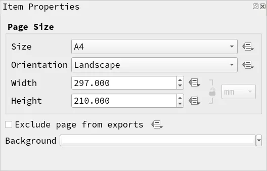
- To edit the paper/layout size, right-click on an empty area of the canvas ‣ Page properties.
-
Add a map to the layout by clicking
 and dragging to create a rectangle that will hold the map in the canvas.
 -
Map layout elements (e.g. maps, images, scale bar, texts) can be moved, resized, etc. with
 .
.
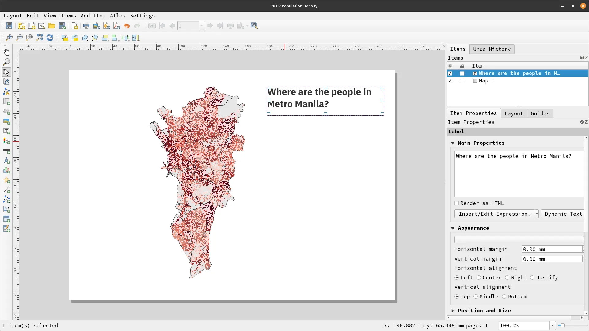
- Add a title to your map by adding a text element
 and edit the text by editing the options in the Item Properties panel.
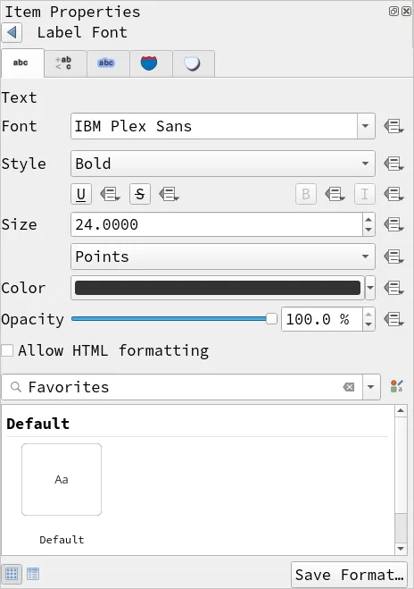
 - Under Appearance in the Item Properties tab, you can edit the font properties.
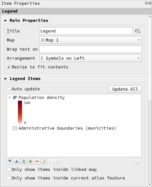
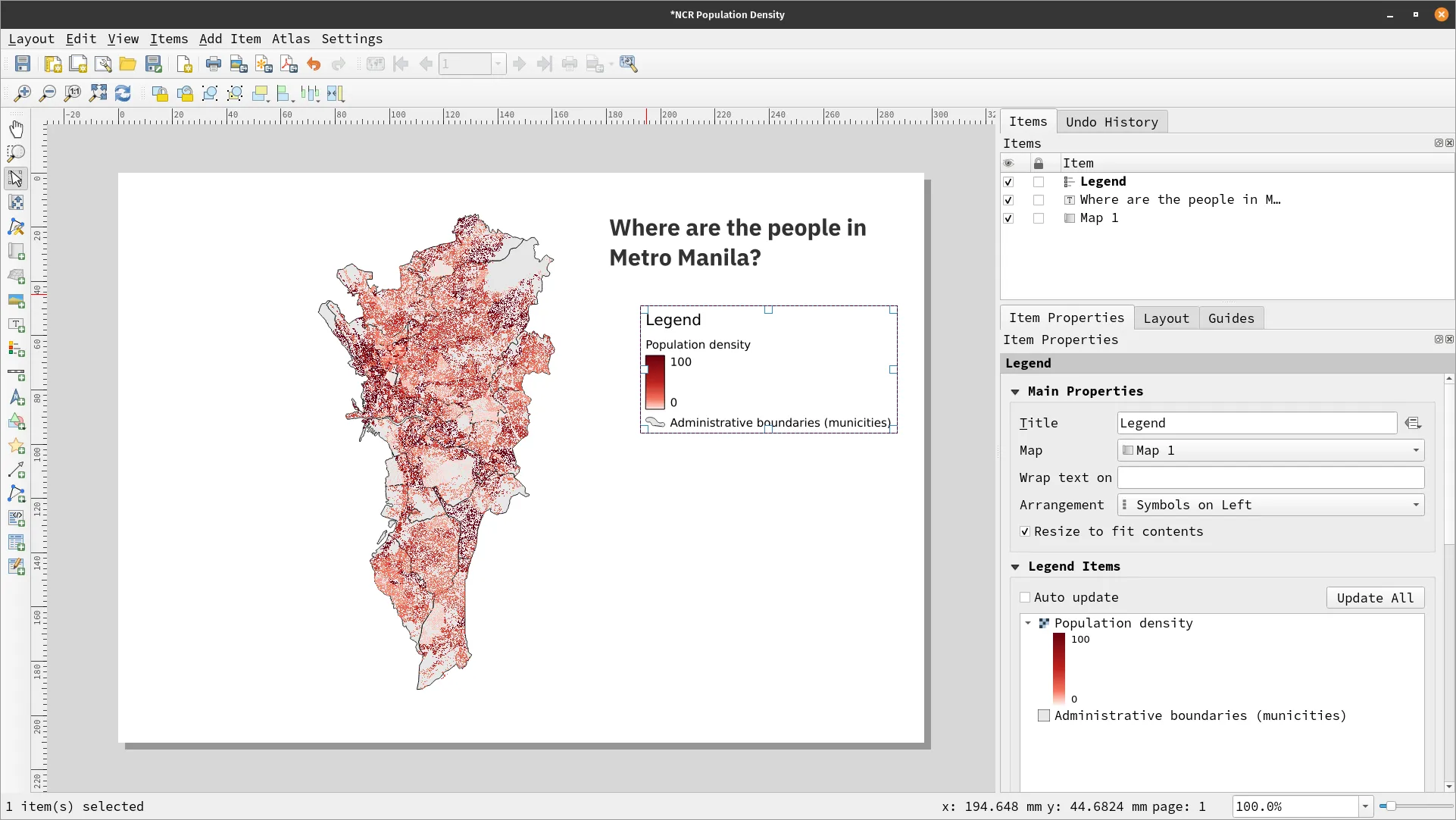
- Add a legend with
 and edit it in the Item Properties panel.
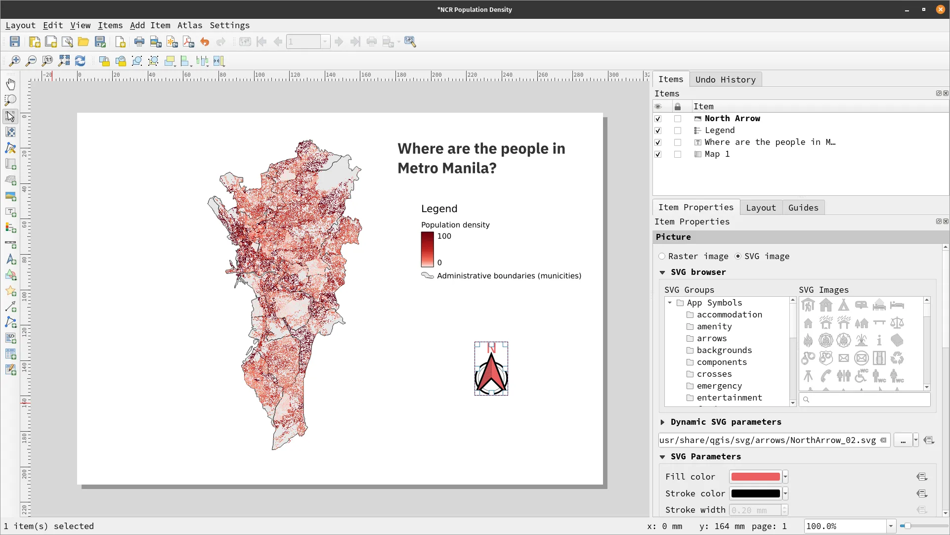
- Add a north arrow with
 and edit it in the Item Properties panel.
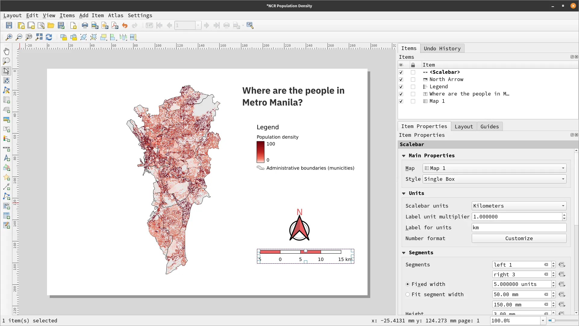
- Add a scale bar with
 and edit it in the Item Properties panel.
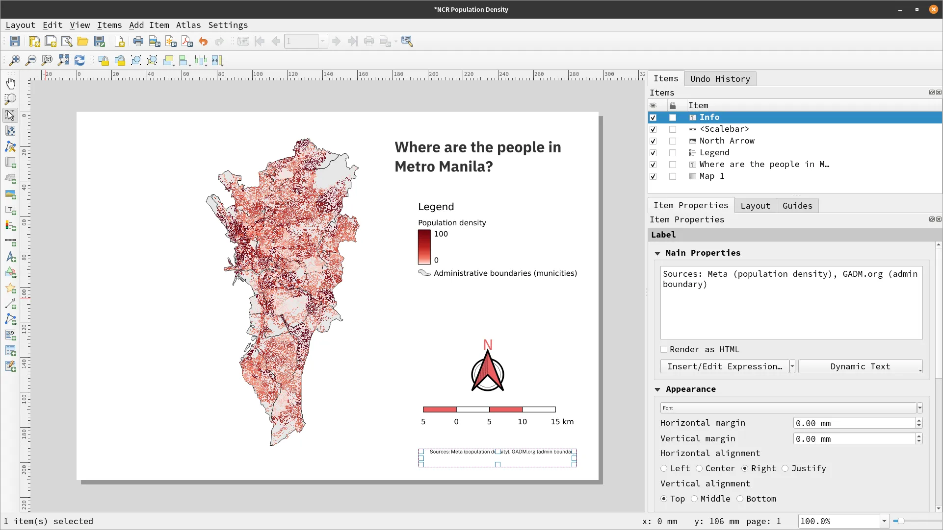
- Add another text element to include other information to your map.
- Export the map via the Layout menu or the following buttons:


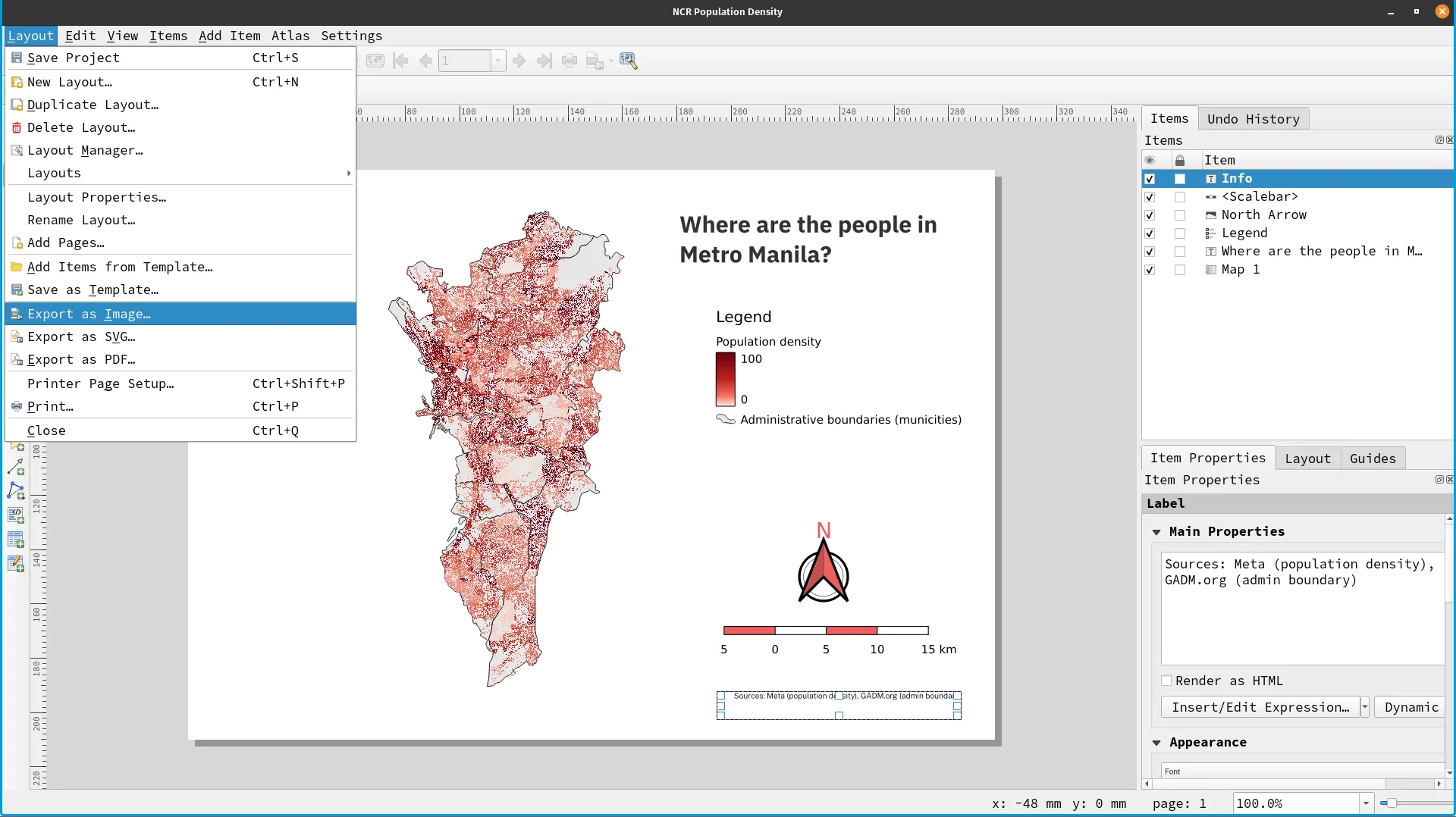
- You can specify your preferred export options.
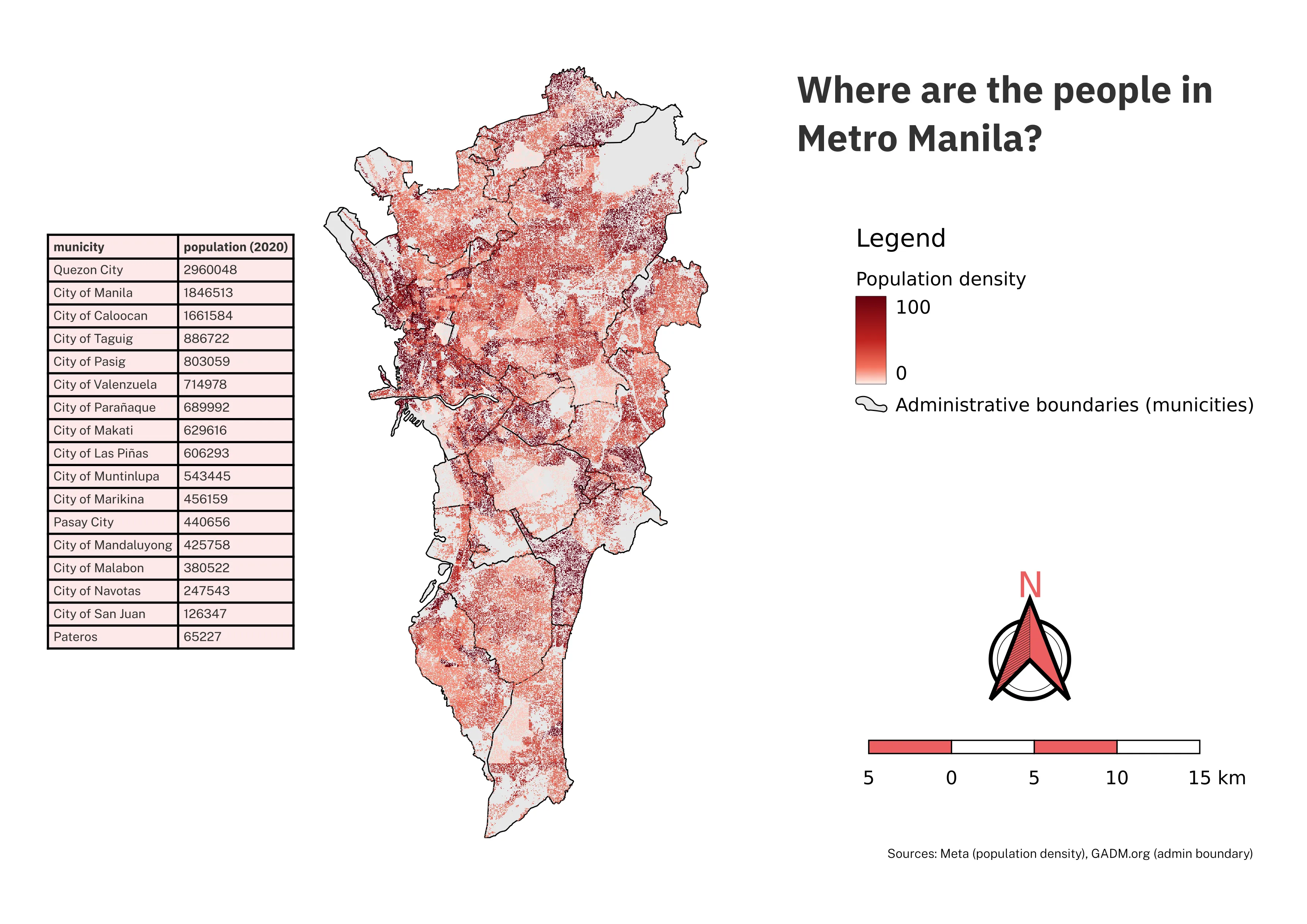
As a challenge, you can try to update/upgrade the map by adding a table of the total population per city/municipality from highest to lowest.
Advanced map-making techniques
Section titled “Advanced map-making techniques”Advanced map-making techniques help you make better maps more efficiently. Below are some techniques that you should learn:
- Preview modes allow you to simulate how your map will look like in different scenarios such as how it would look like photocopied, faxed, or if viewed by someone with color blindness.. This is very useful especially for creating visually-inclusive maps.
- Map themes are snapshots of a your map which saves information related to the layers on your map such as their visibility and symbology. They allow you to quickly switch between different configurations of the layers in your map. Also, since map themes are available in the Print Layout, they allow you to create map items based on the themes and independent of the current rendering or appearance of the main canvas. This is extremely useful when adding multiple maps in a layout (e.g. insets, etc.).
- QGIS Atlas allows you to automatically create a series of maps using a single layout. A properly configured QGIS Atlas will save you countless hours. This is particularly useful if you are creating a series of maps such as those for different regions or time periods.
- QGIS Reports are similar to the Atlas capability but with more functionalities. With Reports, you aren’t constrained to just creating maps. You can add sections of texts, images, etc. Reports can even have other reports nested inside them. You can think of Reports as Atlas on steroids.
Quiz and discussion questions
Section titled “Quiz and discussion questions”- What is the difference between Categorized and Graduated Symbology?
- Why is knowing the CRS of a layer important when applying Hillshade symbology to a raster?
- Which way of applying symbology do you prefer—using the Layer Styling panel or through Layer Properties—and why?
- Although maps are usually created in landscape orientation, QGIS can also be used to create visualizations and materials in portrait orientation. How would this affect your planning and implementation with using the Print Layout.
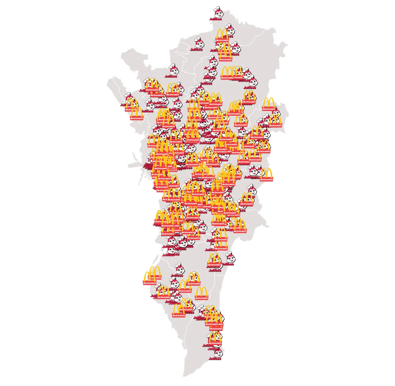
Homework challenge
Section titled “Homework challenge”There is a jollibee_mcdo_osm layer in the geopackage for this module. There are also logos for both fastfood chains under logos.
Load the layer together with ncr_municities in QGIS and try to recreate the following map. Tip: utilize Raster image markers.
Certification and support
Section titled “Certification and support”Contact us or sign-up to our courses if you are interested in having this as an instructor-led or self-paced course.