
Working with Rules, Scale, and Labels
Introduction
Section titled “Introduction”This module will teach you styling and symbology techniques using rules, scale, and labels.
What you should already know
Section titled “What you should already know”As an intermediate level workbook, you are expected to already know basic GIS concepts such as spatial data models and formats and QGIS functions such as loading and styling layers, running processing algorithms, saving QGIS projects, etc.
Rule-based symbology
Section titled “Rule-based symbology”Rule-based symbology in QGIS allows you to apply different styles to features within a layer based on specified rules. Instead of using a single symbology for the entire layer, you can define multiple rules that determine how each feature should be displayed based on its attributes.
This approach is useful for applying complex and combined symbology on layers or when applying styles to things like vector layers. For example, you may want to style a road network based on different parameters.
Exercise 3.1. Styling road maps
Section titled “Exercise 3.1. Styling road maps”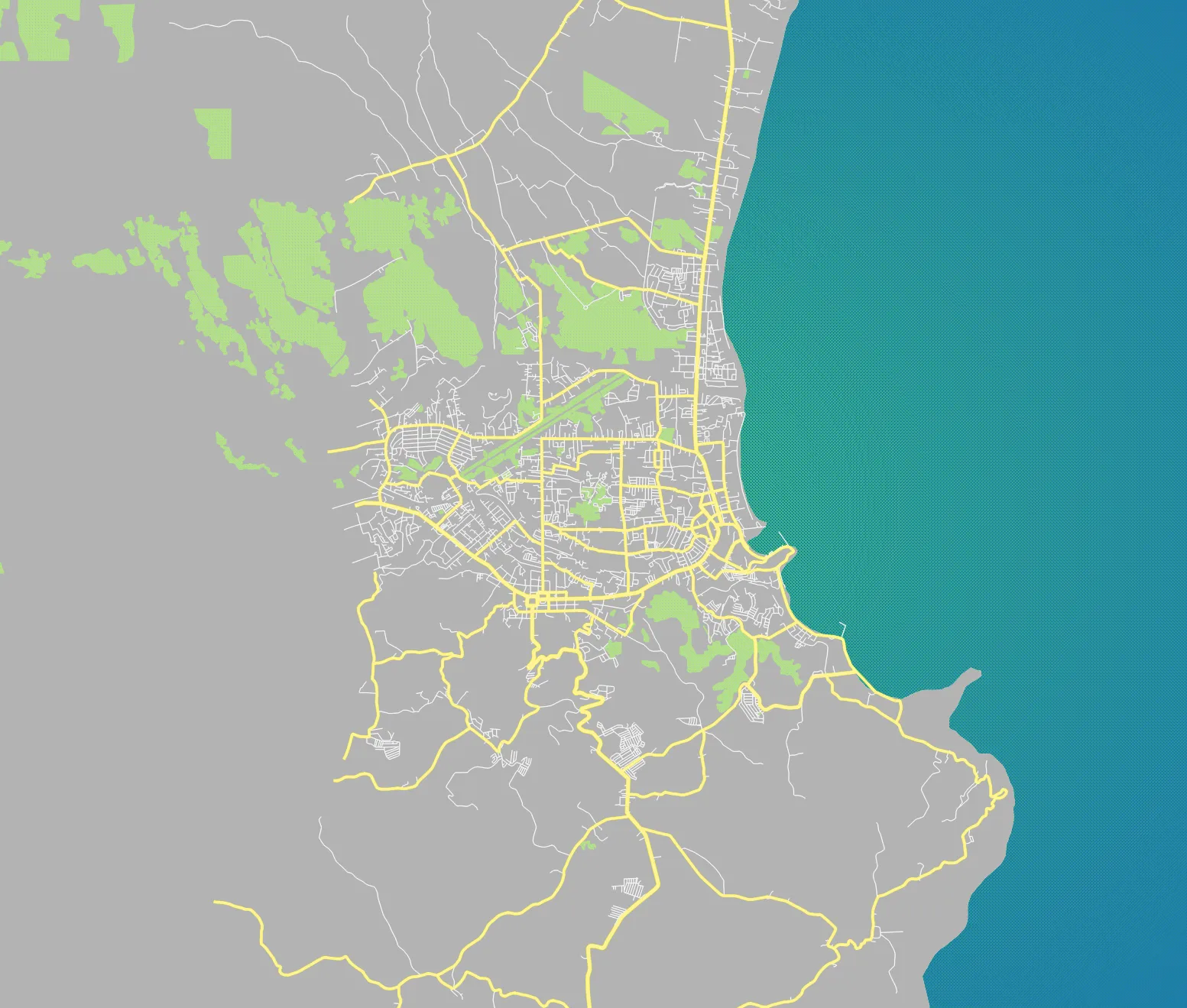
In this exercise, we’ll create a road network similar in style to the ones we see in web maps by applying rule-based symbology on OpenStreetMap road data.
Create a cool-looking basemap
- Load the adm_albay, landuse, and osm_roads_legazpi layers.
- Duplicate the adm_albay layer and name it sea. Create a group named base and put the adm_albay, sea, landuse layers there.
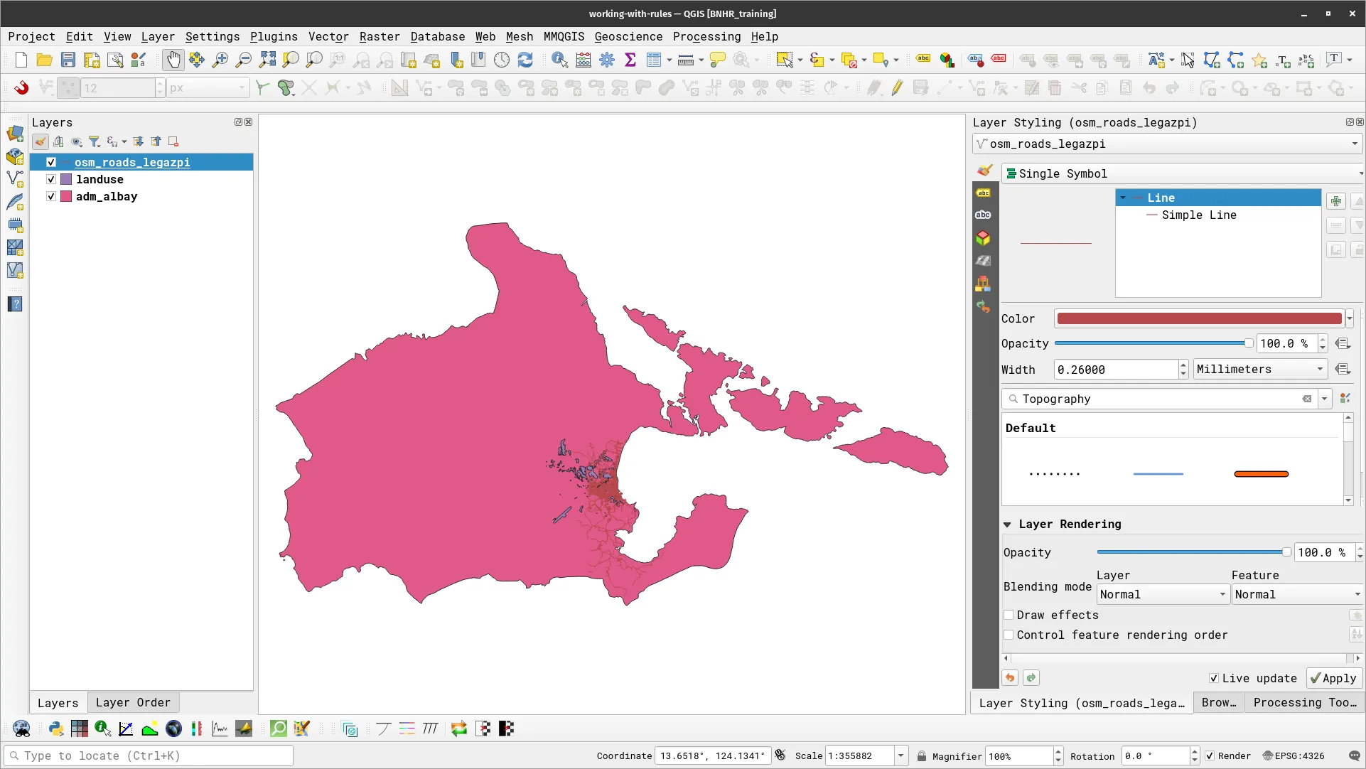
- Style adm_albay using Single Symbol with a slightly-dark color.
- Style sea using Inverted Polygons and apply two fills (a Simple Fill and a Gradient Fill).
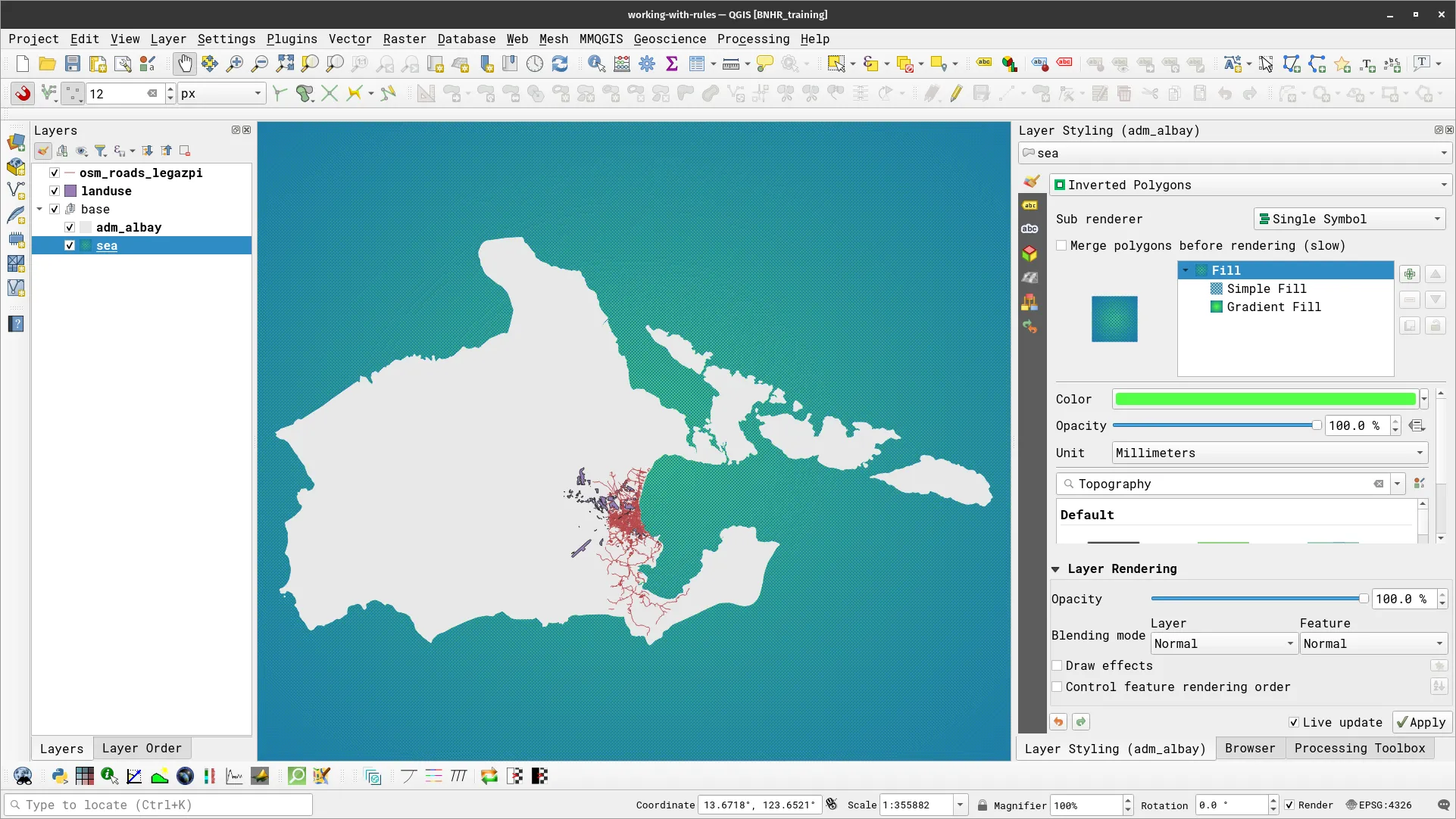
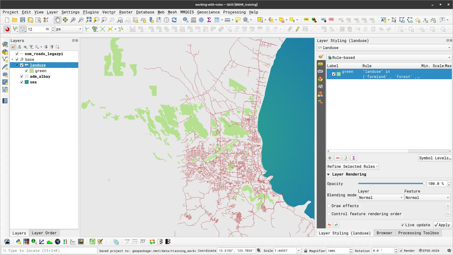
- For landuse, let’s apply a simple rule-based symbology. In this case, we want to style only the “green” areas.
- Select the landuse layer.
- Select Rule-based for the symbology type.
- Add a new rule using the green arrow.
- Use the following rule:
- Label: green
- Filter:
"landuse" in ('farmland' , 'forest' , 'grass' , 'greenfield' , 'meadow' , 'orchard')
Apply rule-based symbology to the road network data
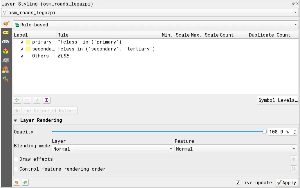
- For the road network data, you will be applying a more complex rule-based symbology. You will create 3 rules—one for primary roads, another for secondary roads, and a catch-all (for everything else). The rules will be:
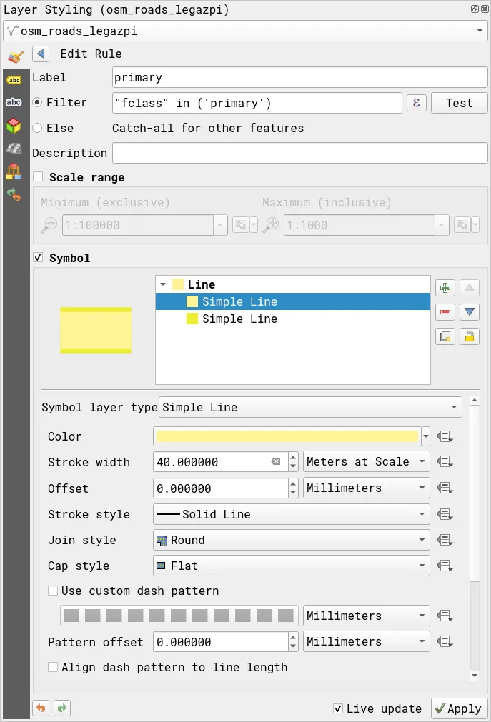
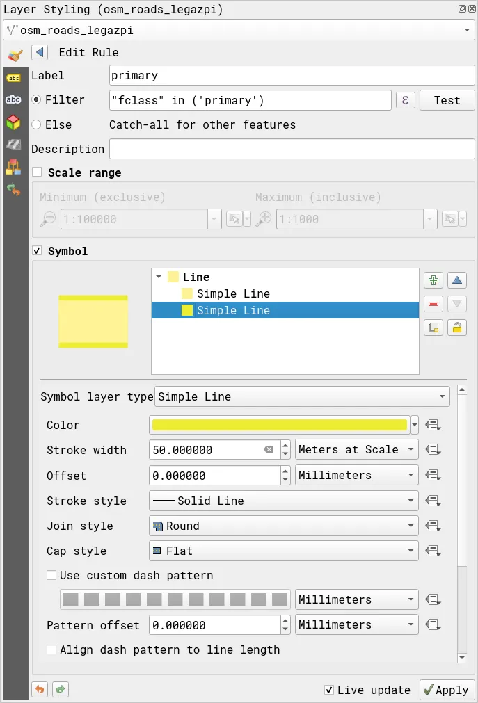
- Primary roads:
- Label: primary
- Filter:
"fclass" in ('primary')
- Symbol:
-
Simple Line (1)
- Color: #fff495
- Stroke width: 40 meters at scale
- Stroke style, Join style, Cap style: Solid line, Round, Round
-
Simple Line (2)
- Color: #ecec32
- Stroke width: 50 meters at scale
- Stroke style, Join style, Cap style: Solid line, Round, Round
-
- Primary roads:
-
Secondary and tertiary roads:
- Label: secondary and tertiary
- Filter:
fclass in ('secondary', 'tertiary')
- Symbol:
-
Simple Line (1)
- Color: #fff495
- Stroke width: 20 meters at scale
- Stroke style, Join style, Cap style: Solid line, Round, Round
-
Simple Line (2)
- Color: #ecec32
- Stroke width: 30 meters at scale
- Stroke style, Join style, Cap style: Solid line, Round, Round
-
-
Other roads:
- Label: Others
- Filter:
Else
- Symbol:
- Simple Line (1)
- Color: #ffffff
- Stroke width: 8 meters at scale
- Stroke style, Join style, Cap style: Solid line, Round, Flat
- Simple Line (2)
- Color: #d3d3d3
- Stroke width: 12 meters at scale
- Stroke style, Join style, Cap style: Solid line, Round, Flat
- Simple Line (1)
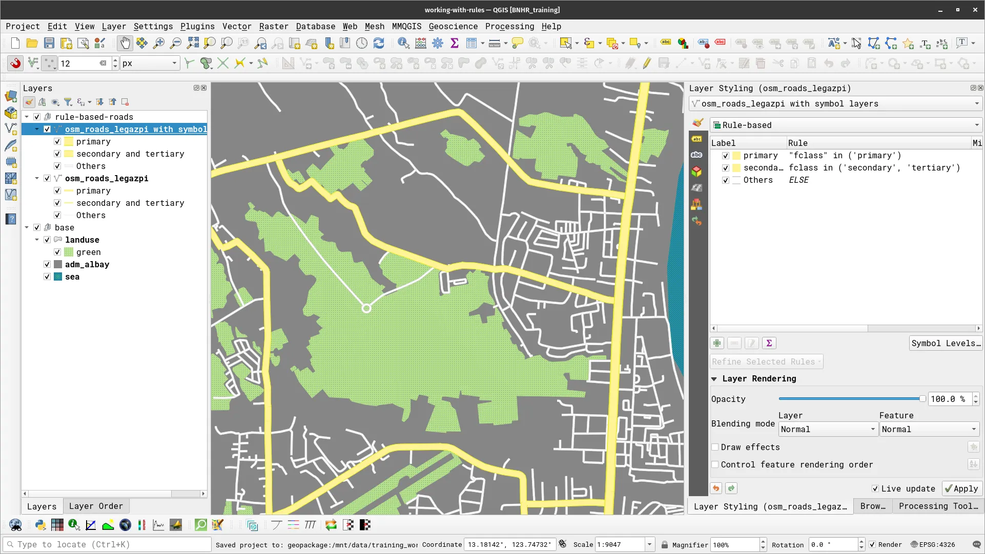
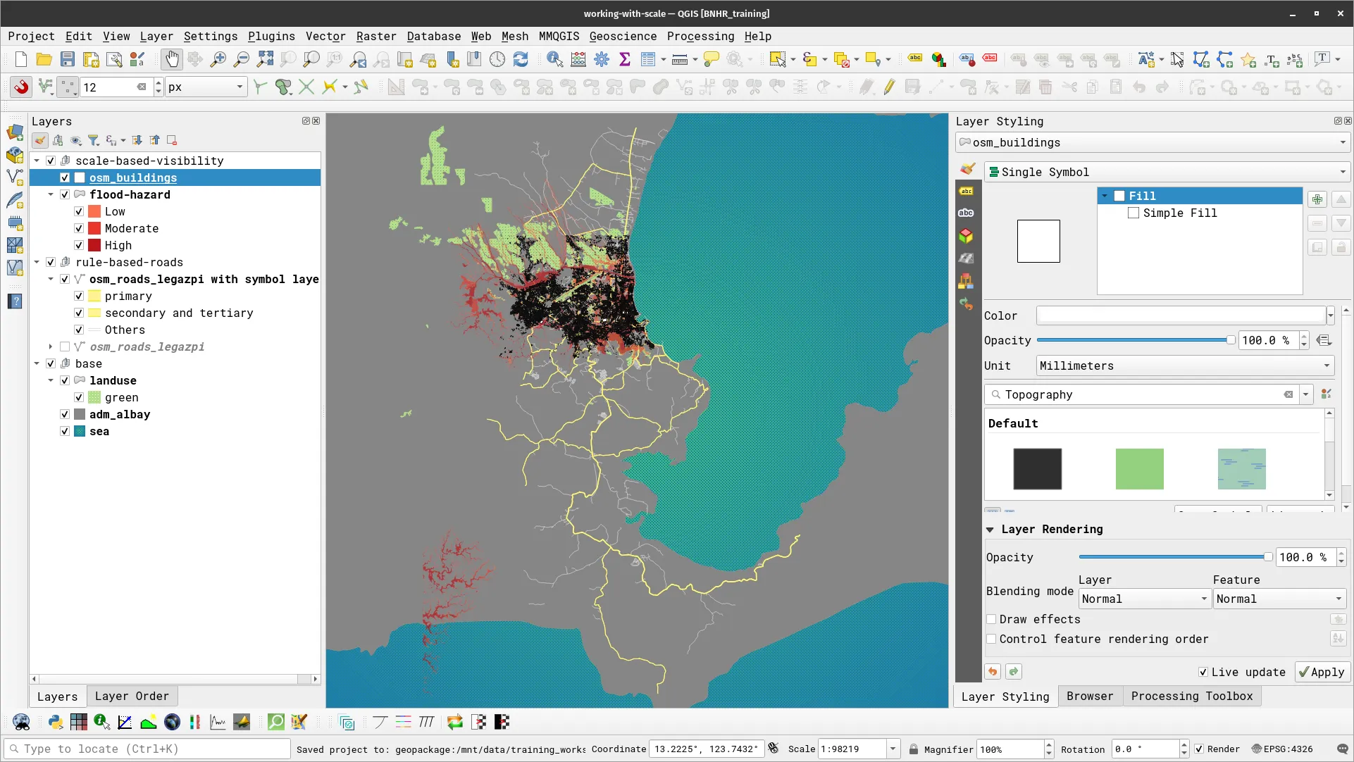
- After applying these rules, your road layer should look like below.
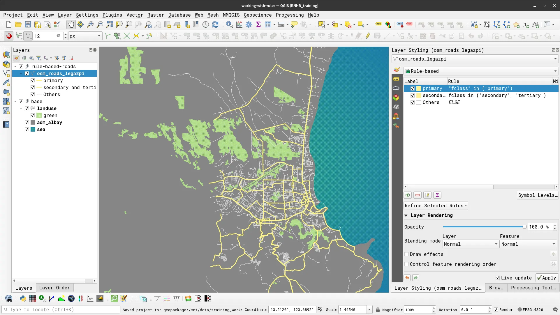
However, if you zoom in to the map, you will notice a bit of an issue.
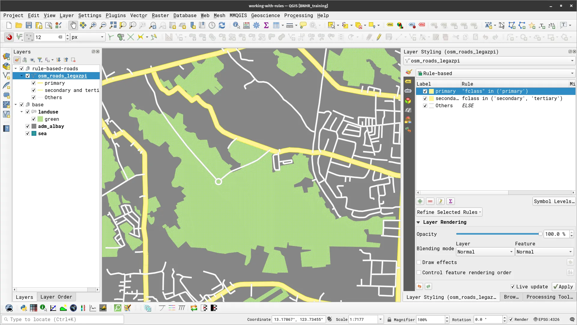
If you look real close, you will notice that the different road feature overlap in a poor way. What you want to do is control the rendering order so that the primary roads are rendered over the secondary and other roads while the secondary roads are rendered over the other roads. To do this, you can use Symbol Levels.
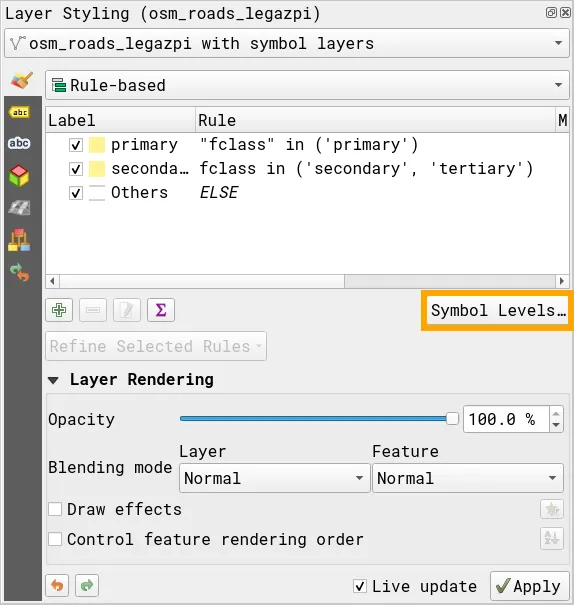
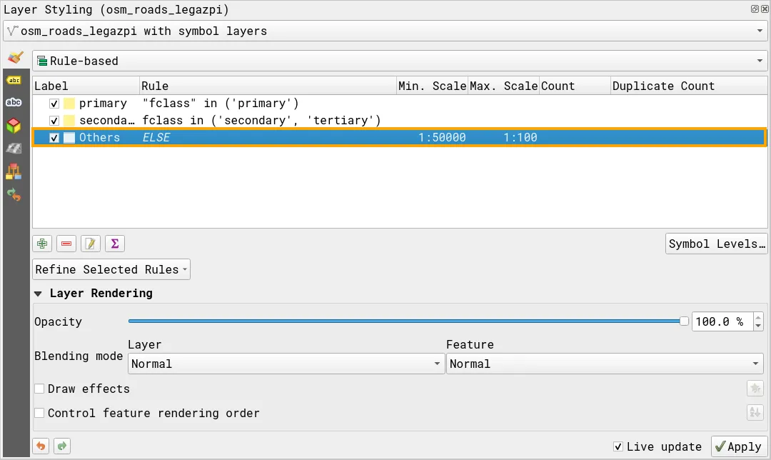
Use symbol levels to feature rendering order
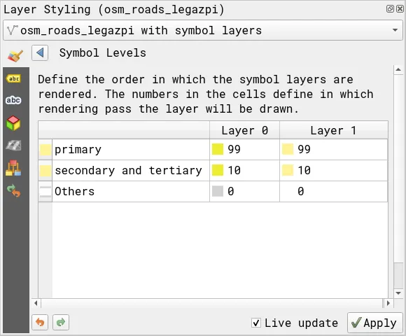
Section titled “Use symbol levels to feature rendering order”Symbol Levels allow you to define the order in which the symbols are rendered. The numbers assigned to symbol rules define when they will be rendered, that means a lower number is rendered first and a higher number will be rendered on top of it. Using this, you can ensure that the other roads are rendered at the bottom and the primary roads are rendered on top.
- Click Symbol Levels on the Layer Styling panel or the layer Properties of the osm_roads_legazpi layer.
- Update the Symbol Levels for each of the rules. Make sure that the values for primary are the highest while the values for Others are the lowest.
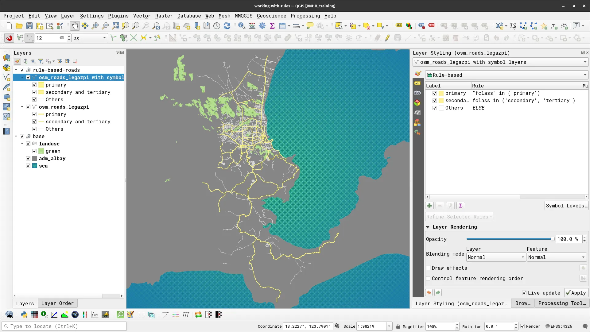
- With these symbol level rules applied, your road layer should look like below when zoomed in.
Working with scale
Section titled “Working with scale”Using scale-dependent rendering, where layers or specific features adjust their visibility based on the scale (or zoom level) is a simple yet powerful way to enhance your map-making abilities in QGIS.
The terms “small scale” and “large scale” are very context-dependent but—by convention—we consider a small scale map as one that shows less detail while a large scale map is one that shows more detail. When representing scales as ratios (i.e. 1:XX,XXX), the one with the smaller ratio (or larger denominator) is considered smaller. Therefore, 1:100,000 is a smaller scale than 1:1,000.
Exercise 3.2. Showing different features at different zoom levels
Section titled “Exercise 3.2. Showing different features at different zoom levels”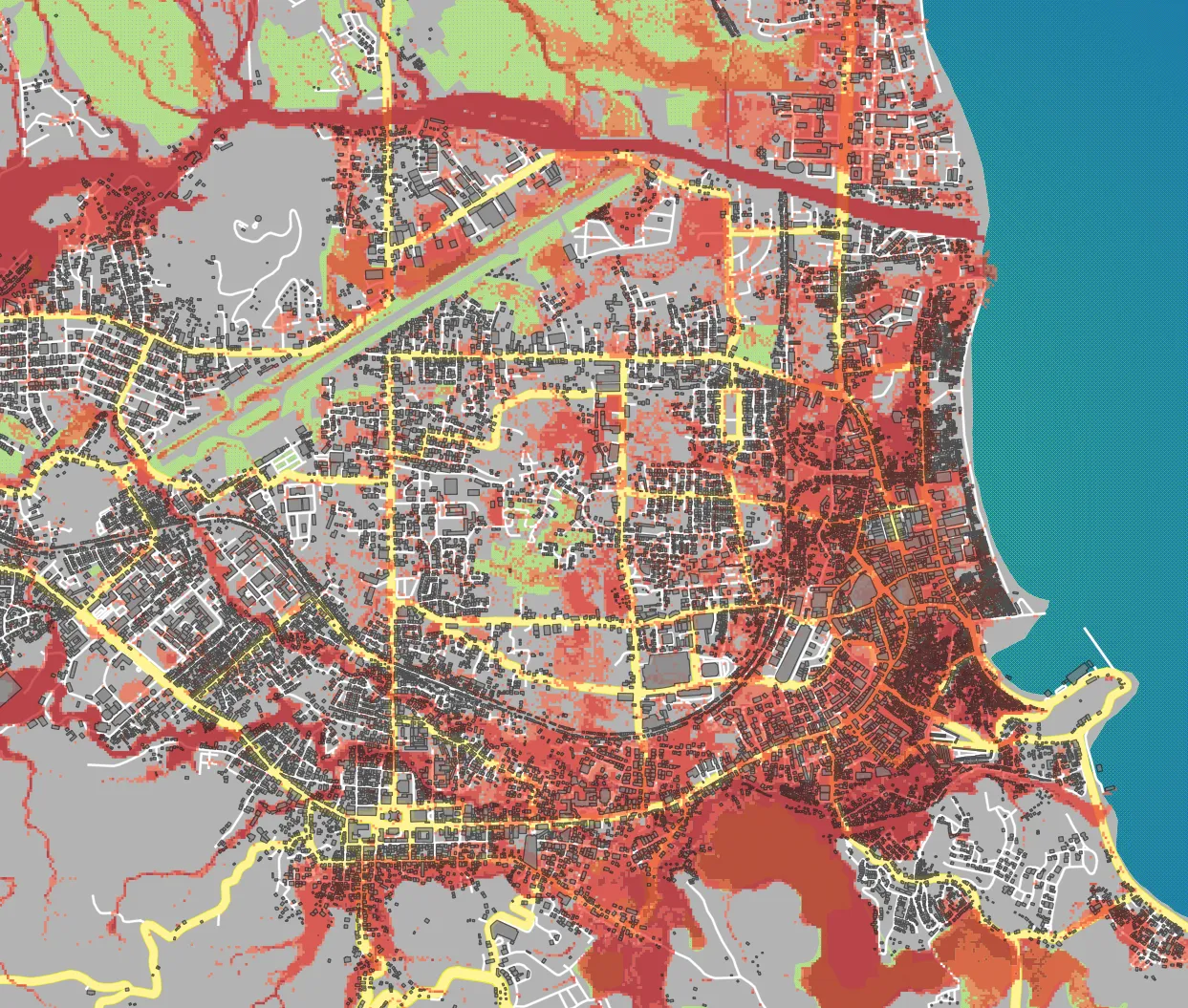
For this exercise, your goal is to change which features and layers are shown as you zoom in or out of the map. In a way, you will be changing the level of detail in the map depending on the zoom level. For example:
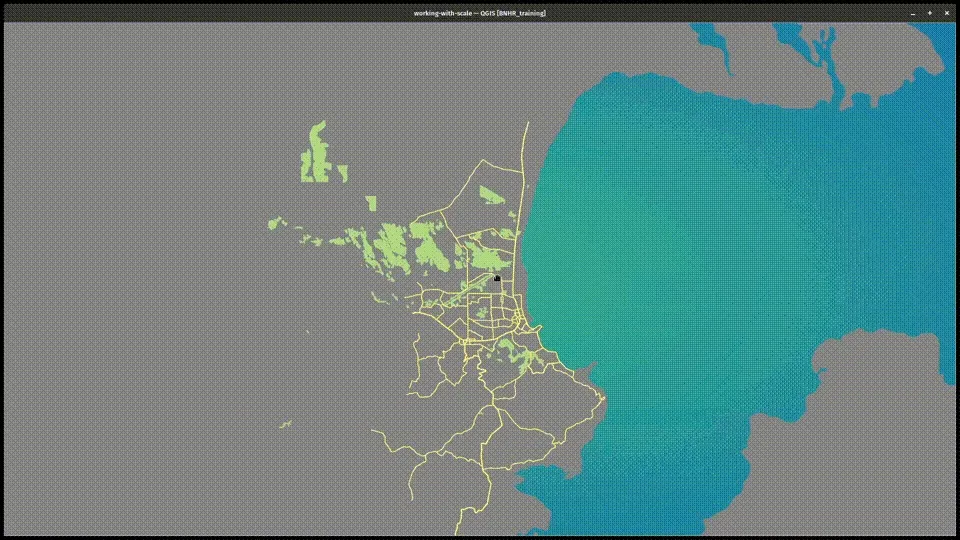
- When zoomed out (e.g. scale < 1:50,000): you only want to see the primary, secondary, and tertiary roads as well as the green areas.
- At middle zoom level (e.g. scale between 1:25,000 and 1:50,000): you want to add the other roads as well as the flood hazard layer.
- When zoomed in (e.g. scale > 1:25,000): you want to show all layers including the osm_buildings.
How will you do this?
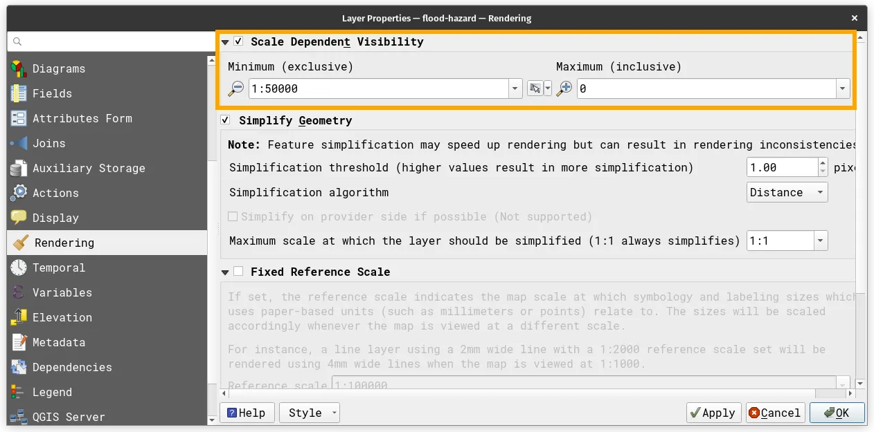
The trick here is to use Scale Dependent Visibility. In QGIS, you can fine-tune and control the scale range at which layers and features become visible.
- For layers: you can find this in the Rendering tab of the Layer Properties
- For features styled using rule-based symbology: you can specify the minimum scale and maximum scale in the style settings.
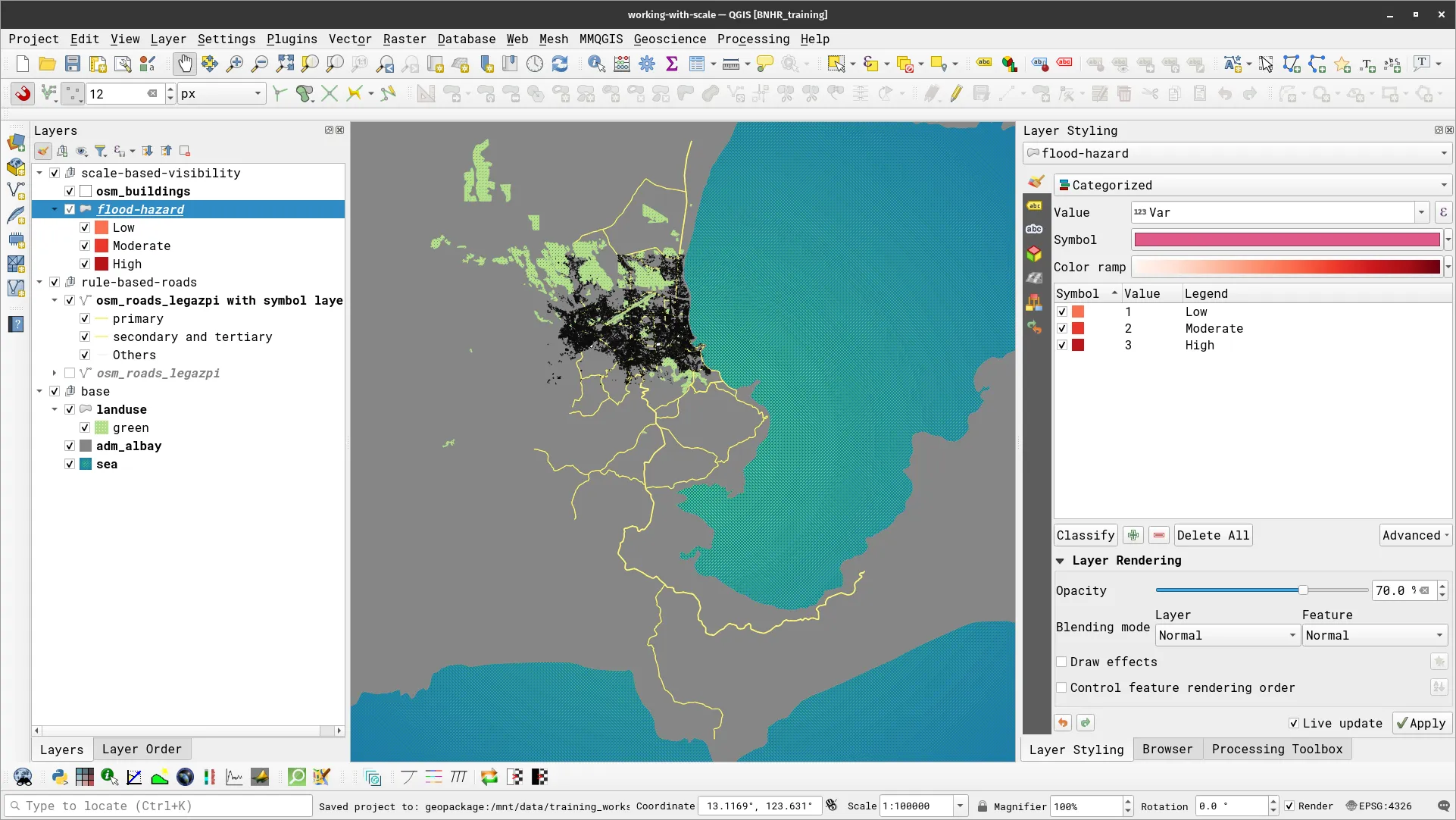
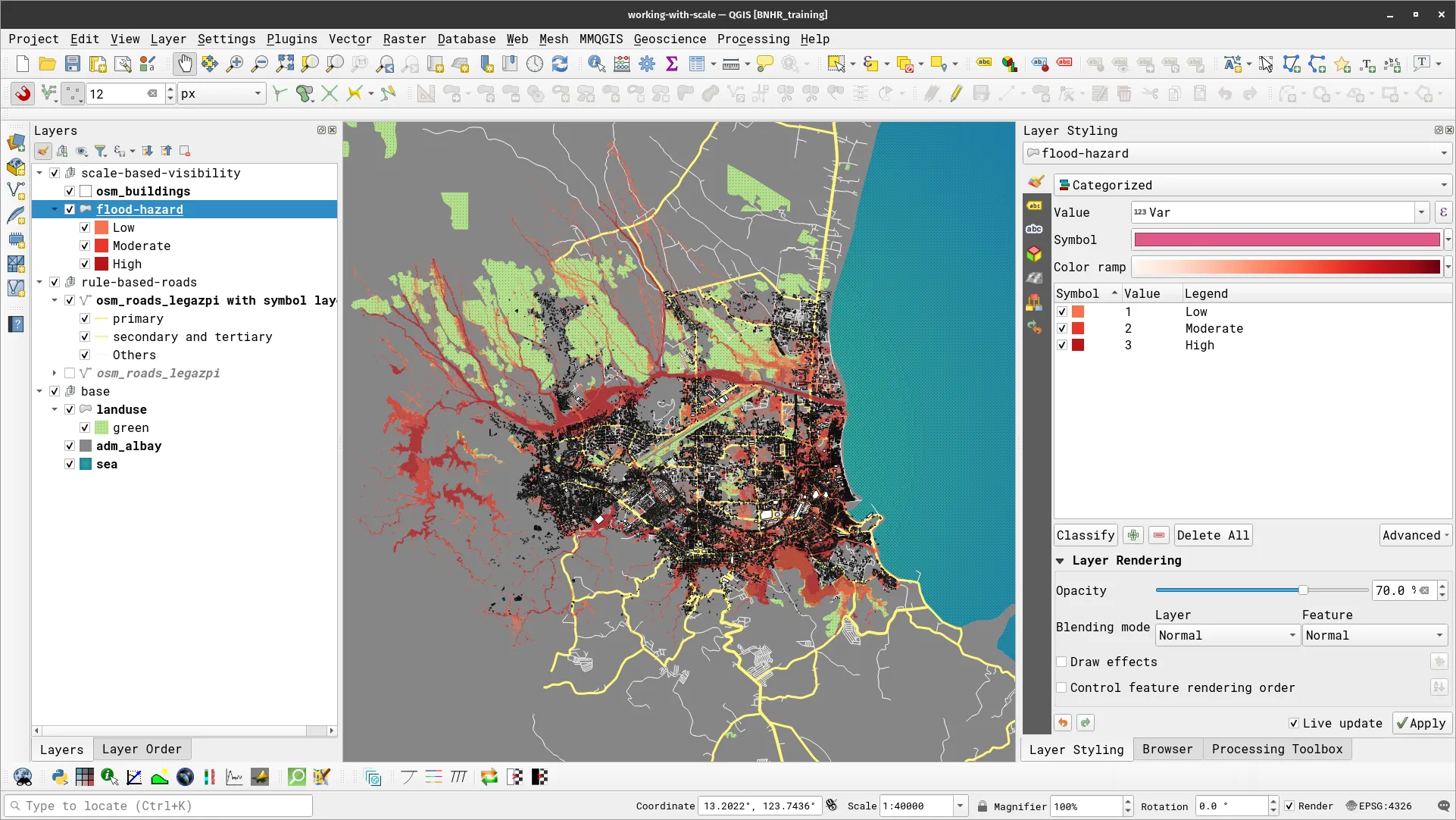
- Add the flood-hazard and osm_buildings layer to the map you created in the previous section and style them accordingly.
- For the road layer, edit the Min. Scale and Max. Scale parameters for the Others rule to 1:50000 and 1:100, respectively. Don’t forget to apply your changes.
- For the flood hazard layer, open its Layer Properties and go to the Rendering tab. Check the Scale Dependent Visibility and put 1:50,000 as the Minimum.
- Look at your map canvas. You should notice that when you are zoomed out (or when the scale is less than 1:50,000), the other roads and the flood hazard are not visible and when you zoom in (or once the scale is greater than 1:50,000) they appear.
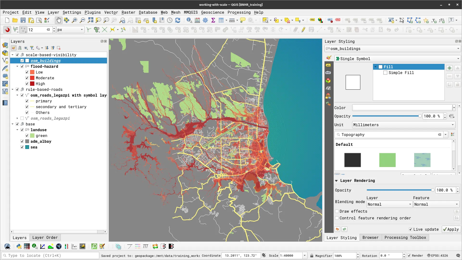
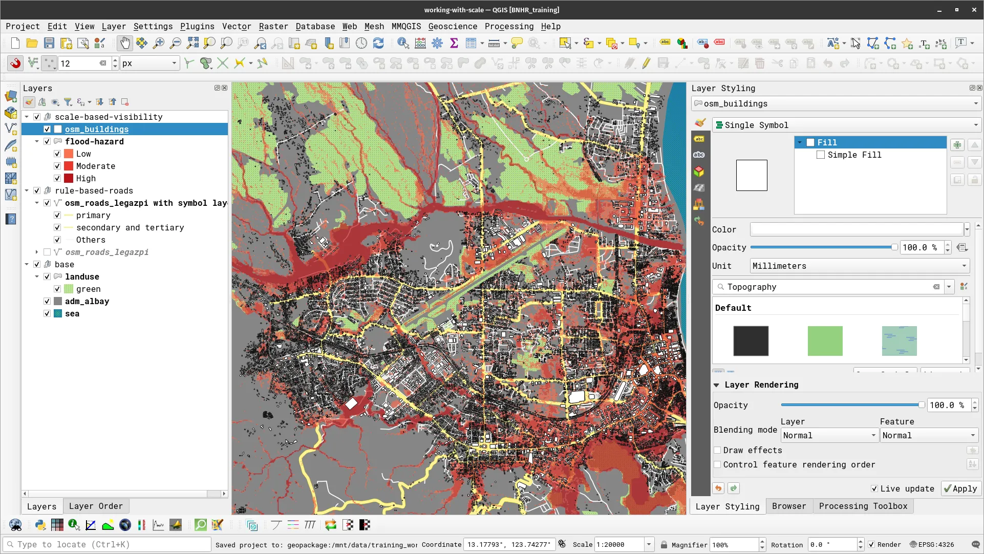
- For the osm_buildings layer, do the same thing that you did for the flood hazard layer but put the Minimum to 1:25,000. Take a look at you map canvas again, this time the building data should not appear when the scale is less than 1:25,000.
Working with labels
Section titled “Working with labels”QGIS has a very mature and customizable mechanism for adding labels. Data-driven overrides, QGIS expressions, and even geometry generators can be used when adding labels to vector maps. Another awesome feature of labels in QGIS is that they can be moved manually anywhere on the map canvas and configured comprehensively to take on different shapes, curvatures, or direction.
Simple labeling
Section titled “Simple labeling”Exercise 3.3.1. Labeling cities based on population
Section titled “Exercise 3.3.1. Labeling cities based on population”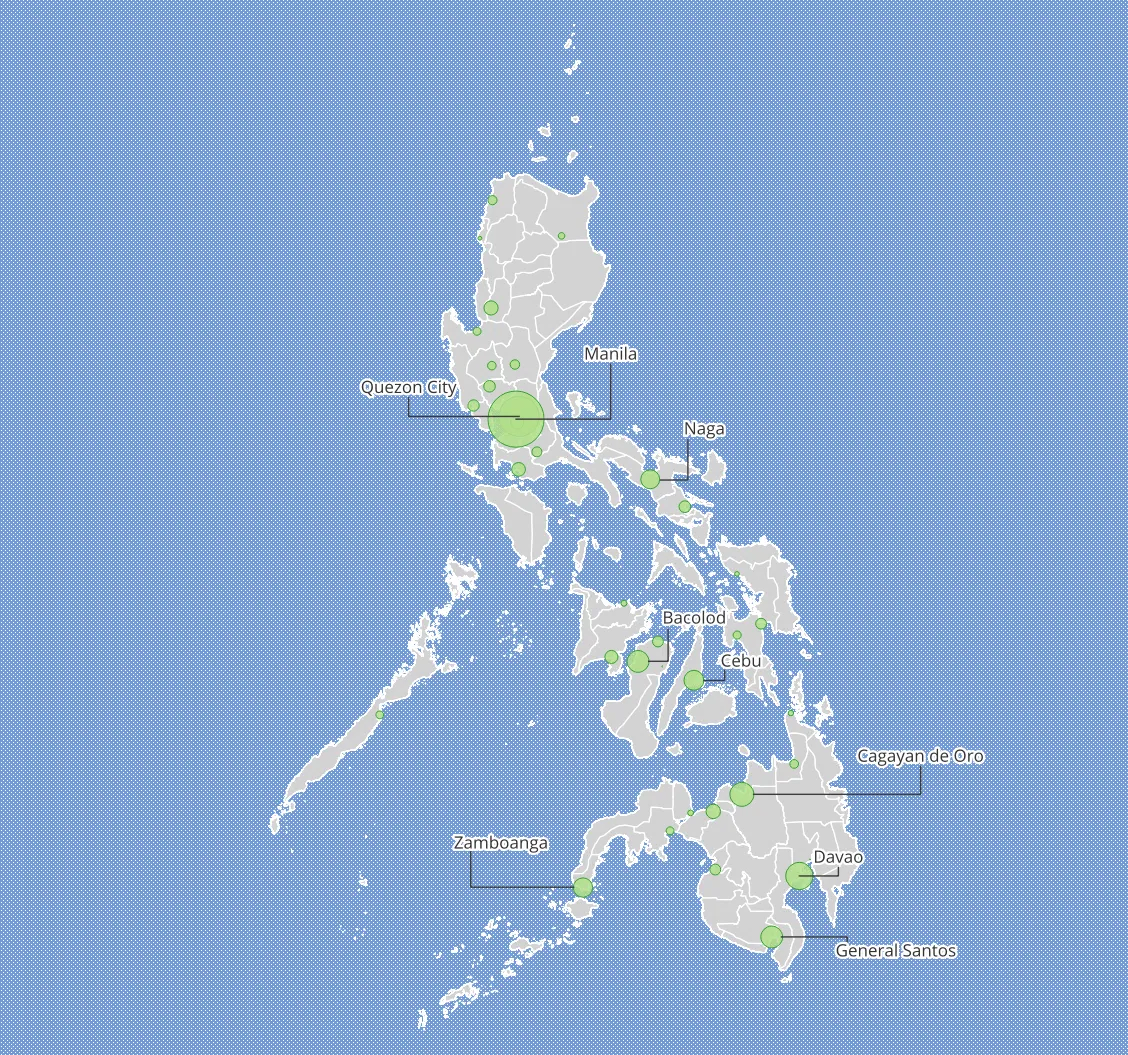
In this exercise, you will add labels to a map showing highly-populated cities in the Philippines—from basic labels to ones using callouts and manual placement.
- Load the gadm_phl_provinces and ne_10m_populated_places_philippines layers in QGIS.
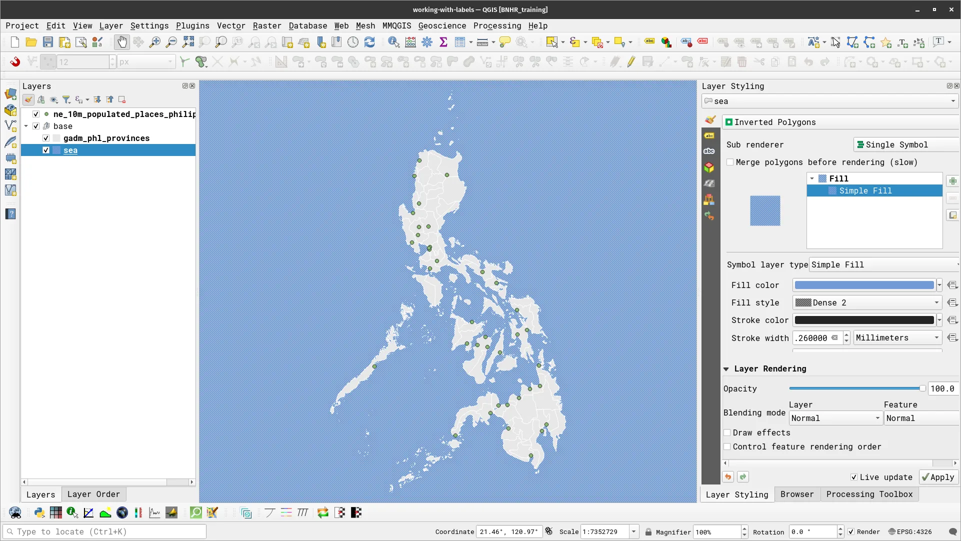
- Duplicate the gadm_phl_provinces and name it sea. Create a group named base and add both layers to it. Style the provinces and sea layers accordingly.
- gadm_phl_provinces: Single Symbol, Simple Fill
- sea: Inverted Polygon, Single Symbol, Simple Fill (Fill Style: Dense 2)
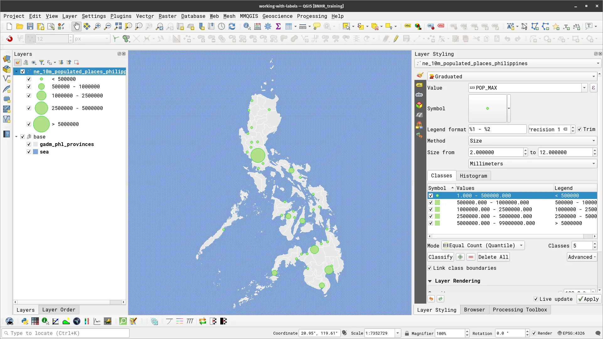
- For ne_10m_populated_places_philippines, apply a symbology that will use size to show the population of the location. You can use several techniques such as a Single Symbol with data-defined overrides for the size parameter or a Graduated symbology with Size method. For the latter, you can use the following parameters.
- Value: POP_MAX
- Method: Size
- Size from: 2.0 to 12.0 Millimeters
- Value Ranges:
- 1 – 500,000 | 500,000 – 1,000,000 | 1,000,000 – 2,500,000 | 2,500,000 – 5,000,000 | 5,000,000 – 99,000,000
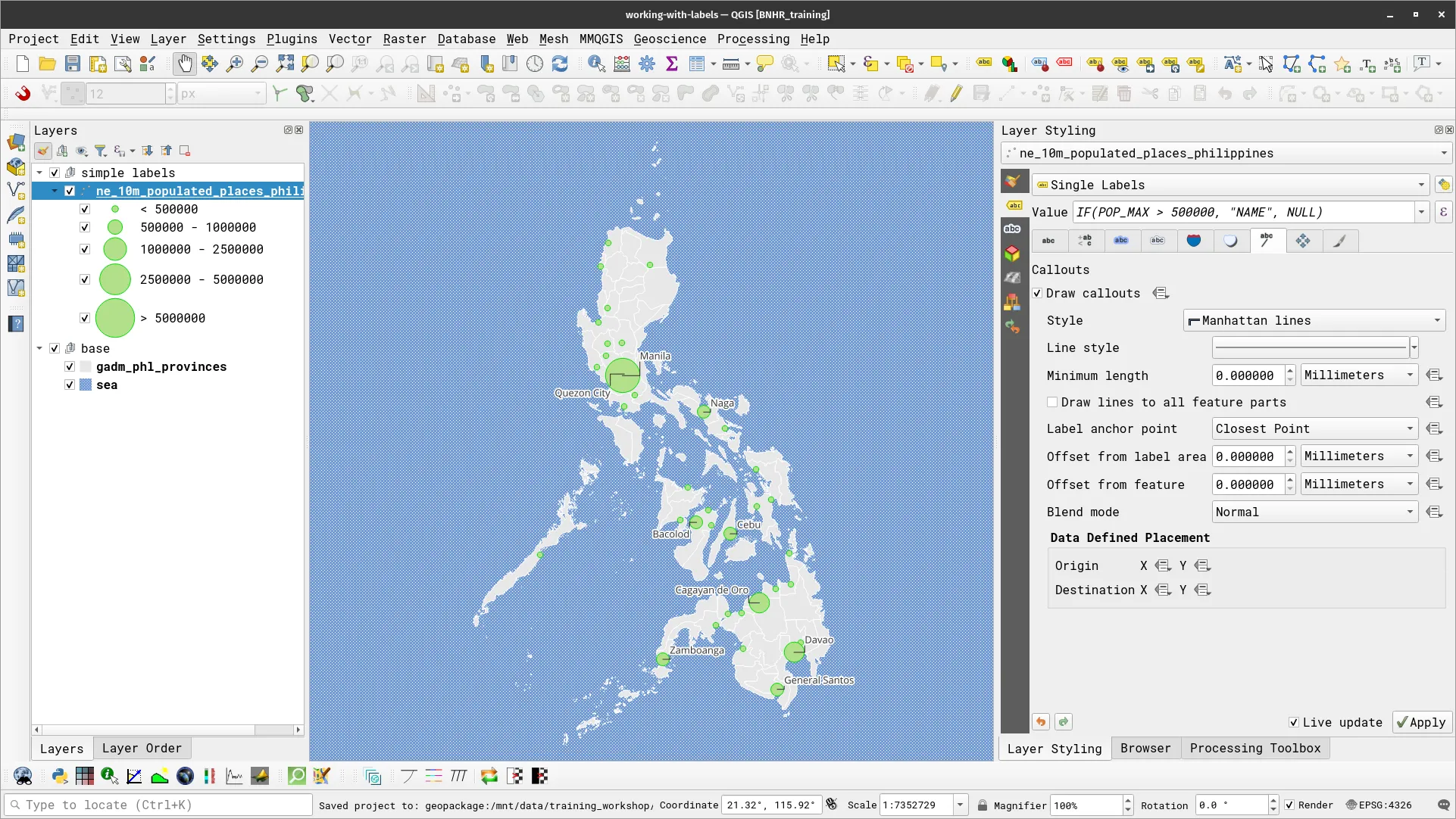
- To add a label, go the the Labels tab in the layer Properties or in the Layer Styling Panel.
- For ne_10m_populated_places_philippines, select Single Labels and use NAME for the value. You can also enable other customizations such as text buffers.
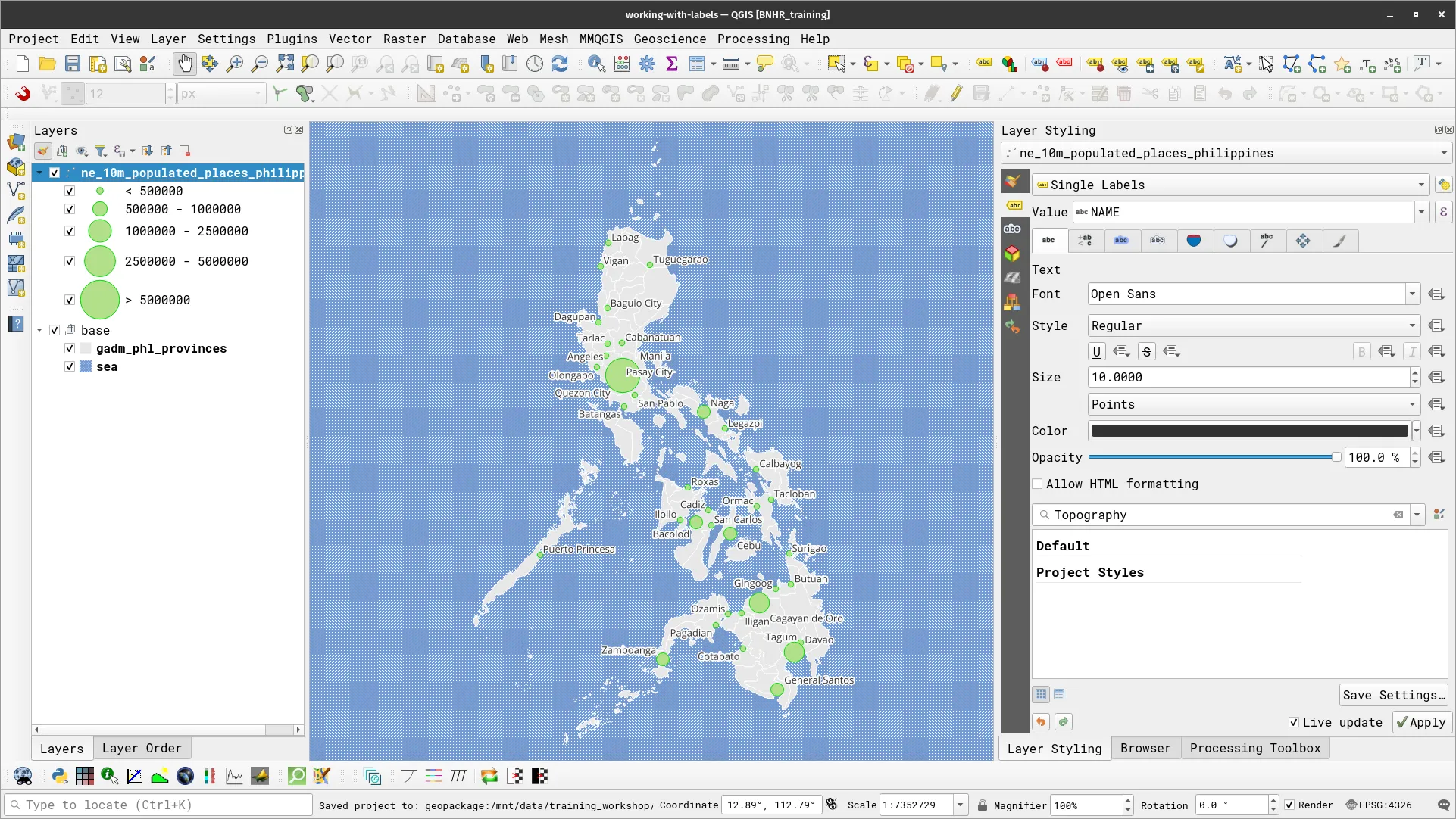
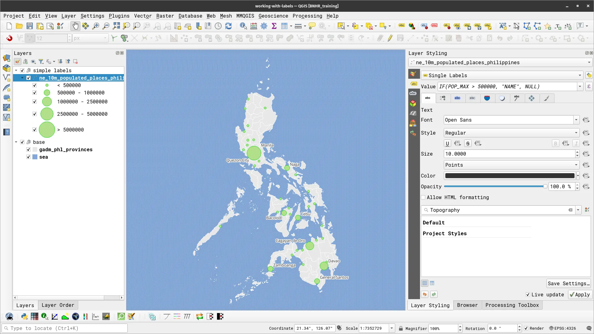
- You now have labels but they look cluttered. What if you only want to label the places with population greater than 500,000? To do that, you need only to edit the VALUE parameter using this expression:
IF(POP_MAX > 500000, "NAME", NULL)- Your map should now look like the one below. Notice that only the locations whose population is greater than 500,000 is now labeled.
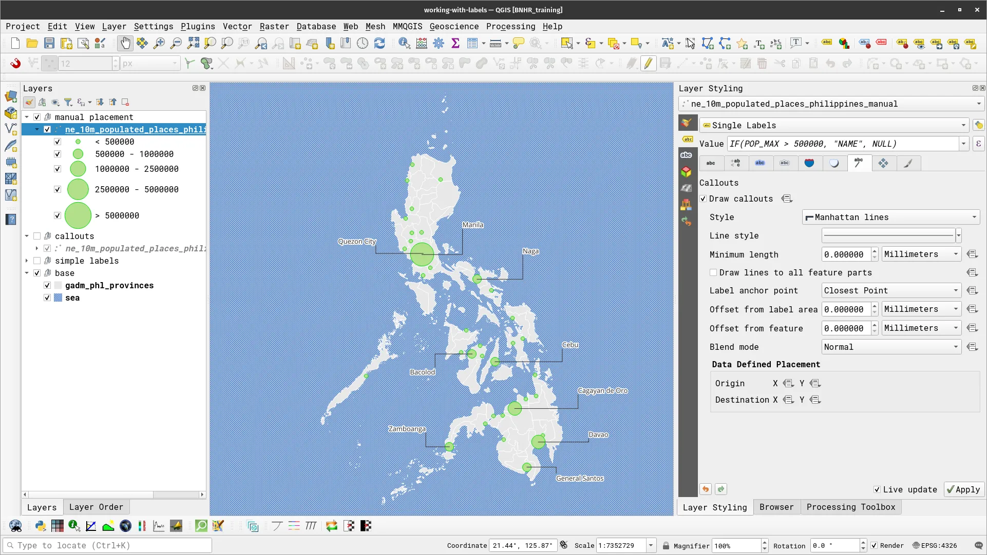
Adding callouts to your labels
Another thing that you can do with labels is to add callouts. A callout refers to a line or connector that connects a label to the feature it’s labeling on a map. The purpose of a callout is to prevent label overlap and ensure that labels are clearly associated with their corresponding features, even if there’s limited space or a cluttered layout on the map. Callouts help improve map readability and comprehension by indicating which feature a label pertains to especially when labels are positioned near or inside complex geometries. To add callouts to your labels, check Draw callouts in Callouts of the Labels Tab.

There are several ways to configure callouts and several built-in callout styles in QGIS. For this exercise, you can use a Manhattan line callout.
Manual placement of labels
What if you’re not content with the default placement of labels? Well, don’t fret. QGIS has several functionalities that allow you to fine-tune the placement, shape, and even orientation of labels. For example, you can edit the placement of your labels in the Placement tab of Labels.
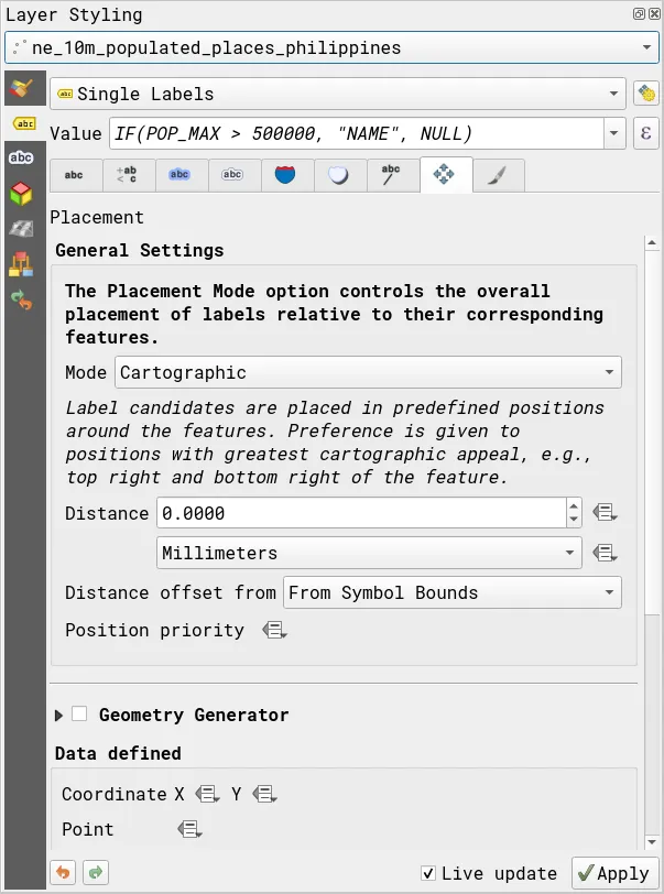
Similarly, QGIS has the Labels Toolbar that allows you to edit and modify your labels—such as manually placing them anywhere on the map.
![]()
Use the Move Label button (![]() ) to move your labels anywhere you want on the map. Notice that the callouts will automatically move with the labels.
) to move your labels anywhere you want on the map. Notice that the callouts will automatically move with the labels.
Multi-attribute and data-defined labels
Section titled “Multi-attribute and data-defined labels”Exercise 3.3.2. Multi-attribute and data-defined labels
Section titled “Exercise 3.3.2. Multi-attribute and data-defined labels”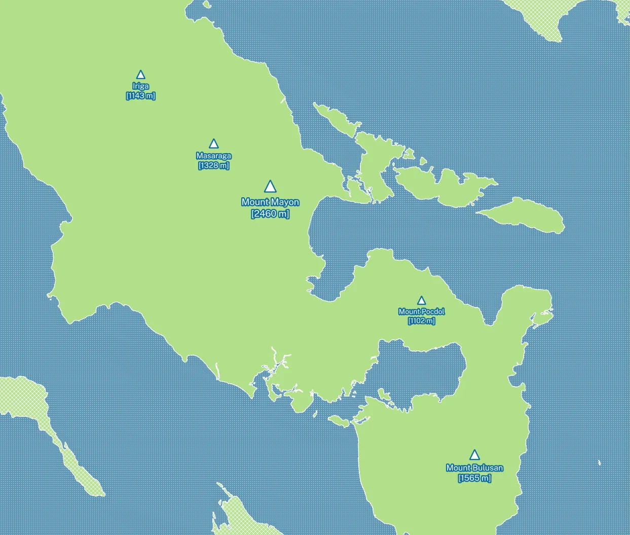
In this exercise, we have a volcanoes layer that has fields for the names and elevations of certain volcanoes/mountains in Bicol. What you will do is style and apply a label to these volcanoes/mountains but with a twist—the size of the marker and label is relative to the elevation of the volcanoes/mountains they pertain to.
To do this, you will use Expressions and Data-defined overrides in your labels.
- Load the volcanoes layer and apply a Single Symbol symbology with a Simple Marker whose Size parameter is data-defined (uses the elevation field) value.
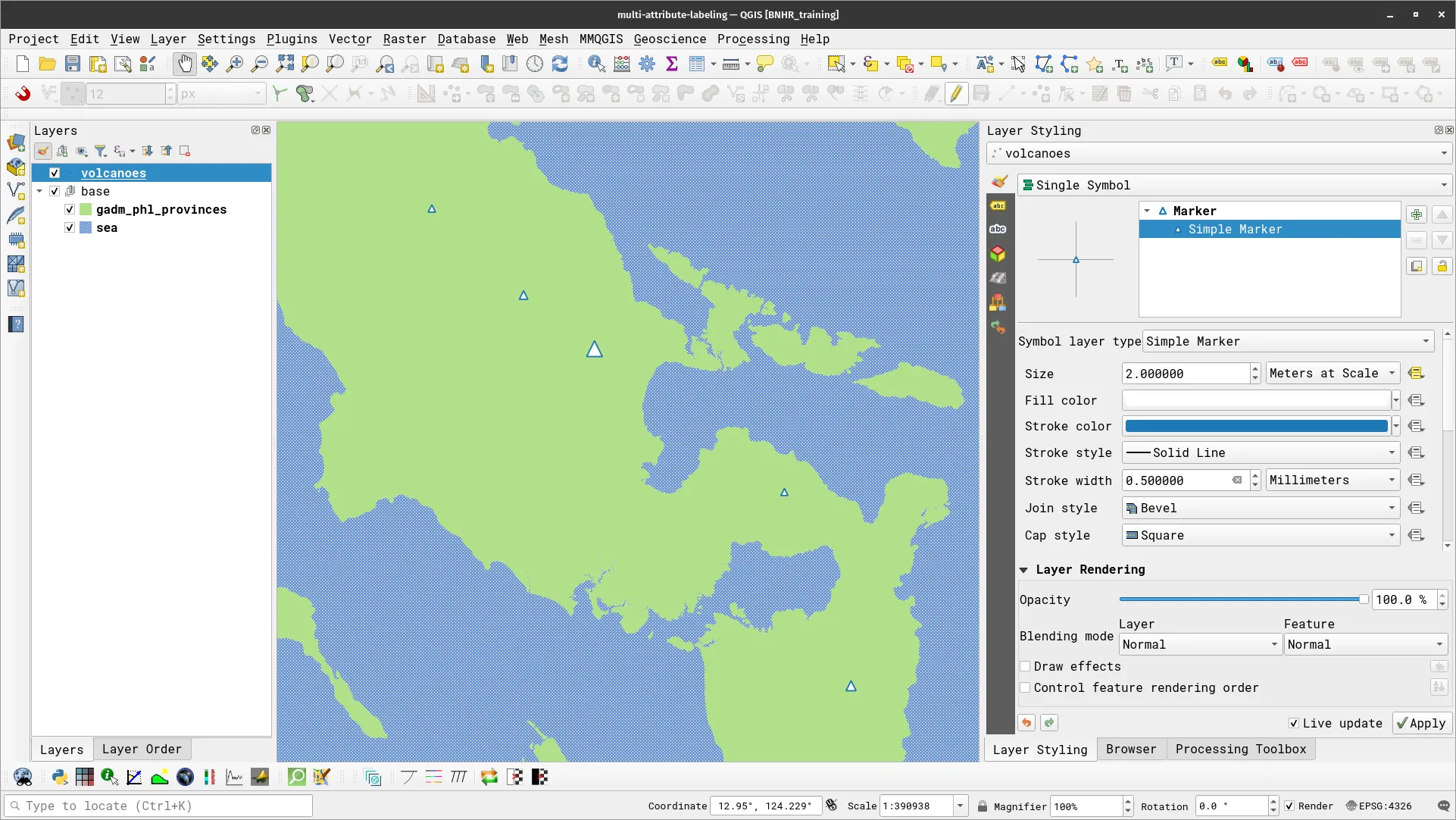
- Apply a simple Single Label to the volcanoes layer and style it accordingly. For the Value parameter, use the following expression:
concat(name, '\n[', elevation, ' m]')- By default, your map should look similar to the one below:

Making the text size be relative to the actual elevation of the volcano/mountain
Here, what you will do is make QGIS have the text size of the label be based on the actual elevation of the mountain/volcano—this means that if Mount Mayon is taller than Masaraga then the label of the former should be larger than the latter.
- To do this, apply a data-defined override to the size parameter of the label’s text using the expression below:
6 + coalesce(scale_exp("elevation", 1000, 2500, 2, 5, 0.57), 0)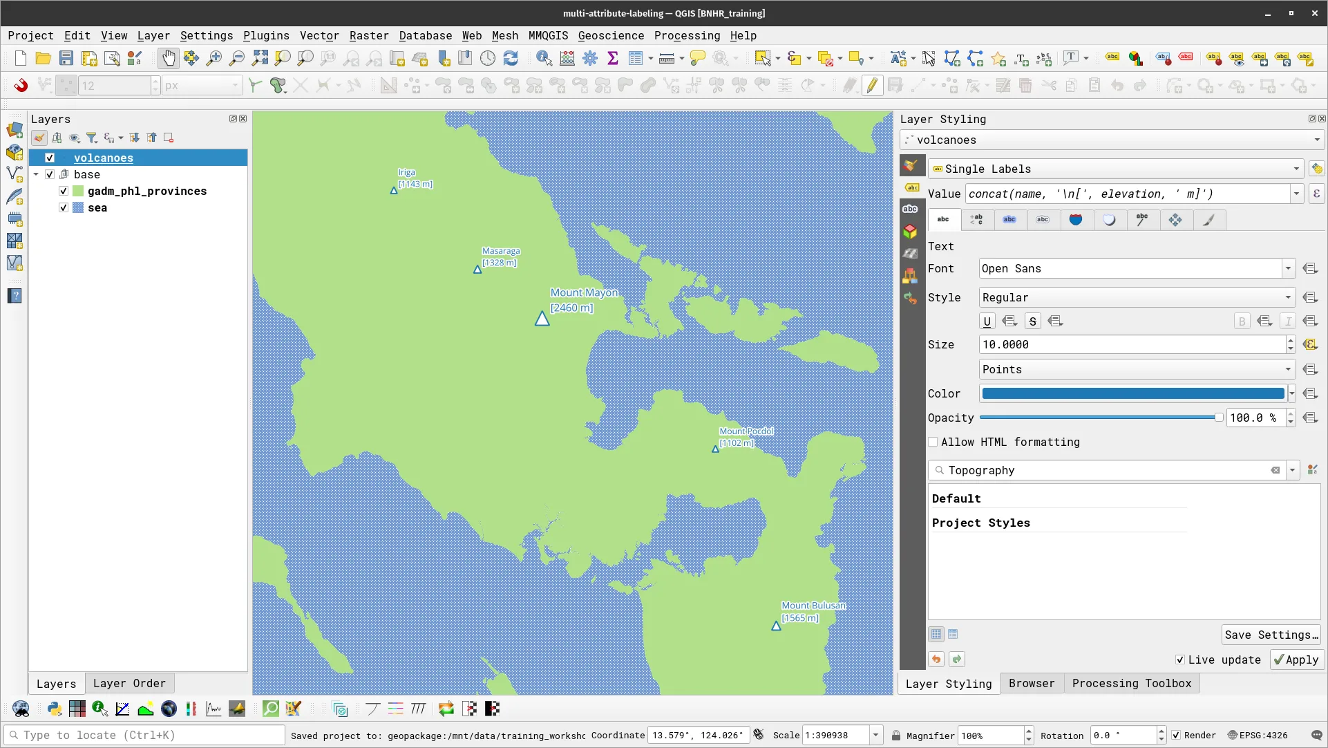
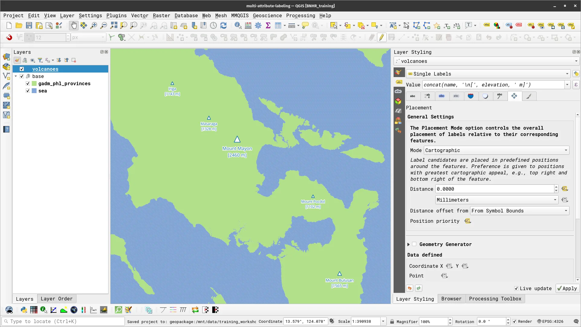
Label placement
Next, you might want to put the labels below the markers. You can do this by editing some of the parameters in the Placement tab of Labels.
- To put the labels at the bottom of the marker, update the Position priority parameter with the following expression.
'B,BSR,BSL,BR,BL,R,L'- To manage the distance between the marker and the label, edit the Distance parameter with the following expression.
coalesce(scale_exp("elevation", 1000, 2500, 3, 5, 0.57), 0) - 2- Your map should now look similar to the one below:
Certification and support
Section titled “Certification and support”Contact us or sign-up to our courses if you are interested in having this as an instructor-led or self-paced course.