
Map layouts and elements
Introduction
Section titled “Introduction”This module discusses map layout concepts, elements, and templates.
What you should already know
Section titled “What you should already know”As an intermediate level workbook, you are expected to already know basic GIS concepts such as spatial data models and formats and QGIS functions such as loading and styling layers, running processing algorithms, saving QGIS projects, etc.
Layout templates
Section titled “Layout templates”Review of the Print Layout
Section titled “Review of the Print Layout”The Print Layout window can be accessed via Project > New Print Layout in the Menu bar or CTRL + P. QGIS also has a layout manager (Project > Layout Manager) that allows you to manage (add, delete, duplicate) print layouts related to a project.
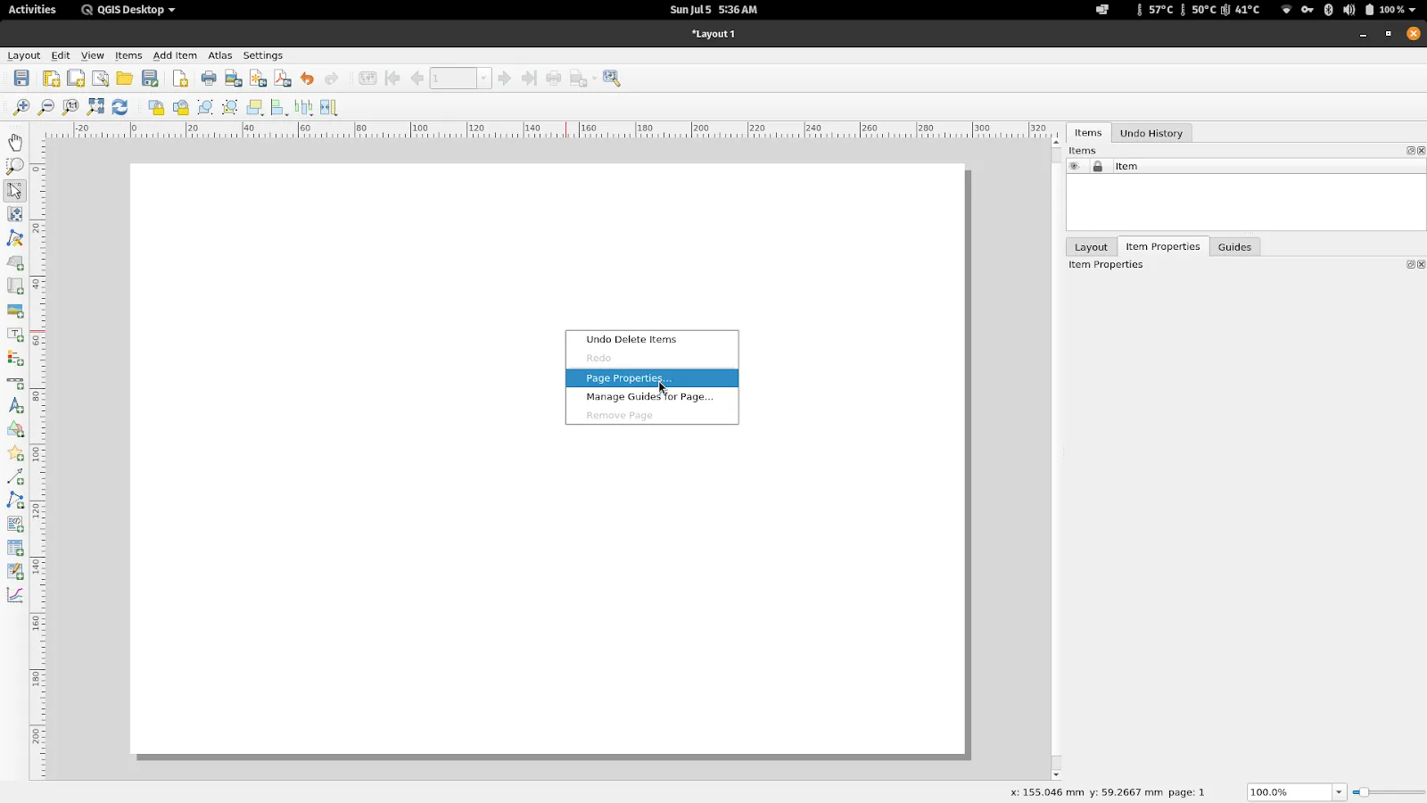
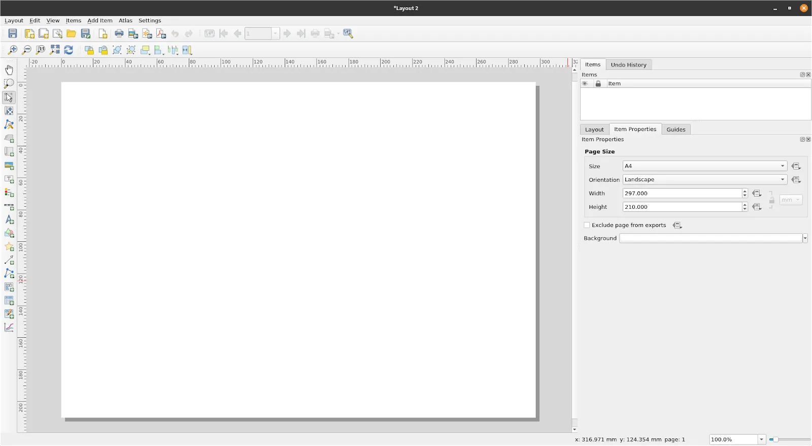
Page Properties
Section titled “Page Properties”The option to edit the page properties of your layout such as the size, orientation, and background color (if any) can be done Right clicking on an empty part of the the layout canvas > Page Properties.
Exercise 1.1. Saving and opening a template
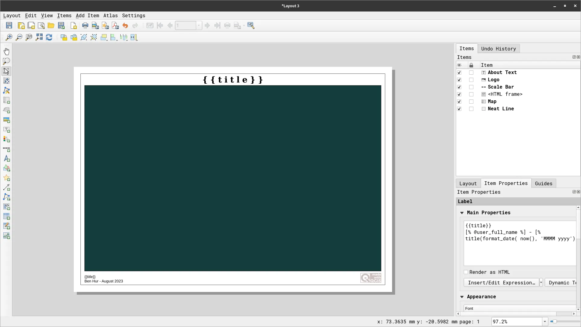
Section titled “Exercise 1.1. Saving and opening a template”QGIS allows you to create and manage layout templates that are reusable across QGIS instances. This is very useful when you need to create standard layouts and maps across different users, machines, and even offices.
- After you’re done creating a Print Layout, you can save it as a template by going to Layout > Save as Template…
-
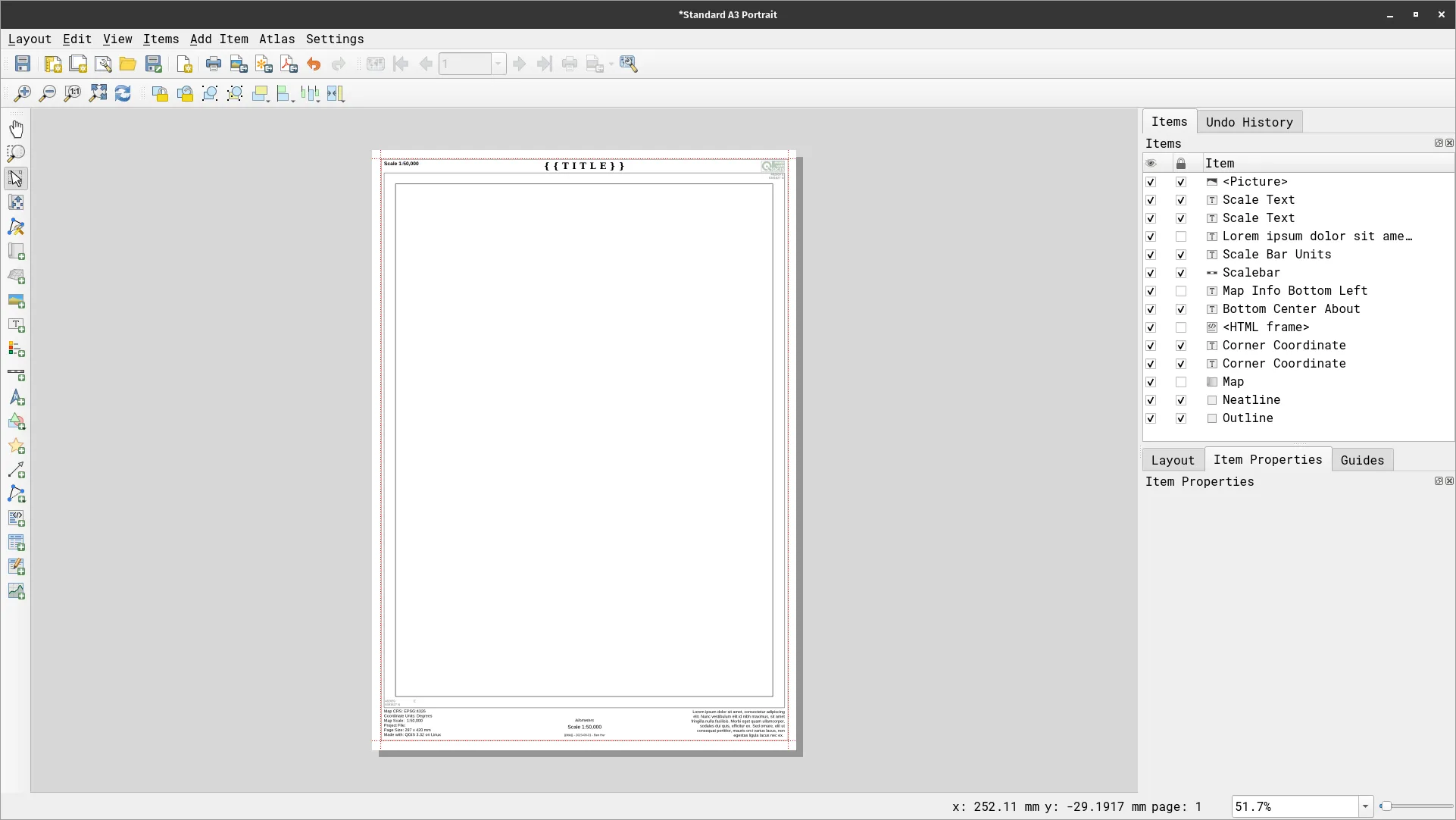
Two sample templates are included in the data folder:
- Simple A4 Landscape
- Standard A3 Landscape
-
Open one of them by double-clicking or dragging them to QGIS and inspect the contents of the layout.
- Another way to use a template is to save them in the composer_templates folder of the user profile. Afterwards, you can use the template in any Print Layout by going to Layout > Add Items from Template.
Map themes
Section titled “Map themes”A map theme is a snapshot of the current map legend that records:
- the layers set as visible in the Layers panel and
- for each visible layer:
- the reference to the style applied to the layer
- the visible classes of the style (i.e. the layer checked node items in the Layers panel. This applies to symbologies other than the single symbol rendering)
- the collapsed/expanded state of the layer node(s) and the group(s) it’s placed inside
Map theme options can be found in the Layer panel via the ![]() button.
button.
Creating map themes
Section titled “Creating map themes”To create a map theme:
- Check the layer/s you want to show.
- Configure the layer properties (symbology, diagram, labels, etc).
- Expand the Style ‣ menu at the bottom of the Styling Panel.
- Click on Add… to store the settings as a new style embedded in the project.
- Repeat the previous steps as necessary for the other layers.
- If applicable, expand or collapse groups or visible layer nodes in the Layers panel.
- Click on the Manage Map Themes button (
 ) on top of the panel and click Add Theme
 - Enter the map theme’s name and click OK.
- Your themes are listed under the button.
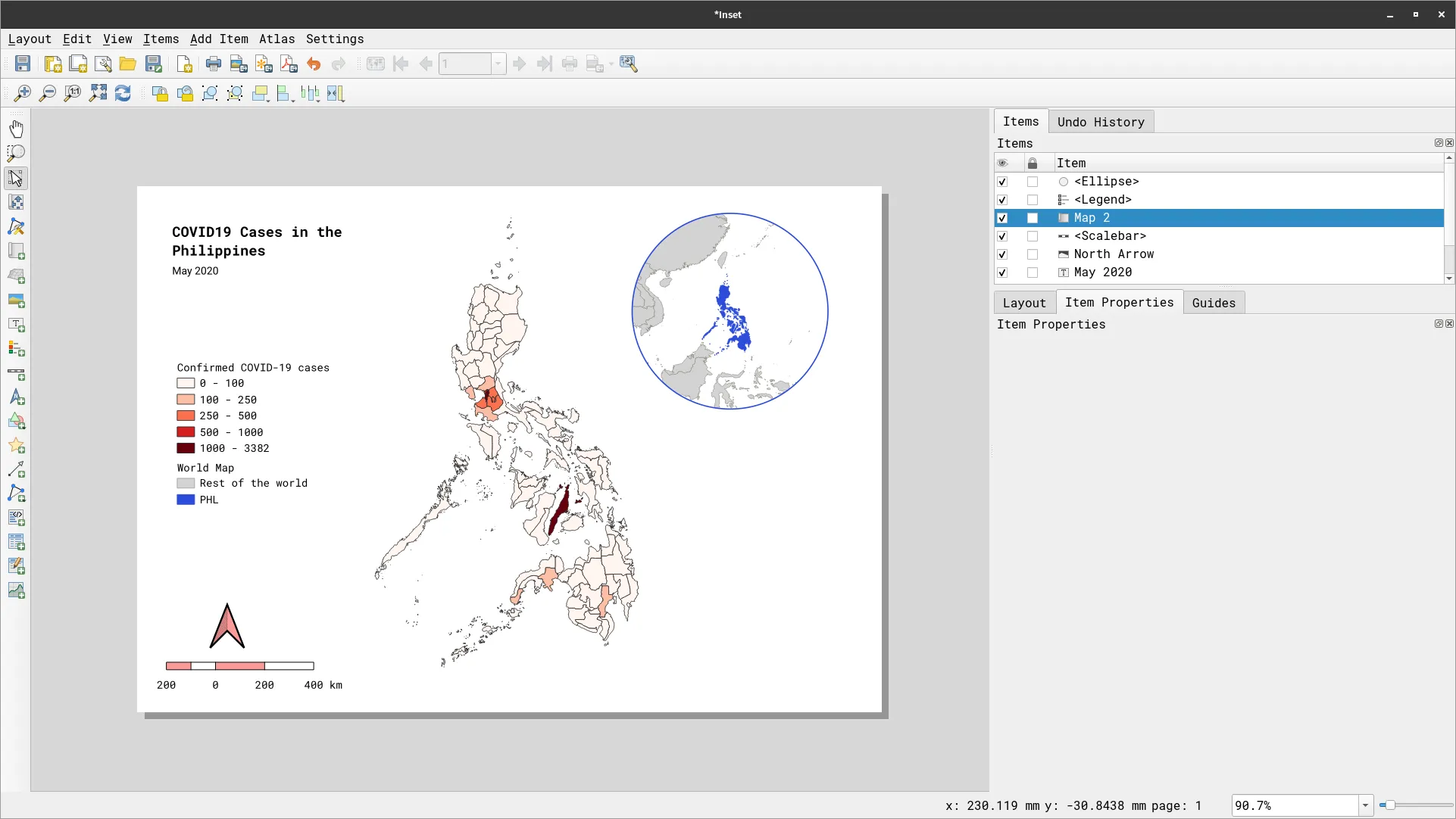
Exercise 2.1. Adding multiple maps to the same layout
Section titled “Exercise 2.1. Adding multiple maps to the same layout”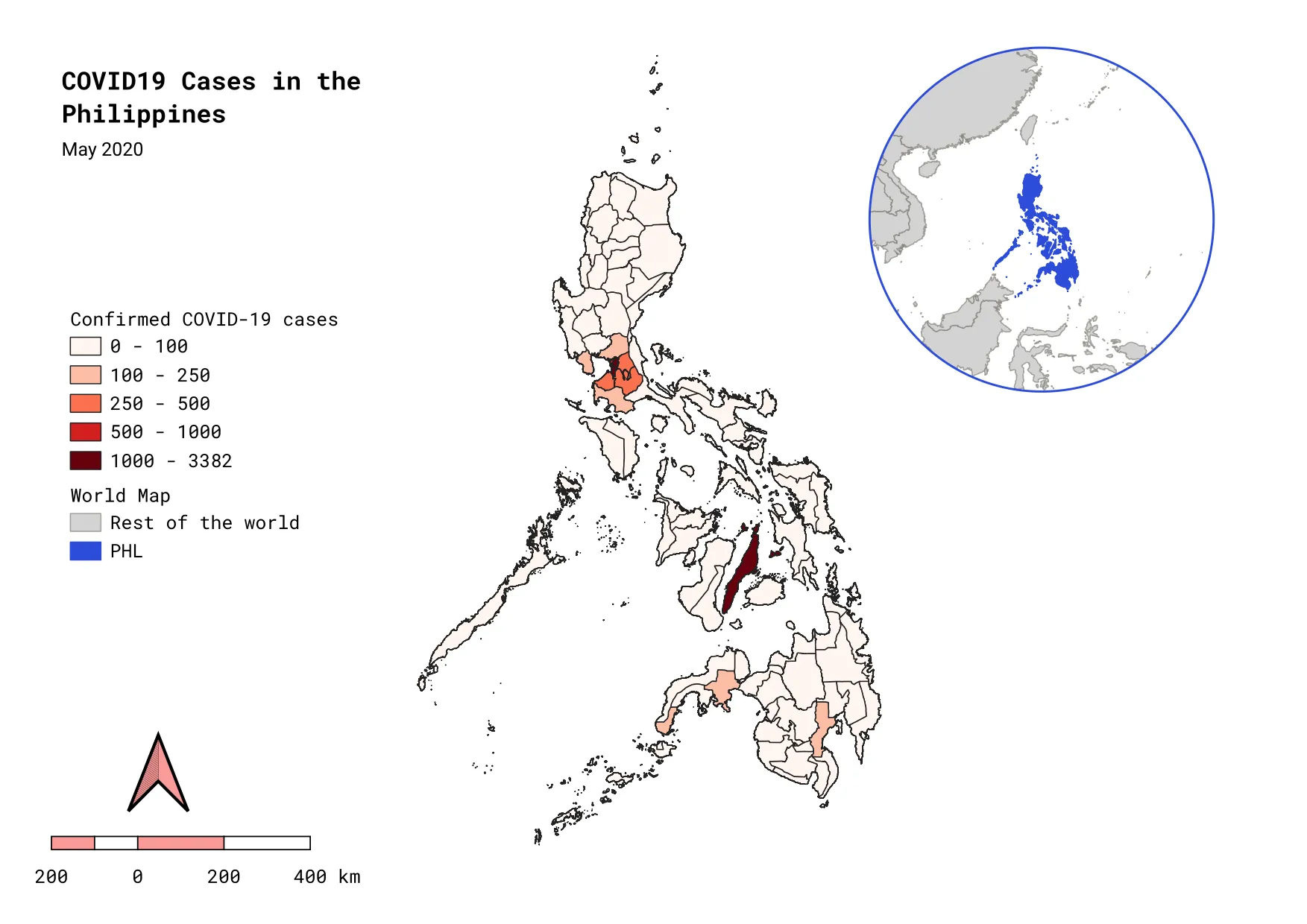
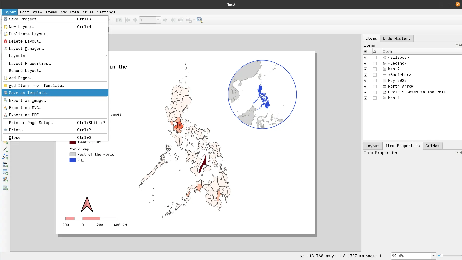
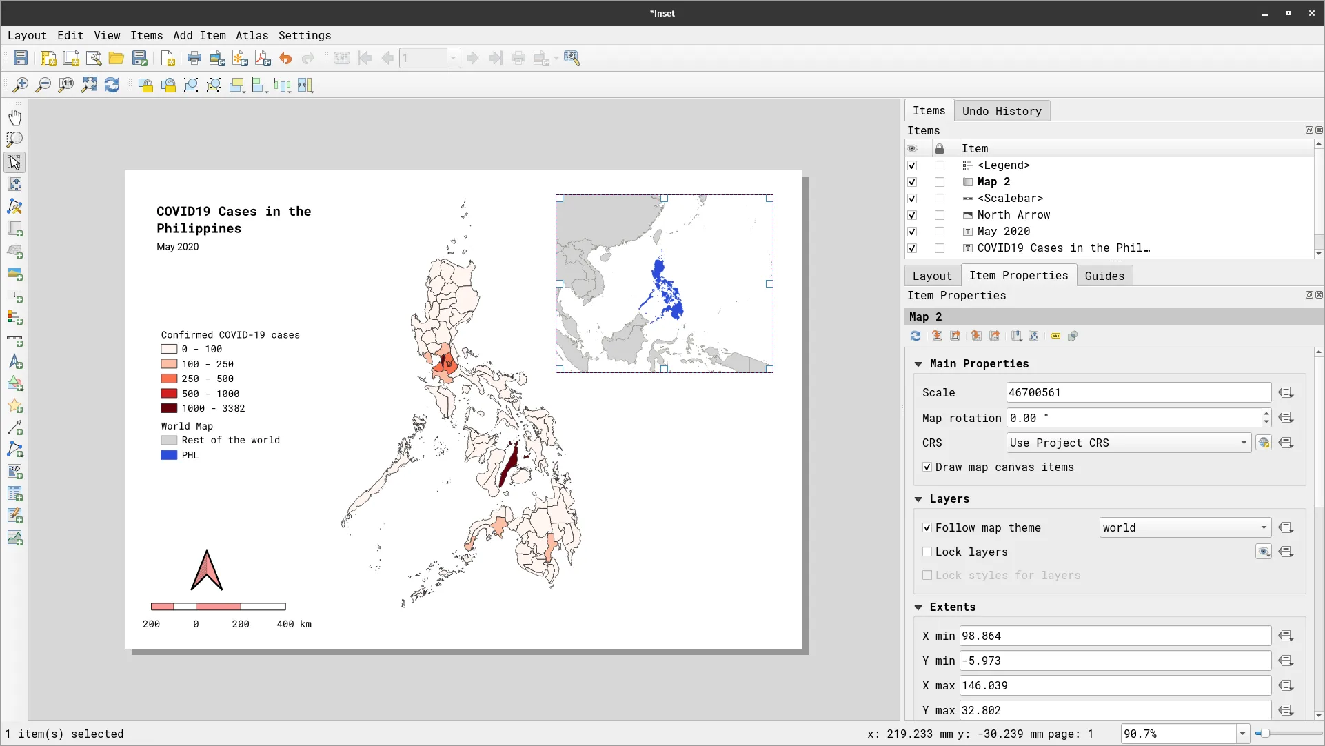
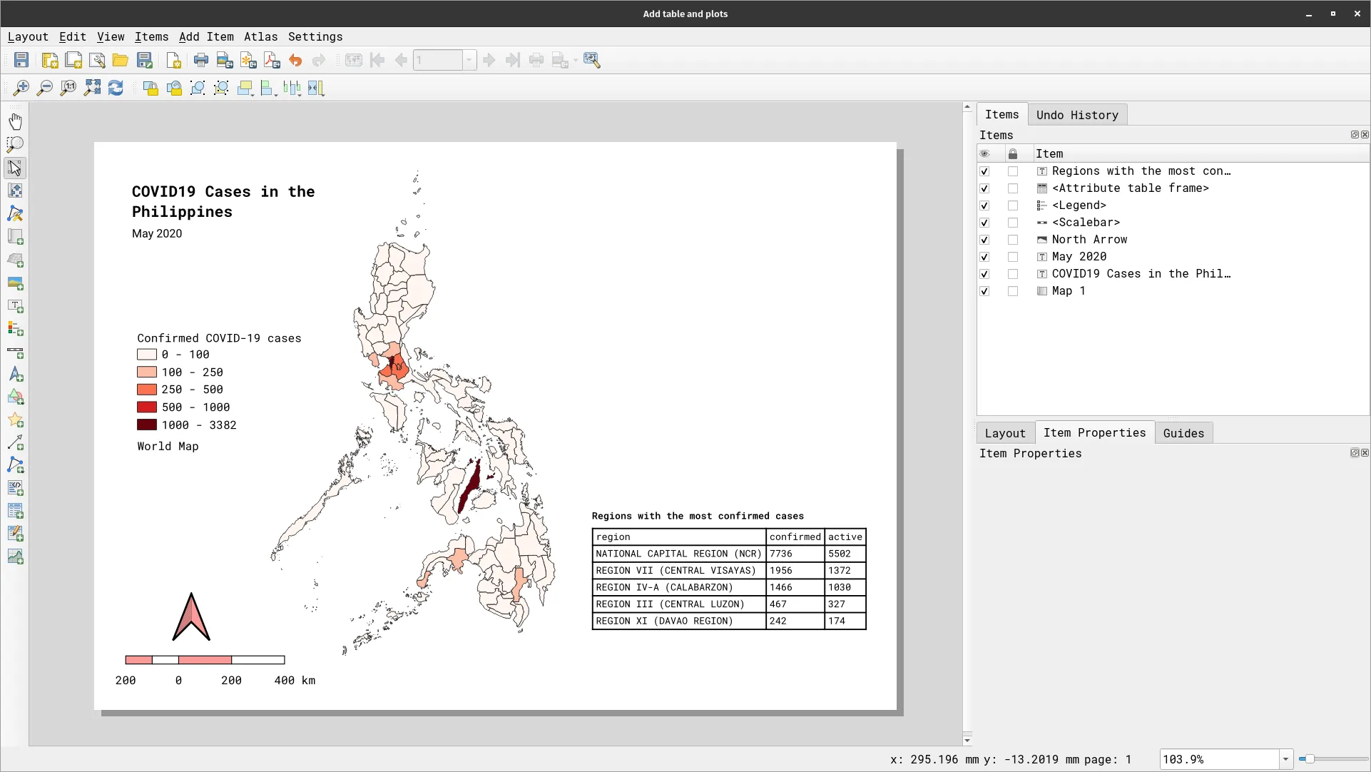
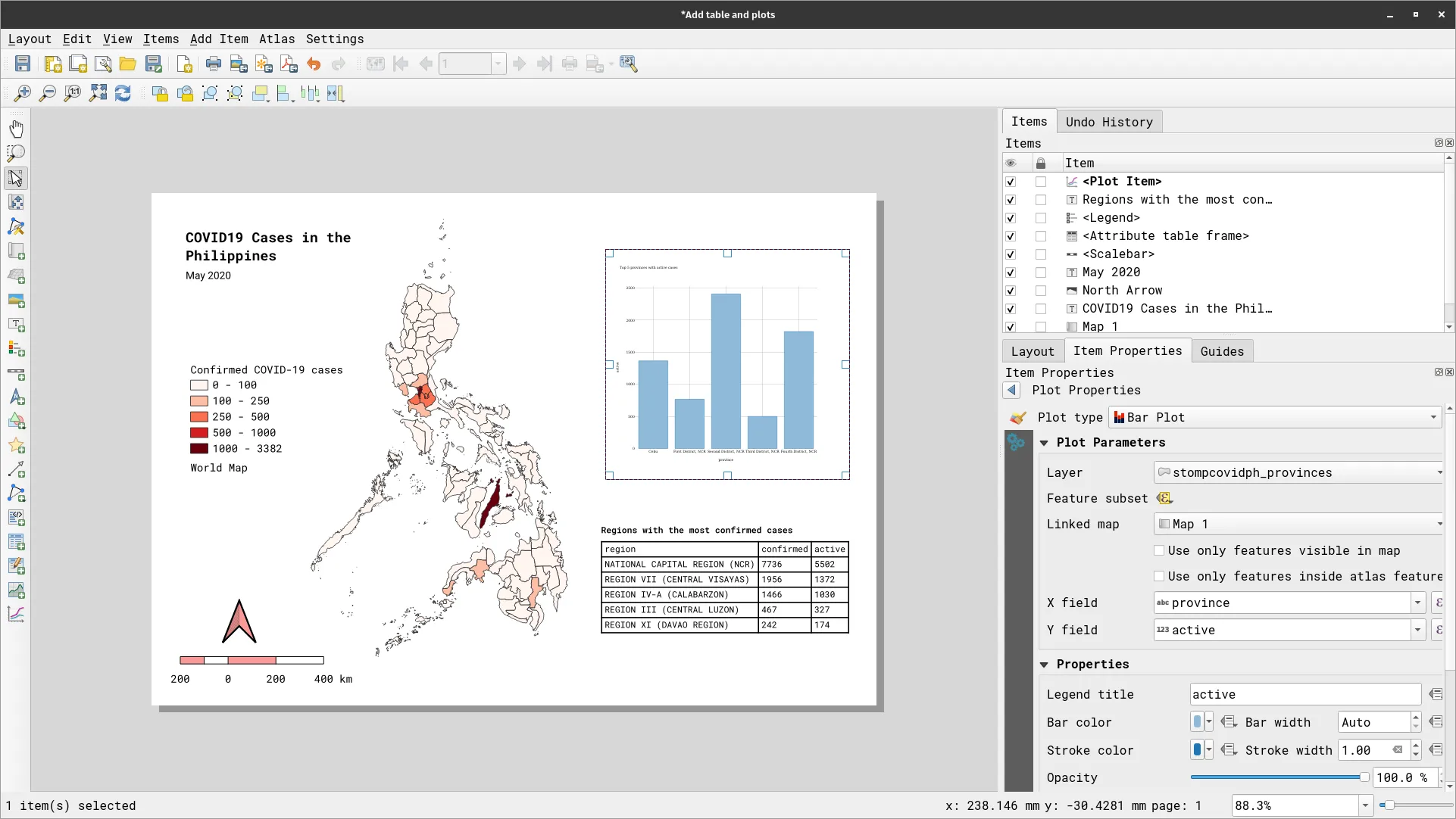
In this exercise, you will utilize map themes in order to add the two maps to a single layout. You will create a map showing the COVID cases in the Philippine provinces with an inset map showing the location of the Philippines in the world.
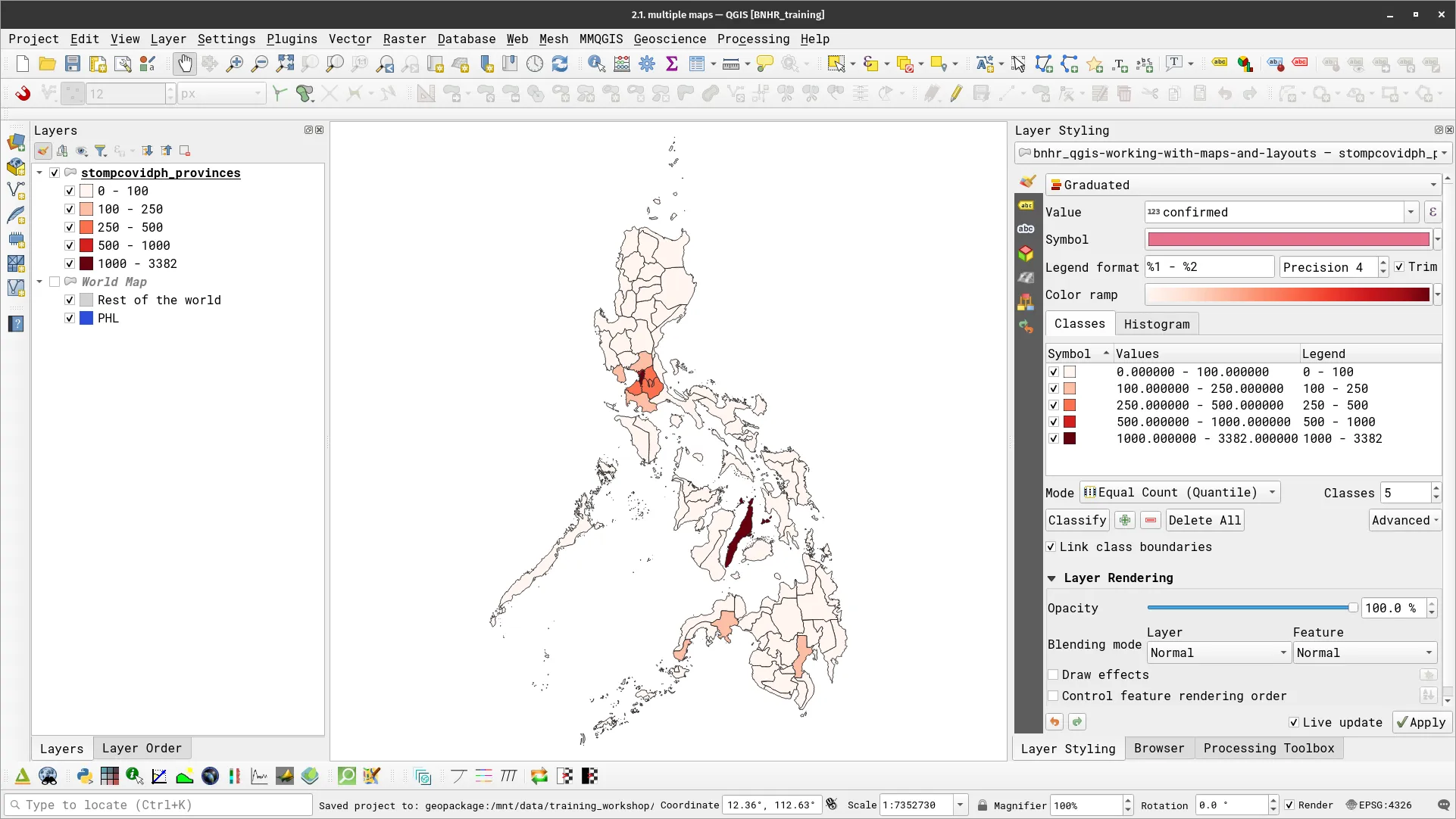
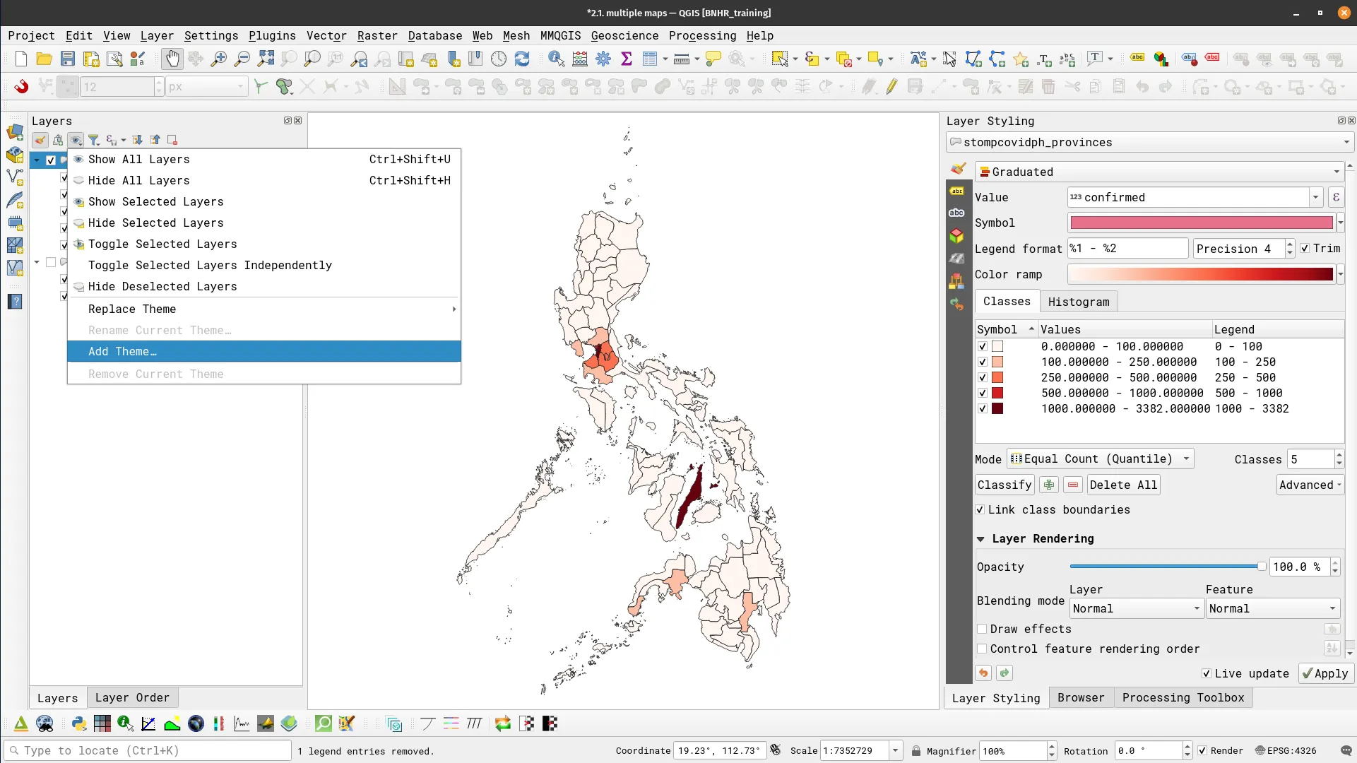
- Load the stompcovidph_provinces layer and apply a Graduated symbology like below.
- Load a world layer and apply a rule-based symbology highlighting the Philippines. This will serve as our inset map in the Print Layout.
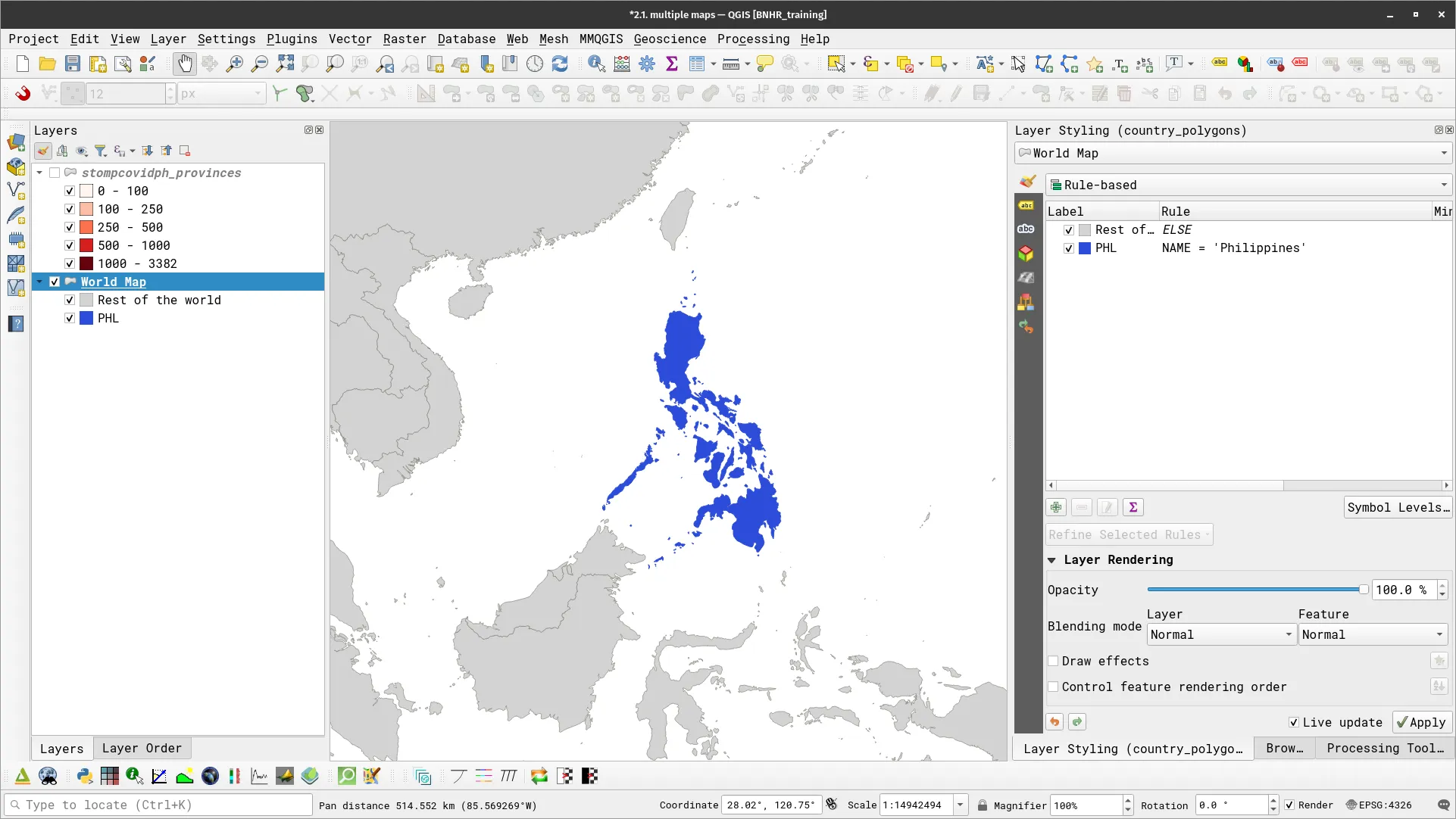
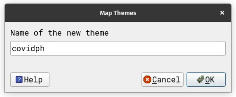
- Set the stompcovidph_provinces layer as the only visible layer (checked in the Layers Panel). Add a theme by clicking > Add New Theme. Name the theme covidph.
-
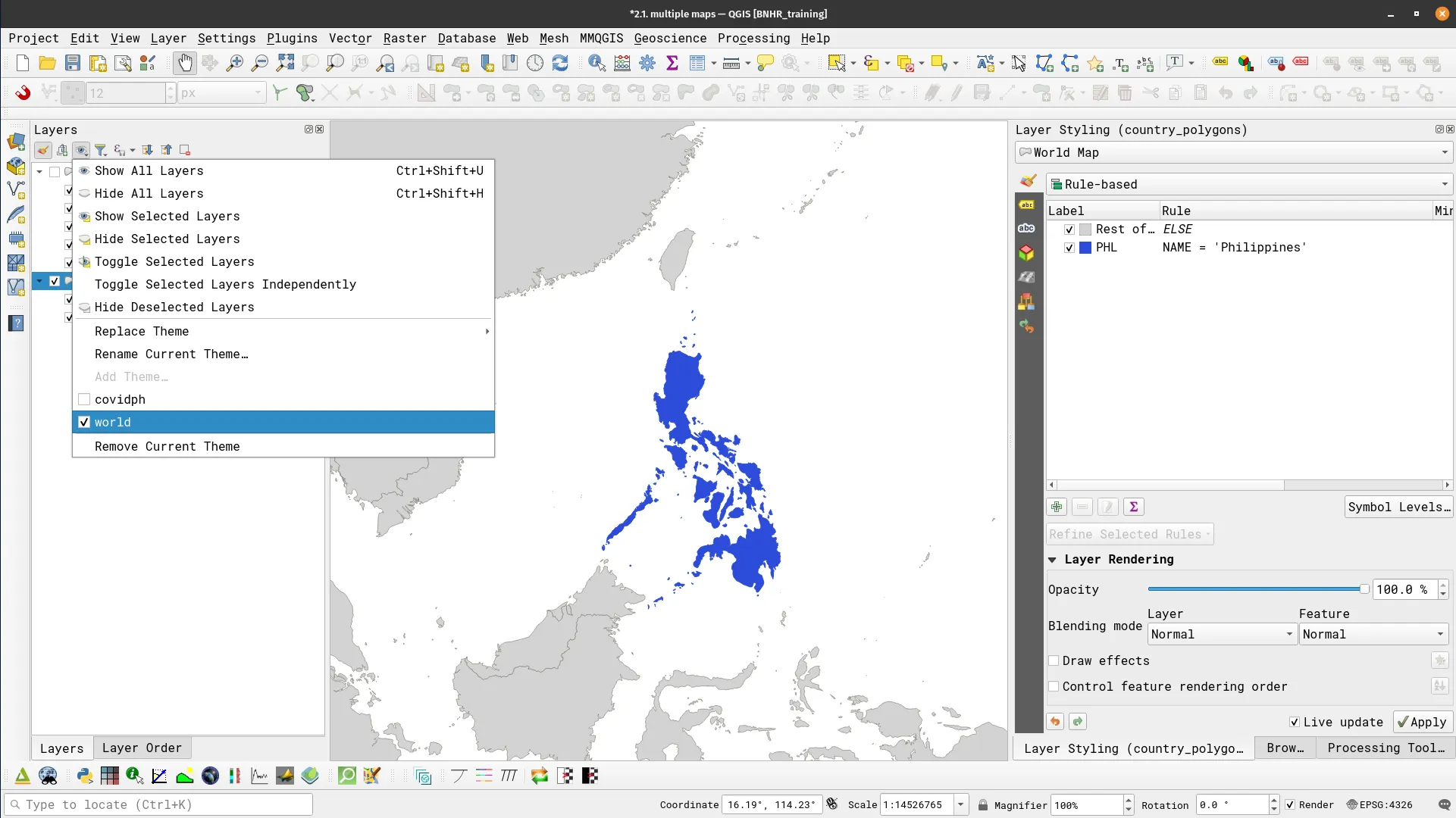
Do the same for the World Map layer. Make it the only visible layer and add a theme by clicking
> Add New Theme. Name it world. -
The map themes are listed under
and can be activated/deactivated any time. Try it.
- Open a print layout and add some basic components (e.g. title, north arrow, scale bar).
- Add a map. In the Item Properties of the Map, set:
- Layers
- Check Follow map theme
- Select covidph
- Layers
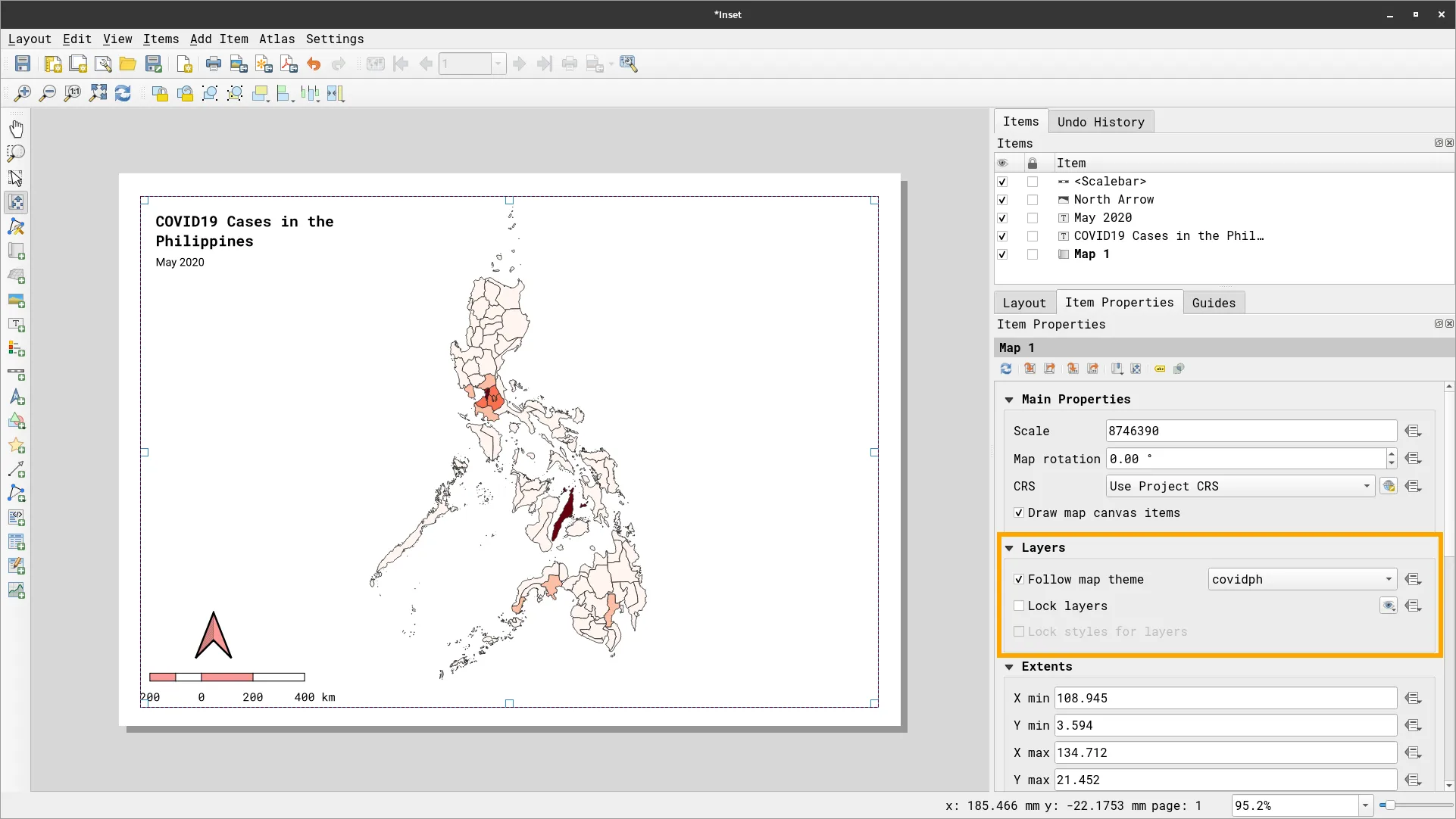
- Add another map element. This time make it smaller and place it in the upper right corner of the page. In the Item Properties of the Map, set:
- Layers
- Check Follow map theme
- Select world
- Layers
- Add a legend.
BONUS: What if you want to clip the inset map so that it looks like a circle (or any other shape)?
Section titled “BONUS: What if you want to clip the inset map so that it looks like a circle (or any other shape)?”QGIS makes it easy to clip map elements. In the Map properties toolbar, the rightmost button will open the Clipping settings that will allow you to define how you want the map to be clipped.
![]()
- Add a circular shape to the map using the Add Shape > Add Ellipse command. You will use this to clip the inset map to its shape. Place this circle over the inset map where you want it to be clipped.
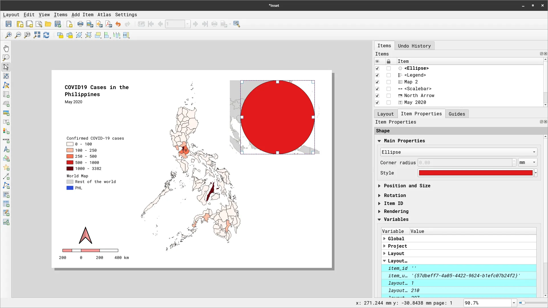
- Go to the Clipping Settings of the inset map, check Clip to Item, and select Ellipse.
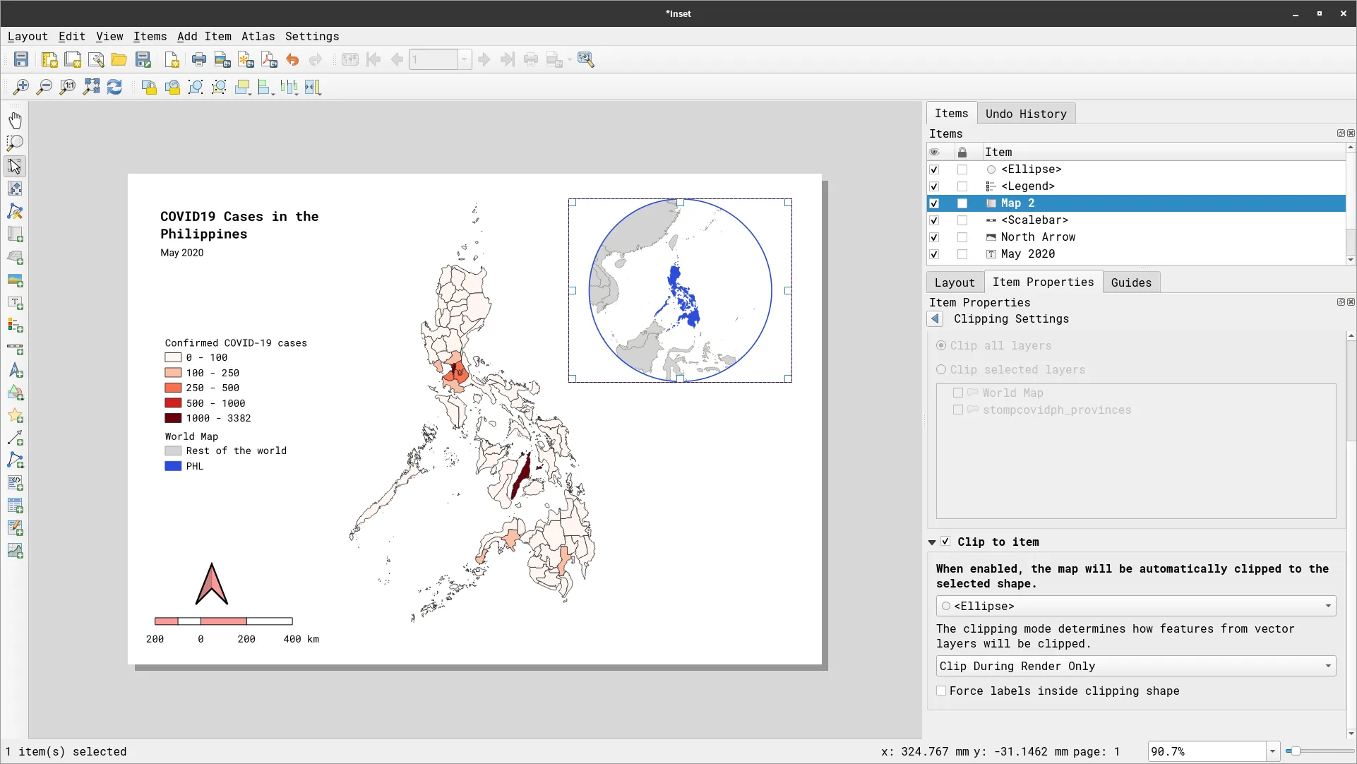
- You can continue to fine-tune your layout. It should look similar to the one below.
Plots, tables, and other map elements
Section titled “Plots, tables, and other map elements”Aside from common map elements such as labels, scale bar, and legends, the QGIS Print Layout also allows for other map elements such as tables and plots to be added to the map. For tables, these can be fixed tables or based on the attribute table of layers.
For plots, they can be added using plugins such as the DataPlotly plugin (https://plugins.qgis.org/plugins/DataPlotly/) for graphs (bar, chart, pie, line) or natively such as with Elevation profiles.
Adding tables to maps
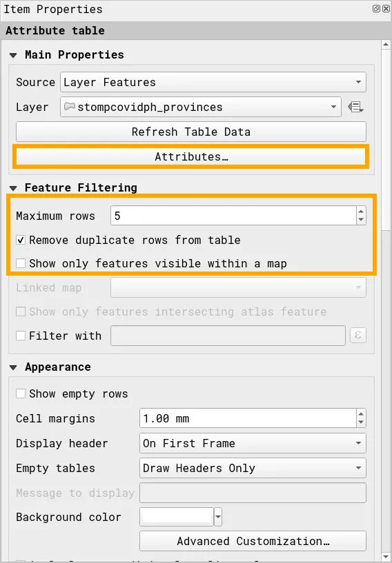
Section titled “Adding tables to maps”Exercise 3.1. Show a table of the top 5 regions with the most confirmed cases
Section titled “Exercise 3.1. Show a table of the top 5 regions with the most confirmed cases”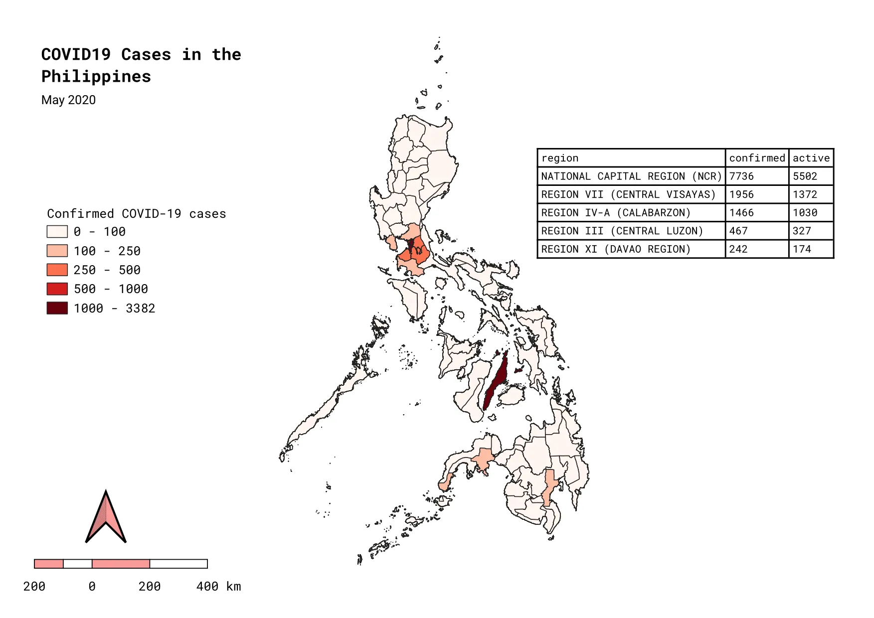
In this exercise, we will add a table showing the top 5 regions with the most confirmed cases based on our stompcovidph_provinces layer.
- Remove the inset map from the layout you created in the previous exercise.
- Add an attribute table to the layout by clicking
 .
. - On the Item Properties Panel,
- Set Maximum rows to 5
- Check Remove duplicate rows from table
- Click Attributes…
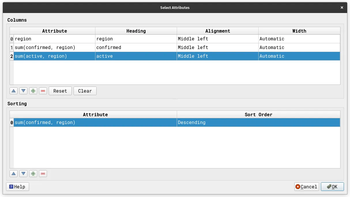
- On the Select Attributes window…
- Remove all attributes so that only region remains
- Add 2 new columns by clicking on the green plus button.
- confirmed cases in the region using the expression:
sum(confirmed, region)
- active cases in the region using the expression:
sum(active, region)
- confirmed cases in the region using the expression:
- Add a new sorting by clicking on the green plus button.
- Attribute is:
sum(confirmed, region)
- Sort Order: Descending
- Attribute is:
Adding graphs/plots to maps
Section titled “Adding graphs/plots to maps”Aside from tables, you can also add plots in the layout via the Data Plotly plugin.
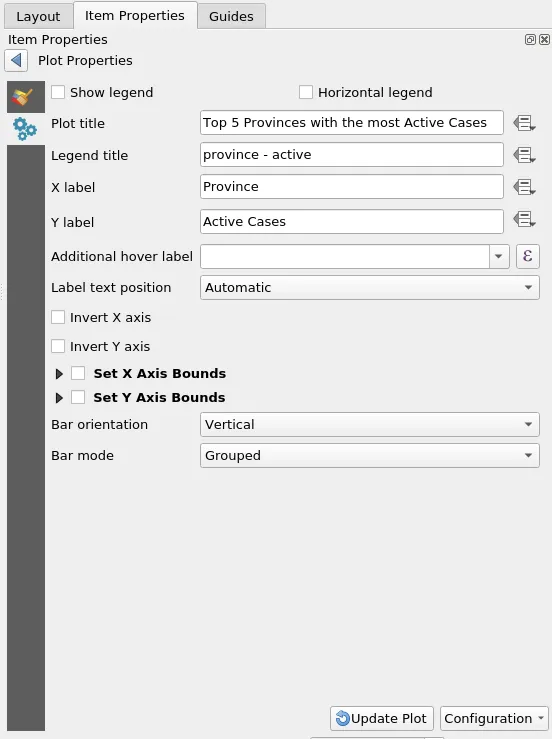
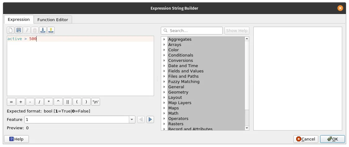
Exercise 3.2. Add a bar graph of the provinces with active cases > 500
Section titled “Exercise 3.2. Add a bar graph of the provinces with active cases > 500”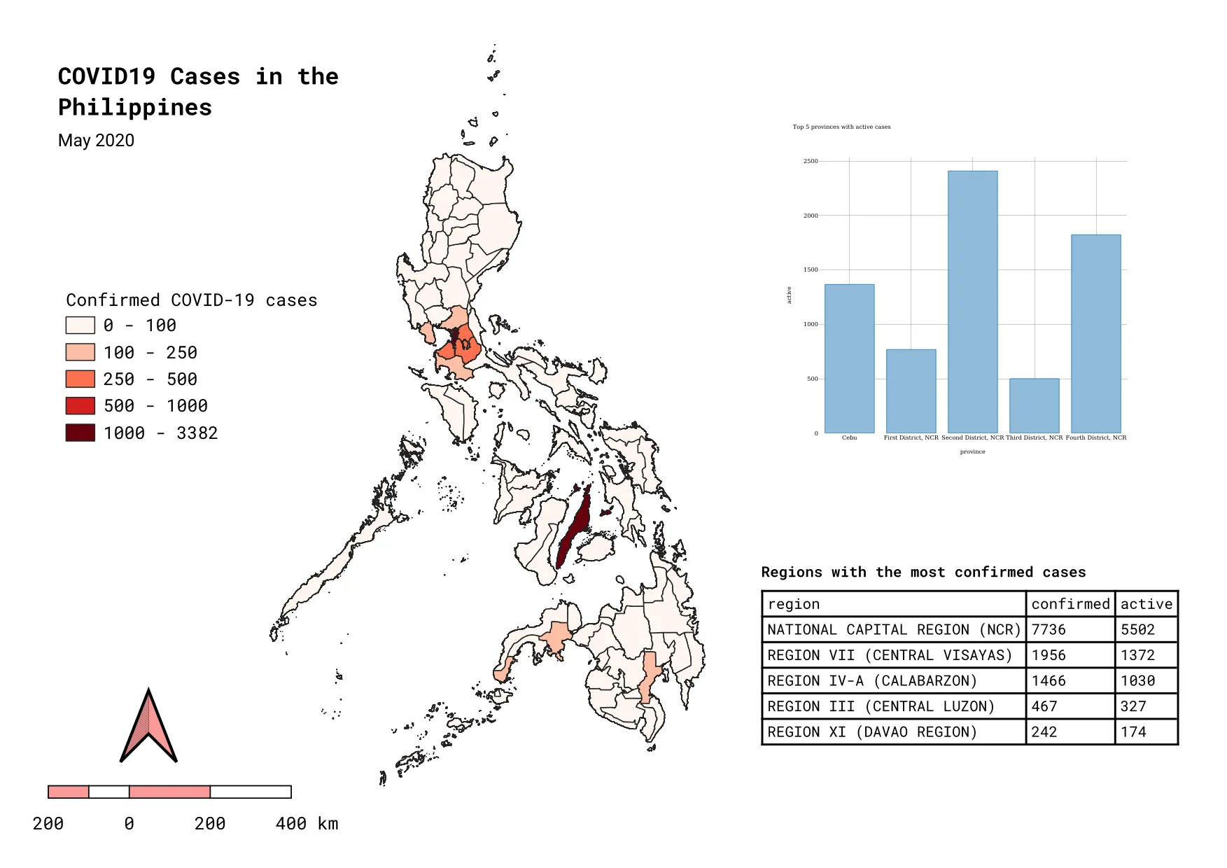
- Add plots by clicking the add plot icon
 usually found at the bottom of the rightmost panel or in the Add Item menu.
 - In the Item Properties click Setup Selected Plot with the following parameters.
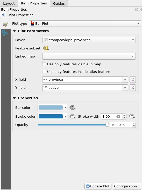
- Use a Feature subset to limit the features to be plotted to those where the active cases > 500. Use the expression:
active > 500
Certification and support
Section titled “Certification and support”Contact us or sign-up to our courses if you are interested in having this as an instructor-led or self-paced course.